Posts Tagged ‘Sharpie’

h1

I Cheated But Just A Little

03/28/2014

Taking a cue from my Colorful Background post, I sploshed some blue and green watercolors on a page in a Stillman & Birn Epsilon Sketchbook. Unlike the artist who made the video in my post, I didn’t want to write on the painting so I cheated, but just a little.

The trick was to make the words temporary without obscuring the background painting. After a few so-so ideas, I remembered a packet of translucent vellum that disappeared years ago. It took some time to locate, but provided the perfect solution.

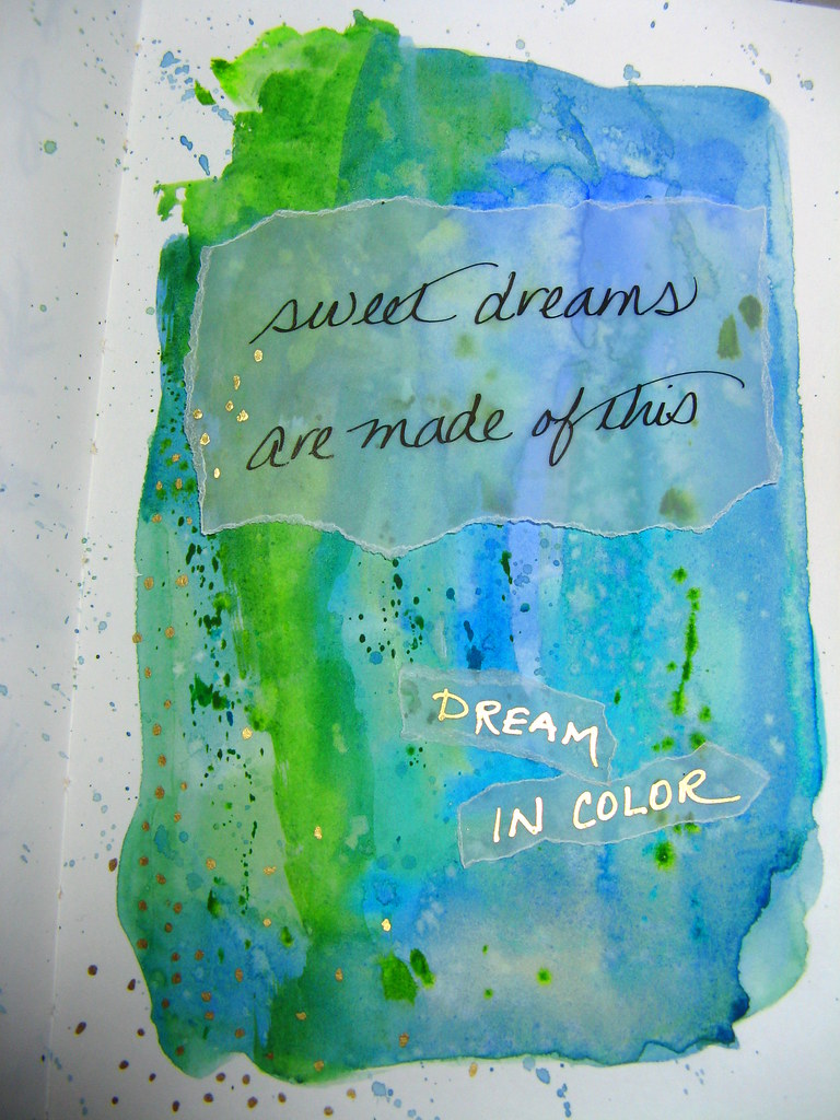
With a Pilot Prera/Plumix Italic and Noodler’s Black ink, I wrote the Eurythmics lyric several times on the vellum until it looked suitable. A little paper tearing produced uneven edges that echoed the watercolor. Then I made another written piece using a Uchida Gold Opaque Paint Marker. With a Scotch Wrinkle-Free Glue Stick, I attached the written words to the watercolor. Lastly, a swath of gold dots on the left side and the page was complete.

The Daniel Smith watercolors are from my basic palette and include Cobalt Blue, Ultramarine Turquoise, and Green Gold with a touch of Ultramarine Blue. I may have inadvertently dipped my brush in Sap Green on one pass, so that could be added to the list or not.

Epsilon paper is 150gsm so it can handle a fair amount of liquid, but it still required quick work to keep things fresh and flowing. The Isabey Petit Gris Mop brush from Leigh was perfect for the loose wash. It holds a huge amount of paint and added to the fun of getting the colors to mingle on the paper.

If you aren’t into painting, a similar background effect can be achieved with wide or brush markers. The latter works extremely well when held horizontally, almost parallel to the paper. Another option is to doodle with Sharpies and write with a fountain pen over your design.

If you want to write with a fountain pen more than paint colorful backgrounds, Jet Pens has a fun palette that could be used to create a pale wash of color over which ink will stand out nicely. More about the Yasutomo Niji Pearlescent set next week, but it could make a good starting point paired with a waterbrush. It does take a few drops of water to get the paint thick enough to put down significant color. However, a less saturated look might be just the thing to make your writing stand out on the page.

Whatever way you go, writing over a colorful background adds pizazz to your words. If it inspires you to write, so much the better. Play with it and have fun. That’s what should happen with all artistic endeavors.

Speaking of having fun, I think I’ll add a few more gold dots. One can never have too much gold, right?

h1

On My Desk To Start The New Year

01/01/2013

A neat desk is a good way to start the new year. I reckon I will have to wait until 2014 for that bit of holiday joy.

The top section of my list comprises only the pen related items.

  • 14 pens including three Platinum #3776 pens at various stages of testing, three Levenger True Writers and a Namiki Falcon B nib filled with Noodler’s Inks for testing,  four Lamys and a Kaweco Sport filled with inks from previous tests, and two pens that are in regular rotation, a True Writer Cursive Italic and a Pelikan M215 Cursive Italic.
  • The inks in those pens are Platinum Pigment Blue, Diamine Sepia, Noodler’s Golden Brown, Tiananmen, Beaver, Purple Martin, Australian Roses, 54th Mass., Q’E-ternity, Air-Corp BBk, Ottoman Azure, plus Montblanc Racing Green, and Kaweco BBk.
  • An Apica 6A10 Note Book, a Daycraft Signature 2013 Diary, various Rhodia pads, several Staples sugarcane spiral notebooks, Stillman & Birn Journals, an Exacompta Sketchbook, Staples notebook paper, and a couple of legal pads.

Then there is all the stuff that is not fountain pen related.

  • Two Autopoint mechanical pencils and assorted erasers
  • Pentel Pocket Brush Pen
  • Two Chinese seals and a bottle of Chinese ink for painting
  • One magnifying loupe
  • One 6″ jade statue
  • A container of watercolor brushes and two Altoid-sized boxes filled with pans of watercolor paint
  • A container of drawing pencils and Sharpies
  • Six bottles of hand lotion (Well, a girl has to have options.)
  • One roll-on bottle of Life TIME Stopain Topical Analgesic
  • Minolta E-323 camera
  • Small TV, cable box, laptop-sized keyboard, mouse, and a large computer monitor that dominates the whole affair
  • Clock radio and a phone
  • One LED and one standard bulb flashlight
  • Three pairs of glasses

You should see what else it holds. Or maybe not. No need to traumatize you neat and tidy people.

h1

A 2012 Moleskine Planner And That Paper Issue

12/11/2011

Last week the European Paper Company sent a Moleskine Weekly Notebook Diary/Planner 2011-2012 that I won in a giveaway. How could I not give it a test spin for Inkophile readers?

Moleskine Academic Planner for 2011-2012

Moleskine Academic Planner for 2011-2012

The planner comes with a supple, soft cover and two page layout. On the left side is a weekly calendar and on the right a lined page. There are lots of extras at the front of the notebook including a monthly calendar, schedule of international holidays, map of time zones, dialing codes, chart of measures and conversions, and more. The back has a pocket with a sheet of stickers. There is a ribbon bookmark and the whole package stays together with a neat elastic band. All to the good and fitting with the Moleskine brand and price.

Moleskine Academic Planner for 2012 - Interior Pages

Moleskine Academic Planner for 2012 – Interior Pages

As always Moleskine looks great and feels wonderful in the hand. The planner paper is thin which allows space for a huge number of sheets in a notebook a mere one centimeter thick. The good news is that the acid-free (pH neutral) paper feathers much less with fountain pen ink than the last time I tested a Moleskine. The bad news is that the paper shows significant bleed-through though less so with Noodler’s Kiowa Pecan, Zhivago, and Red-Black inks. Since both sides of the paper are necessary for the diary’s format, this could be a deal-breaker for fountain pen users.

Moleskine Academic Planner - Written Sample

Moleskine Academic Planner – Written Sample

Moleskine Academic Planner for 2012 - Written Sample (Reverse)

Moleskine Academic Planner for 2012 – Written Sample (Reverse)

Other writing instruments worked better but still there was a little ghosting. With such thin paper, this is to be expected. Years ago I used a Parker ’51’ Aero Special with a fine nib and Noodler’s Black ink in a Moleskine journal with good results. Pendemonium‘s Noodler’s Legal Lapis worked well as did J. Herbin Poussière de Lune. I suspect all would be good with this planner as well.  The Sharpie Pen and the Zig Millennium 05 were well-suited to the narrow line-spacing. In fact due to its fine point, the Sharpie will be my first choice for the Moleskine when I don’t have the ’51’ with Zhivago to hand. When I need color the Millennium with Pure Violet ink will do.

One of these days I’d like to test a recently manufactured regular Moleskine journal to see if the bleeding is an issue. Writing on one side of the page would solve the problem though it would be a less than economical use of the journal. There have been enough remarks on Fountain Pen Network from people who have no issues with Moleskine to make me think there are pens and inks that suit the paper beautifully. If you have had that sort of experience, the Moleskine Weekly Planner should be just right. If not, then expect to test and experiment until you find a suitable match. If you love fat juicey pens, I wouldn'[t recommend the Moleskine. Switch your pen or find a different planner, one known for tolerating fountain pen ink.

Parker '51' With J. Herbin Vert Empire On Moleskine

Parker ’51’ With J. Herbin Vert Empire In An Old Moleskine

Some non-fountain pen ink tests from DIYSara.

h1

Links To Enjoy With Your Sunday Coffee

07/10/2011

Actually, I like Earl Gray tea first thing but I’ve already used that one.

h1

Pens, Dogs, Crayons, and Moleskine Links

09/03/2010
h1

A Variation on the Levenger True Writer Theme

03/22/2010

Fountain pens remain my first choice for writing and often for drawing but sometimes they just won’t do. On my desk are some gorgeous journals with paper that isn’t fond of  fountain pen ink. So to give them a chance and possibly even make them useful, it seemed only fair to look beyond fountain pens for something suitable. With lots of help from my Inkophile friends, I found just the thing.

The comments to my original post on the subject, When A Fountain Pen Just Won’t Do,  started my research. Eventually I settled on a fiber tip or fineliner as the second best writing instrument for my personal preferences as well as to test paper.

Thanks to the generous Inkophile reader Peggy Love who saw my When A Fountain Pen Won’t Do, Part 2 post, I now have three Levenger True Writer Rollerballs loaded with Levenger Fiber Tip refills. The pen colors are Water Lilies, Mosaic, and Starry Night. From past experience with True Writer Fountain Pens, I knew I would like the size but that was just the beginning.

Levenger True Writer Rollerball

Levenger True Writer Rollerball

Water Lilies is a true standout next to my simple black pens. With its variety of blues and dabs of green and lilac, this pen invites playful interaction. Starry Night is far more subtle as well as much darker than the other two. The amount of light striking the barrel can turn it from blue-black to a melange of blues and violets. It lacks the swirls of mineral green and the yellow stars of the Van Gogh painting but it is still handsome on its own. Mosaic is a violet affair with a mix of swirls and hatch strokes. In terms of ink colors, it has hits of Diamine Violet and J. Herbin Violette Pensee but J. Herbin Poussiére de Lune is the predominant shade.

It didn’t take long to discover that just like a fountain pen, the Levenger fiber tip takes a light touch. It isn’t as smooth as a True Writer nib but the ink flow is very consistent. That steady flow of ink did produce some ghosting on the back of absorbent paper but just with the broad tip. The extra-fine had less trouble. In fact that nice chunky broad line will make me reach for the TW instead of a Sharpie when I’m out and about. The line isn’t as wide as a Sharpie but the pen looks far more more upscale and professional. The black ink resists water if imperfectly. However, it is odorless unlike the Sharpie. That alone makes it a winner!

The downside is the limited range of ink colors for the fiber tip refills. Black and blue are just too ordinary for someone accustomed to a range of fountain pen inks. Levenger could add a blue-black and red at least but other colors would be welcome, too. The True Writer comes in such a variety of colors that it is a pity the ink can’t keep up with the promise of the pens.

The fiber tips are available in extra-fine, medium, and broad so that’s a bit more interesting. According to the package, they measure 0.8 mm, 1.0 mm, and 2.0 mm. The broad tip doesn’t really produce a line that wide unless you bear down hard and that would spoil the tip. Still it is considerably wider than the extra-fine so if you like a bold line, go for the broad size.

Bored at your board meeting? Doodle away with that fiber tip or take notes in two sizes to keep things interesting. You can do this with a single pen by varying the angle. Unlike a fountain pen nib, the medium and broad fiber tips have a huge sweet spot. A 90° angle to the paper yields the tips finest line. A 45° angle produces a much wider line. An even lower angle will make a line three times the width of the finest line. Writing isn’t workable at that angle but it’s great for bold underlining or a stout moustache on that caricature of your boss.

Now that I’ve seen how pretty it is, I really want the Water Lilies fountain pen plus a second one for my daughter. My pen wish list is getting long, very, very long. But you already knew that.

h1

When A Fountain Pen Just Won’t Do

02/25/2010

Have you got a minute? I need your advice.

Several companies have sent new paper products for review that are terrific looking but not so friendly with fountain pens. It’s a shame the paper isn’t accepting of bottled ink but it’s hard to begrudge companies catering to the larger share of the market. Well, not much anyway.

Still it would be fun to put a few of these handsome journals to use. That means finding something other than a fountain pen to pair with them.

Are you shocked? Heh, so am I.

Well, here’s another shocker. The Sharpie Pen crept into my arsenal last year. It works on any paper and unhesitating delivers a consistent if uninspired line despite weeks of neglect. It makes a great pen for my handbag while my pampered fountain pens remain safely at home.

However, gorgeous binders deserve something more upscale. Understated to let the journals take center stage and under $20 are my basic requirements.

So pen friend, what would you suggest as a non-fountain pen solution to complement a very attractive journal?