Posts Tagged ‘paper journal’

h1

Grid Format and Why Didn’t I Try This Before?

01/31/2015

It’s only a month into this journal so my opinion might change in future, but for now, the grid format is working very well. That’s something I never thought would happen.

Ruled notebooks are designed for writing. Like the yellow brick road, just follow the path. I’ve used them for years and doodled in the margins, but with a few exceptions like when Gene Kelly danced across a page, seldom added anything else.

Blank journals have no limits, but do invite filling the empty space creatively. However, I miss the lines that keep my writing level and so use blank journals mostly for water media rather than words.

As my daughter pointed out, the pale grid format is like a background pattern. The horizontal lines can be followed for writing or I can ignore them and doodle in any direction. Turning the book sideways, allows for long sentences and a fresh perspective.

Line spacing on Miquelrius paper is 4mm so skipping a line when I write full-sized looks fine or I can use a fine nib and write on every line. For my journal use, this grid is just the right size. For comparison, the Moleskine and Rhodia grids are 5mm so there isn’t much difference.

Glad I didn’t spring for a dated planner since the freedom of decorating pages my own way is liberating. Plus I don’t write in my journal every day and some days I write more than a page. Despite the useful design and appeal of a Hobonichi or Midori, I need room to roam.

Things like Washi tape, paper cut outs, stamps will enliven pages, but not add significant bulk. Watercolor squiggles applied with a dry brush is another option. Filling in some of the squares to make various designs is relaxing and can add more details. No talent necessary for any of these embellishments.

Trying something different has paid off this time and added an element of adventure to keeping a journal. Predictable can get ever so boring. Where’s the fun in that?

h1

Paperblanks Journals Are Gorgeous

01/13/2014

Until a few weeks ago, I would have needed a “way back machine” to recall my last Paperblanks journal. So when the company offered products to review, I was happy to oblige. Imagine my delight when not one but three of the beauties arrived!

These journals are solidly constructed and friendly with enough inks to earn a place in my paper wardrobe. They come in lined and blank formats and offer standard Smythe sewn binding, acid free archival paper, ribbon bookmarks and Memento Pouches in the back of each journal. The closures vary by model from clasps to flaps to traditional book style.

The journals sent for review include the Parisian Mosaique Safran Midi, the Gandhi Embellished Manuscript Mini, and the Silver Filigree Maya Blue Ultra.

At 5″ x 7″ the Safran Midi is just the right size for my desk. The cover is gorgeous, rich in color and texture. Like the other two Paperblanks, the spine carries the same detail as the cover and looks sumptuous and vintage on my bookshelf. My Safran will get pressed into service as a repository for famous, and maybe not so famous, quotes along with a few doodles and flourishes in the margins. How would you use such an elegant journal?

The Gandhi has an aged look with an embossed quote decorating the front. It’s a mini at 3 3/4″ x 5 1/2″ and a very comfortable size in the hand. Pages are lined on both sides so there is ample room for writing. The cover of the Gandhi snaps closed with concealed magnets. The flap protects the pages so it could easily serve as a travel journal and it is sure to be a head-turner at the local coffee shop.

The 7″ x 9″ Silver Filigree is just beautiful with its blue and silver cover and antique-looking clasps, but then I do have a soft spot for those colors especially when turquoise ink flows from a white gold nib. However, black ink might be better suited to this journal allowing the cover to be the prominent feature. The Silver Filigree is so elegant it begs to be treated like royalty.

Then there is the paper. Although there is a faint impression on the back of a sheet, it isn’t enough to be considered show-through or ghosting and there is absolutely no bleed-through. This makes the paper suitable for writing on both sides and is how all journals should perform. It’s like getting double the writing surface compared to Moleskine and the like.

Black ink is the perfect neutral for the beautifully detailed covers and it has convinced me to keep a pen so loaded at all times. Noodler’s Black performed very well and, as a good all-purpose ink, is a fine choice for Paperblanks. For now NB is loaded in the ivory Pilot Prera Italic for an elegant duo that will suit any of the journals.

Additional inks that tested well include Noodler’s Air Corp, Diamine Sepia, Diamine Steel Blue, Sailor Sky High and Waterman Florida Blue. The remaining inks tested showed the tiniest amount of feathering, but no show-through or bleed-through. Rohrer & Klingner was the exception and produced too much feathering to get a pass, but I’ve been disappointed with it on other brands of paper as well. I will continue to test inks as pens get refilled and post an update should any ink prove to be as trouble-free as Noodler’s Black.

So here’s the deal. Paperblanks journals are gorgeous, but you already knew that. If you use anything but fountain pens, the paper will be fine. For fountain pen users for whom paper is the deal breaker, my findings are mixed. Some pens and inks are good to excellent. Others are not up to my standards.

Because the covers are so attractive, I won’t use my full ink inventory but restrain myself to neutral colors like black, gray and brown. With Noodler’s Black handy, ink performance will not be an issue. Eventually, the best gray and brown inks will emerge and my ink selection for the Paperblanks journals will be settled.

Since all inks tested performed better or comparable to Moleskine without any show-through or bleed-through, and Paperblanks easily beats Moleskine in the looks department, I know which one I would choose. Well, at least I know which brand. Selecting a style from the Paperblanks offering is a whole ‘nother matter.

With the lone exception of the writing sample, all photos were taken by Tessa Maurer.

Here is a first for An Inkophile’s Blog:

h1

Personalize That Holiday Gift With Décopatch

12/14/2013

Want to make a journal truly unique? Cover it with Décopatch from Exaclair. Even a Moleskine Cahier can look smashing when it’s all dressed up!

Decopatch

h1

Can Ink And Watercolors Cohabit In A Doodle Journal?

08/09/2013

Did my recent post about doodling with pens and watercolors pique your interest? They don’t always play nice with each other, but the right paper can tame some of that antipathy and even let them work well together.

A Doodle Kit

Pencils are easy and can doodle on any paper. Paint over pencil lines with watercolor, as I did in the little flower painting above, and the markings remain intact. For a pencil/watercolor duo, any watercolor journal should do.

Fountain pens work best on smooth paper, but watercolor paper is usually textured. Mixed media paper is smoother and can be a good compromise.

Filling pages with a combination of ink doodles and watercolor dabs can be very satisfying and casual doodling should make use of the tools at hand. But if your inks lack the wherewithal to stand up to water, it’s easy to keep your doodles from co-mingling by leaving a quarter to a half inch gap between the ink and paint. For those inks that do stand up to water, there is a lot of fun to be had with putting ink and watercolor together.

Noodler's Lexington Gray and Daniel Smith Watercolors

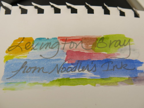
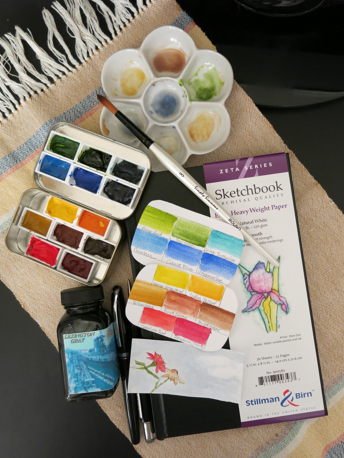
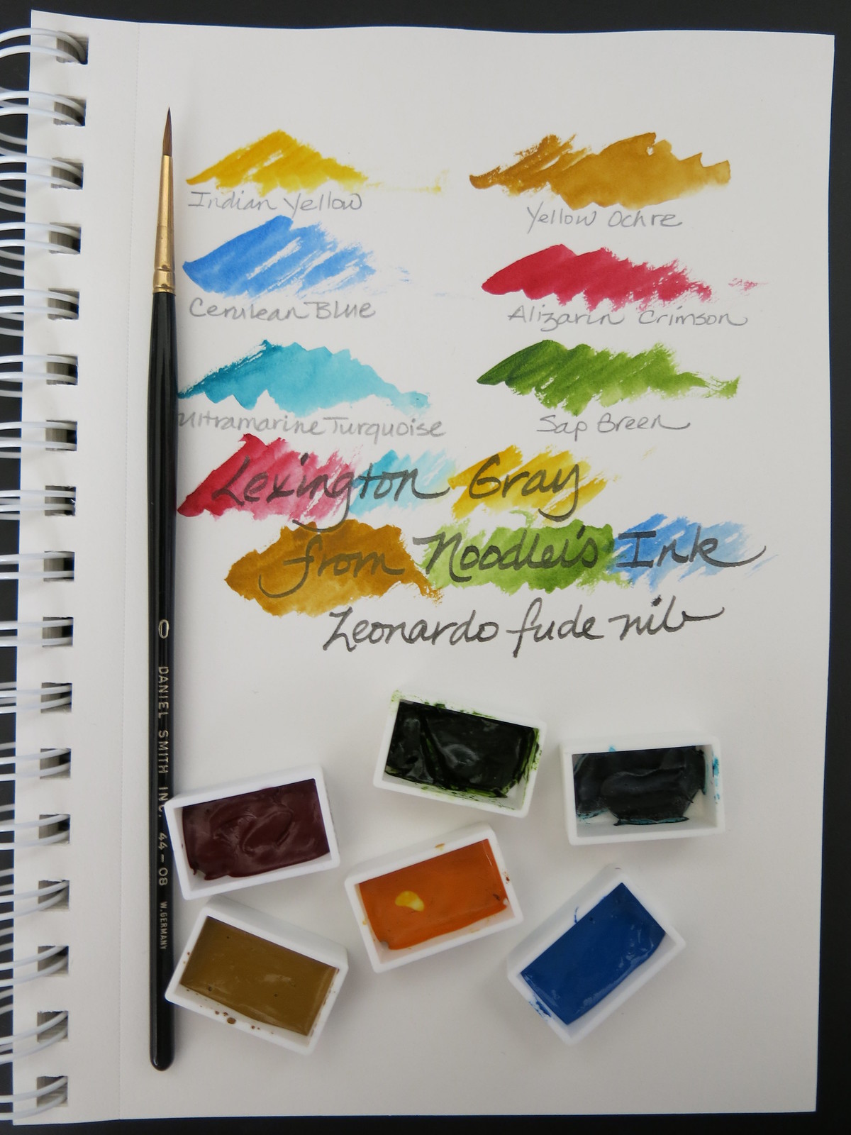
Most inks run away from even the smallest amount of water but Noodler’s Lexington Gray stands up well. The words in the sample were written with a Leonardo fude (Asian calligraphy) nib. Then Daniel Smith watercolor was washed over to test the ink’s permanence and visibility through various colors. All turned out to the good.

Leonardo Calligraphy Nib

However, the Chinese manufactured Barnes & Noble Sketchbook paper, while smooth and a good size for a small desk, is not well suited to water-based media. It’s a sketchbook that takes pencil best. That has its place, but I want to have no such limits when the muse strikes.

There are a number of paper products that meet the needs of fountain pens and inks, but fewer are suited to heavier water media like watercolor or chunky markers. Many of those papers are too rough for fountain pens, especially those with narrow nibs. The paper that meets all my requirements would be smooth enough for pen use and thick enough to contain the flow of watercolor paint or anything that happens in between.

Pentel Pocket Brush Pen on Stillman & Birn Epsilon paper

My Pentel Pocket Brush Pen dances well with the Stillman & Birn Epsilon Series Sketchbook 150 gsm paper but the Zeta at 270 gsm can handle more water.

When watercolor is my focus, the S&B Beta 270 gsm has a rough surface that adds texture to a painting, but away from my desk, the Zeta would be my choice for versatility. It’s such a heavy paper that both sides can be used and both sides are smooth so that’s another advantage.

Aquabee paper is 150 gsm and not as heavy as the Zeta Series, but it should be good with most media. One side of the paper is lightly textured while the back is quite smooth so consider that when matching it to your tools of choice. Also, it is a more absorbent paper and will soak up your fountain pen ink making a wet writer seem dry. That isn’t bad – it’s just different.

Canson XL Mix Media is another absorbent paper but it feels thinner than the others even though it is 160 gsm. That brings down the price but at a cost. Again, the front of the paper is rougher than the back. I’ve used Canson spiral bound books for years to test watercolors, long before I heard of S&B or Aquabee. At 160 gsm, it isn’t heavy enough for paintings, but it’ll do for color swatches and doodles.

Noodler's Lexington Gray Ink on Strathmore Windpower paper

Strathmore Sketch is a 89 gsm, budget paper, but it doodles well when small amounts of color are used. More than five years of Inkophile ink tests have been done in these notebooks so there is that recommendation. Show-through happens so I only use one side for tests, but the paper takes swabbed ink well and that is what matters. It buckled somewhat with watercolor and a tiny bit of moisture affected the page beneath. No off-putting damage done, but a blotter sheet between the pages would have avoided that entirely.

Daniel Smith Watercolors on Strathmore Windpower

For the watercolor test, I used a Daniel Smith Kolinsky brush size 0 with Daniel Smith watercolors just as for the B&N notebook. Lexington Gray performed well again so it has found a permanent mate in the fude nib.

Daniel Smith Cerulean Blue

Online retailer Daniel Smith carries everything you need including the plastic pans I filled with tube paint. If you want to keep things simple, there are a number of brands of pre-filled pans and kits that will get you started. For use in a journal, student grade will do. The Cotman series from Winsor & Newton is the most well known and fine for the purpose. If you are more serious about painting, buy artist grade. You never know when a masterpiece will emerge.

There are empty kits designed to store paint, but an Altoids tin will suffice and holds seven pans in a single layer. Poster tack will hold them in place or double-sided tape can work in a pinch. If seven pans aren’t enough, you can attach more to the lid. Or you can line the lid with Yupo waterproof paper and turn it into a mixing area. At my desk, a 3″ to 4″ white china plates serve that purpose. My favorite one is shaped like a teapot and was originally intended to hold a used tea bag. Others were sold as dishes for dipping sauces. For $2 or less, these are handy containers for mixing additional colors, though most of the time, I just dip and doodle.

Now about ink. Waterproof, bulletproof, water-resistant, and so forth sound great, but some inks so called are not easy on fountain pen nibs and feeds. If you go that route, use your pens frequently and clean them regularly. The former will keep ink flowing well and the latter will remove any debris that might result in a clogged pen. If you use a pen until no ink will flow, clean it in short order or refill with the same ink. The longer you wait, the more likely the pen will have problems.

No ink brand bashing on Inkophile and I use whatever is on hand or submitted for review. With proper care, any ink can be worth using.

If you use fine or extra-fine nibs, Stillman & Birn and Aquabee are good matches. Strathmore Sketch fits a tight budget or works for anyone who goes through tons of paper. I’ve been known to rip out a few pages, doodle around the edges, and use it for stationery. Paper like that will never go to waste.

There are other suitable papers and your suggestions are welcome in the comments.

Regardless of how you use it, the right paper counts and without a doubt your doodles are worth it!

Daniel Smith Watercolors

Photos by Tessa Maurer.

Update: There are some diminutive palettes available on eBay this week.

h1

Daycraft Signature 2013 Diary

11/12/2012

The Daycraft Signature 2013 Diary (English Version) is unusually comfortable in the hand and comes loaded with extras. There’s a whole lot to like but a caveat is in order.

Daycraft Signature 2013 Diary

Daycraft Signature 2013 Diary

The cover feels like soft leather and has no markings on the front. Only a tiny, embossed logo on the back gives away the manufacturer. The book sent for review by Daycraft is dark brown with red edged paper to match the interior cover and front sheet. The ribbon bookmark is red, too. Thea case bound pages and flexible cover give this diary the feeling of a much used, favorite book. In keeping with that, the book remains open without effort which makes it easy to write margin to margin. Eventually it should get even looser and more supple. This is one journal that could easily become an old friend as the year progresses.

Daycraft Signature 2013 Diary Interior Pages

Daycraft Signature 2013 Diary Interior Pages

The interior is packed with 28 pages of information including international holidays, international guides, international area codes, world times, size conversions, and health and nutrition data. The page per day format for weekdays and half page for weekends should be ample for most of us. The 6mm gray lines are unobtrusive and the A6 size (108mm x 149mm) is handy and comfortable. With 408 pages there is a lot to like in this Signature Diary. However, if A6 doesn’t suit you, it comes in other sizes and variations.

The paper is cream colored and at 60gsm relatively thin. All of the writing instruments tested worked well on the smooth paper but with mixed results for fountain pen ink. In this it was similar to the Slab Notebook with a tiny amount of feathering but much less than Moleskine. Just as with the Slab, there was mild to medium show-through and some bleed-through with FP inks. Since two-sided writing is necessary in a diary, mild show-through may be acceptable but bleed-through a frustration. A blotter sheet between pages will protect the following page and can be used to keep other types of ink like those used in gel pens and ball points from smearing.

Daycraft Signature 2013 Diary Writing Samples

Daycraft Signature 2013 Diary Writing Samples

Daycraft Signature 2013 Diary Writing Sample Reverse

Daycraft Signature 2013 Diary Writing Sample Reverse

If you use anything but a fountain pen, this is an excellent diary. If you must use a fountain pen, try a pale ink in a wider nib or a dry ink in a very fine nib like those from Japanese pen makers. Either could produce acceptable results but this is one of those”your mileage may vary” caveats. The nib and ink flow might be just right or might be just awful. My Levenger True Writer custom italic nib using Noodler’s Golden Brown worked well. It is a dry writing pen and that is what made the difference. For a change, its stingy flow was perfect. However, my True Writer with a stock fine nib and Diamine Chocolate Brown showed through on the reverse but did not bleed through at all. The Signature Diary is one product that proves matching pen to ink to paper can be worth the effort.

Daycraft makes some great journals but you’ll have to order them online if you live in the U.S. The Signature 2013 Diary (A6 English Version) is offered for $219 HKD or $29 USD at the current exchange rate. With free worldwide shipping, this might be just the thing to track your 2013. But order it now. You know how slow international shipping can be especially around the holidays.

h1

The Daycraft Slab Journal Is Golden

11/11/2012

In anticipation of the holidays and the beginning of a new year, there are two products that I received from Daycraft some months ago that deserve special mention: the Slab Notebook and the Signature 2013 Diary.

Daycraft Gold Slab Notebook

Daycraft Gold Slab Notebook

Admittedly I’ve wanted one of the Gold Slab Notebooks since I first laid eyes on it. It really does look like a gold bar with its brilliant gold cover and gilt paper edges. The only clues that it isn’t what it looks like are the subtly embossed lettering on the cover and the tiny, discreetly embossed logo on the lower left side of the back cover. The front cover reads “Fine Gold” and “999.9 Pure Thinking” but I had to train a bright light at the right angle to read it. If something this large and gold colored could be called understated, the Gold Slab is it.

It is a chunky journal with 360 pages (back and front) but the paper cover keeps the weight manageable. It measures 6 1/4″ x 4 3/8″ x 3/4″. The 6.5 mm line spacing accommodates larger handwriting and the cream colored paper is easy on the eyes. The sewn binding is stitched in four places so the paper is sufficiently secure. The pages lay flat making it easy to write from margin to margin.

Again taking the concepts of subtle and discreet seriously, Daycraft has left each page to the writer’s imagination with the logo printed only once at the bottom of the final page. There are no prompts or hints or titles. Just lines to keep words orderly. Frankly, this shows a level of respect for the writer and the beautifully executed product. Kudos to Daycraft for treating us as adults.

So how does the Gold Slab handle writing instruments and ink? Everything I tested that would fit the line spacing worked very well on the smooth paper but with mixed results for fountain pen ink. There is a little feathering on close inspection but not enough to bother me. It is far better than Moleskine in that regard. However, there was show-through and bleed-through with some inks. A fine nib with a dry ink will yield the best results if you want to write on both sides of a page. If you are content with writing on just one side, then use any pen and ink you like. A blotter sheet behind the page on which you are writing will protect the next page and keep it pristine.

Daycraft Slab Notebook Writing Sample

Daycraft Slab Notebook Writing Sample

Daycraft Slab Notebook Writing Sample - Reverse

Daycraft Slab Notebook Writing Sample – Reverse

If you prefer a more natural, organic appearance, there is another version of the Slab but done in the look of wood.

Daycraft Wood Slab Notebook

Daycraft Wood Slab Notebook

Daycraft makes some of the best looking journals and diaries I’ve seen but you’ll have to order them online if you live in the U.S. The Slab Notebook is offered for $129 HKD or $17 USD at the current exchange rate. With free worldwide shipping, the Gold Slab journal would make a memorable gift. But order it now. You know how slow international shipping can be especially around the holidays.

A review of the Daycraft Signature 2013 Diary is now available.

h1

Martha Stewart Home Office Supplies At Staples

04/05/2012

Martha Stewart is famous for a lot of things but I must say her robin’s egg blue/aqua color is the first thing I associate with her name. Her beautifully composed rainbow follows just behind. The Martha Stewart line of home office products from Avery and carried exclusively at Staples celebrates the best of her color sense. Even the red, usually my least favorite color, hits the mark. Mix and match or go monochromatic at your desk for an inspiring, creative environment.

There are far too many items to cover here so check out the website for the entire line. Everything I picked up was made in China and much of it cello-wrapped, so I cannot vouch for paper quality beyond the items purchased. However, there were no obvious imperfections and that is encouraging.

Chinese paper is a hit or miss thing so I purchased two vastly different items to compare quality against similar items on the market. The first product is a stitch-bound cahier notebook (small journal with a flexible cover) and the other is a packet of sticky notes. Both are notoriously poor performers with fountain pens so that makes them highly suitable for ink and pen tests.

Martha Stewart Small Notebook

Martha Stewart Small Notebook

Now, are you sitting down? The Martha Stewart Notebook paper outperformed the Moleskine Journal! The scan shows less feathering and none of those inky spider lines that Moleskine paper may suffer. The outlines are more consistent to the naked eye and only show slight imperfections. (If you want paper perfection, Rhodia is the journal most likely to meet your standards.)

The Martha Stewart Notebook has a Personal Reference page in front for contact information should your journal become lost and two pages listing holidays for 2012-2014 if you really must plan ahead. The closer for me is that every sheet is perforated so notes can be detached without spoiling other pages. Finally, somebody understands my work flow.

Also worthy of note is that this cahier has a textured cover, sewn binding, very smooth paper, and will lay perfectly flat without any fuss. The exterior label detaches leaving an unmarked cover, one that is more sturdy than comparable products.

On the downside the paper is thin enough to suffer the same show-through and bleed-through as a Moleskine. However, it is closer to white than Moleskine and, at least in the aqua journal, the lines are the same blue as the cover and dotted rather than solid.

Looking at the two journals, the Moleskine gives the impression of vintage goods while the Martha Stewart Notebook looks cheerful and contemporary. The latter does come in black if you prefer to split the difference with a conservative cover and modern interior pages.

Martha Stewart Sticky Notes

Martha Stewart Sticky Notes

Now for the sticky notes and at this Ms Stewart wins over traditional Post-its though with one caveat. Diamine Umber took about 4-5 seconds to dry so if you must affix your note immediately, avoid touching the wet ink. Not a deterrent for me since I was able to use a fountain pen without losing the vibrancy and other characteristics of my jewel-toned inks. These sticky notes come in decorative shapes and adhere well. I’m sold.

Martha Stewart Sticky Note vs Post-it Comparison

Martha Stewart Sticky Note vs Post-it Comparison

The Martha Stewart products are priced slightly above some lines but lower than others. The 38 sheet notebook and the 3-pack of sticky notes cost $2.99 each.

There are quite a few paper items in the line including journals, notebooks, and pads. I have only tested two so this is not an endorsement of products except those tested though two for two is very encouraging.

With spring flowers blooming and the weather warming, a bit of cheerful color at my desk is very welcome and it might be fun to add a few more touches of Martha Stewart color to my otherwise neutral workspace. If so, I’ll let you know how they measure up to the competition…if they even have any.

Now for a few words about my shopping excursion. Cover your ears if you are a big fan of Staples. There isn’t much that wows me there, sugarcane-based paper being the exception. Perhaps it’s just the local store in Glendale that is understaffed and poorly laid out. Really now. Who would place the extensive line of Martha Stewart Home Office Supplies with the computer equipment rather than front and center with the office supplies? It was only by luck that I happened to catch the aqua color and wander over to find the display. To make comparisons to similar products I had to walk back and forth across the store numerous times. Finally in frustration I grabbed a couple of the Martha Stewart items and headed for the checkout only to wait and wait in a long queue at 2pm on a weekday. Sheesh!