Deciding which pens and inks to put together can be anything from a pleasant endeavor to a time-consuming frustration. Do you have rules for matching pens and inks? I don’t after more than twenty years of using fountain pens. However, I have developed a few observations that help narrow my choices when either a pen or an ink is begging for a workout. More often than not, the pen comes first and then the ink. These guidelines help refine my search.
- Dark green and red inks work best with narrow nibs.
- Blue, brown and black work with all nibs.
- Orange and purple suit medium and wide nibs.
- Turquoise and burgundy go well with medium nibs.
- Pastel and pale inks are best paired with wide nibs.
- Blue, teal and brown inks are good with fine to medium fude nibs.
- Wide fude nibs bring out the best qualities of gray inks.
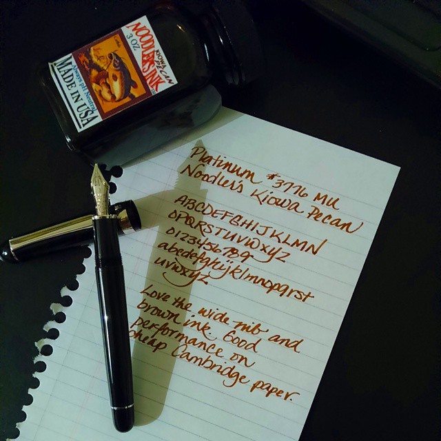
- For the palest pink inks, only the Platinum #3776 Music Nib will do.
- Sailor Peach Pink, Sailor Sakura Mori, Iroshizuku Kosumosu, Herbin Bouquet D’Antan are pretty with any wide nib.
- Characteristics like sheening, outlining and shading are best revealed with stub and italic writing.
- Often I will forget which ink is loaded in which pen, so I keep a scorecard nearby.
- I track how pens and inks perform together by writing a few words in a dedicated pen and ink notebook.
- If there is an outstanding combination, like Diamine Violet with a TWSBI 580 1.1mm stub, that gets noted, too.
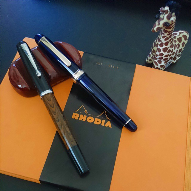
- I can be guilty of matching inks to pen colors though on occasion to shake things up, I will put together complementary ones. Red pen with green ink as an example.
Perhaps too many guidelines, but they suit my needs. Most came from analyzing how I put things together without giving my actions any prior thought. They help me narrow my search, and with the size of my collection, they are essential. Your list will be different, but creating one can be a helpful action if choosing pen and ink mates is challenging, frustrating or even too time-consuming. Or you might just do it for fun.