Posts Tagged ‘iroshizuku’

h1

An Autumn Ink Palette Inspired By Van Gogh

11/04/2019

My favorite season has returned though where I live, you wouldn’t know it was autumn. One way to compensate for that deficiency is to let my ink and pen selection represent the color variety that the local flora does not. Could my current maximum rotation of five pens do the season justice? After extensive perusing of ink swatches, I was not satisfied with any combination and put aside the project for another day.

Then I noticed a book of Vincent Van Gogh’s paintings, a gift from family earlier this year. Why not consult a master? Eventually, I settled on his painting, Rocks with Oak Tree, and found a few inks in my collection that approximate the colors.

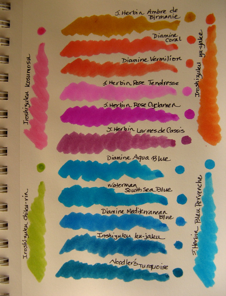
  • Herbin Ambre de Birmaine
  • Iroshizuku yu-yake
  • Iroshizuku ina-ho
  • Herbin Lie de Thé
  • Noodler’s Dostoyevsky
  • Waterman Florida Blue

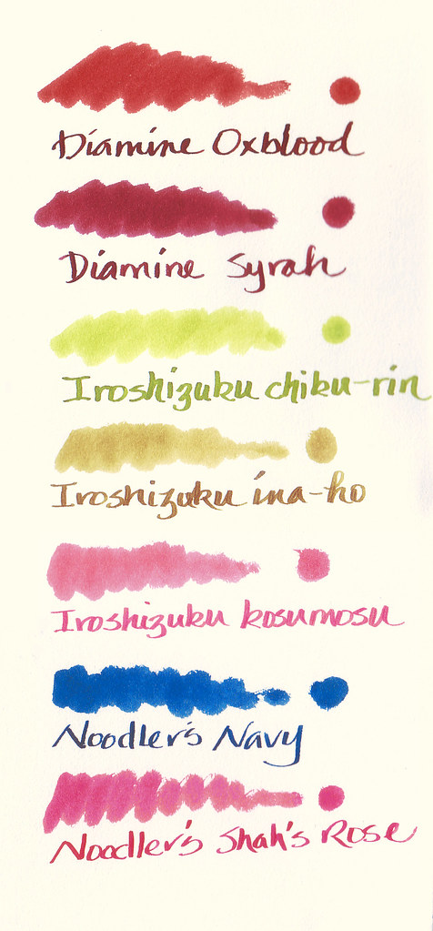
The two pens already on my desk were filled with Sailor Tokiwa-Matsu and Diamine Violet so adding six more would be too many. Three inks were returned to the shelf, leaving a manageable number.

This group will do nicely for visual variety and writing pleasure.

  • Iroshizuku yu-yake
  • Herbin Lie de Thé
  • Noodler’s Dostoyevsky
  • Diamine Violet
  • Sailor Tokiwa-Matsu


These inks may not reflect the season so much as Van Gogh’s color choices, but that’s fine since they will provide sufficient variety to meet my current writing needs. As the holidays approach, yu-yake and Violet will be replaced by Diamine Emerald and a bright burgundy to carry me into the new year. At least that is the current plan. I am quite fickle when it comes to ink, so don’t hold me to it. I am after all an inkophile. Aren’t you?

These items are available at Amazon.com. For qualified purchases, Inkophile receives a small commission at no additional cost to you.


h1

A Few Links: Pens, Inks, Plus A Singing Cat

01/10/2019

Thursday is my slump day so a break from the usual was in order. Do enjoy today’s mishmash of links especially the ten-second cat video. Hard not to smile at that one.

https://twitter.com/i/status/1082047486846353408

h1

Modern Pilot Fountain Pens

05/19/2016

That is my collection of Pilot/Namiki fountain pens. Nice variety to it, but they seldom get inked. In comparison to other pen makers, I’ve experienced more flow issues with their modern pens than any other brand. While the fine nibs can be temperamental, the wider nibs and flexy ones are the most frustrating.

With more than thirty Pilots having passed through here in the last few years, I am certain their feeds and nibs are not created equal. The nibs write well enough but the flow is not able to keep up. The pens are too often hard starting and skip mid-word even failing for a full word or occasionally even several. This has never happened with my Sailor and Platinum pens. It has been a rare issue with a vintage Western pen but that could be attributed to careless handling by a former owner. My Lamy, Waterman, and Levenger True Writers have had very rare flow issues though matching ink to pen has helped in a few cases.

Pilot Elite pocket pens from the 1970’s are not so quirky though some of the Script nibs write dry and especially narrow. The ink flow keeps up nicely maintaining an even line. The pretty, decorated ones have had a higher than acceptable rate of cracked barrels so that’s a different kind of warning. However, my Socrates, Isaac Newton, and Black Striped models have been especially good writers and aren’t at all picky about brands of ink. That sort of versatility puts them on my list of favorite fountain pens.

This doesn’t mean all of their pens have flow issues. However, this post can be considered a caveat to my previous pen recommendations from the Pilot Custom 742 to the Custom 74 to the lower end Prera and 78G and the bottom of the line Plumix. Even the Namiki Falcon Soft Broad (SB) nib unlike the Soft Fine (SF) has a flow that is inadequate for the amount of ink that should be laid down. A nib adjustment might help though I’ve experienced mixed results on that score.

A free-flowing ink can improve performance a notch. Pilot Iroshizuku ink is a good match though some Diamine and J. Herbin inks have proven up to the task as well. Waterman Blue-Black is my standard test ink and one that can bring out the best in a multitude of pens so that’s a good one to have on hand. Unfortunately, ink won’t fix a pen but it can improve one that is borderline.

This isn’t meant to dissuade you from buying a Pilot or Namiki fountain pen but it is a warning. Your sleek, new pen may need tweaking to be the best it can be. Or it may only take finding the right ink and paper combination to bring out its most charming qualities. Even better, you could get a pen that is perfect from the start. Shouldn’t they all arrive that way?

h1

Brilliant Summer Inks And Watercolors

07/14/2014

Usually by June, my tools get pared to a minimum. This year things have gone the other direction.

Instead of a limited three to five ink selection, my rotation is getting a color infusion. For inspiration, there is a swatch on my desk to remind me what is on hand. It isn’t a watercolor palette, but it has the same come play with me effect.

  • Sailor Jentle Peach Pink
  • Noodler’s Purple Martin
  • Diamine Emerald
  • J. Herbin Ambre de Birmaniestil
  • Diamine Teal
  • Waterman Blue-Black
  • Noodler’s Kiowa Pecan
  • Sailor Jentle Nioi-sumire
  • J. Herbin Lierre Sauvage
  • Diamine Aqua Blue
  • Iroshizuku fuyu-syogun
  • Noodler’s Lexington Gray

Elaine from Jet Pens sent a bottle of Sailor Four Seasons Nioi-sumire (Sweet Violet) and Karen at Exaclair has promised bottles of two J. Herbin inks so my rotation will be changing in short order. Now to find an empty, italic pen for some doodling in my Stillman & Birn sketchbook.

Along with modifying my ink rotation, summer is a good time for some colorful experimentation with my watercolor palette. Starting with a dozen basic paints, I added another dozen that I seldom use. That leaves a few empty slots for new acquisitions. My choices are brighter than usual and painting with them will provide a good challenge for the next few months. Even so, I included a modifier, Neutral Tint, just in case a color shouts a bit too loudly.

Certainly a palette needs to be functional, but it can also benefit from visual appeal. This Kremer is a good example of that. The beautiful arrangement encourages playful interaction.

A girl’s gotta have fun you know and what better way than color infused days. Love you guys, but the muse is calling. See ya later!


h1

Summer Inks For A Limited Rotation

06/06/2014

It’s starting to feel a lot like summer and a good time to put together a new rotation. Matching nibs that don’t dry out quickly with inks that suit the season takes some planning. Orange, turquoise and pink will get added to the black and gray already at hand. In hot weather, ink can evaporate and leave a clogged nib, so the number of pens on my desk gets reduced to half its usual size. Five or so will be plenty.

Some likely prospects:

  • J. Herbin Ambre de Birmanie
  • Diamine Coral
  • Diamine Vermilion
  • Iroshizuku yu-yake
  • Iroshizuku kosumosu
  • J. Herbin Rose Tendresse
  • J. Herbin Rose Cyclamen
  • J. Herbin Larmes de Cassis
  • J. Herbin Bleu Pervenche
  • Diamine Aqua Blue
  • Waterman South Sea Blue
  • Diamine Mediterranean Blue
  • Iroshizuku ku-jaku
  • Noodler’s Turquoise
  • Iroshizuku chiku-rin

Chiku-rin and Blue Pervenche are beautiful together but I have too little of the latter so I would have to order that one. Kosumosu and chiku-rin are small samples, but good for a fill or two. Time for a few swatches.

That was useful in settling on a short list.

  • Diamine Coral
  • Iroshizuku kosumosu
  • Iroshizuku chiku-rin
  • J. Herbin Bleu Pervenche (preferred) or Diamine Aqua Blue (on hand)

How do you put together your seasonal rotation?

h1

Pinkly Inks On Clairefontaine GraF it Sketch Paper

06/13/2013

Take these colors with a grain of salt or skepticism, whichever suits.

Ink on Clairefontaine GraF it pad

Swatches were painted with a small watercolor brush and lettering with a Brause dip nib.

h1

Inky Goodness In The Small Size

06/06/2013

If you haven’t taken advantage of the ink samples available at Goulet and I Sell Pens, do so. It’s a great way to indulge in some inky goodness without loading your shelves with a gazillion bottles or draining your wallet of too much of that hard-earned cash.

This lot arrived less than a week ago and several inks already show promise. The first to get a call to duty was Diamine Oxblood in a black marble Levenger True Writer F. I wrote one sentence and it deserted me for my daughter. Hrumph!

Next Iroshizuku chiku-rin will get a twirl with a Lamy Vista 1.1 nib. That clear barrel will show off the green to good advantage. My other Vista will enjoy either Iroshizuku kosumosu or Noodler’s Shah’s Rose.

So much for my limited summer rotation vow but you knew that was destined for failure, right?

Ink Samples

Tested on Strathmore Windpower Sketch with a dip pen.