Pen enabler extraordinare, Leigh Reyes, has written about the extra long Duke calligraphy nib for ages and of course she can do things with it that are both amazing and beautiful. When I saw one on eBay recently, resistance was futile.
History
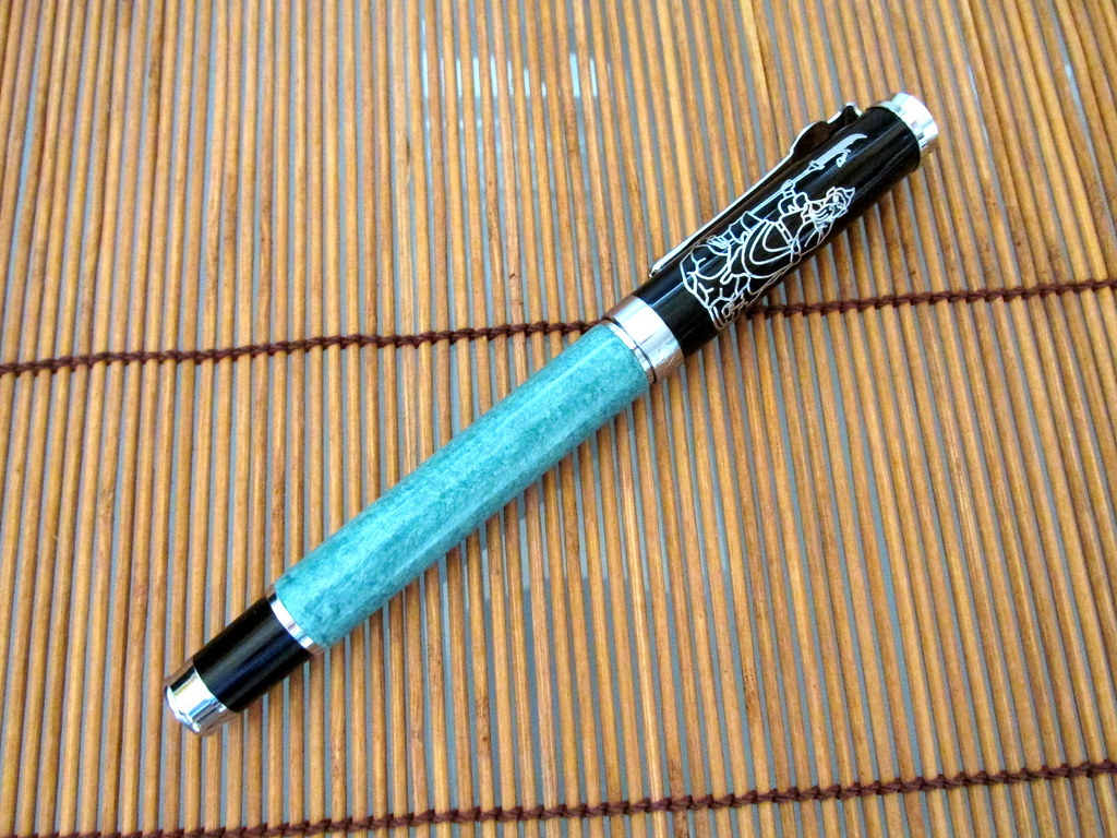
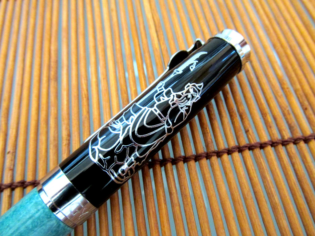
Meet the Duke Guan Yu Calligraphy Fountain Pen. It has the Chinese warrior Guan Yu holding his weapon, a guan dao named Green Dragon Crescent Blade, on the cap. Also on the cap are four Chinese characters, “Zhong, Yi, Ren, Yong” for “Loyalty, Righteousness, Humanity, Valor.” Guan Yu was highly respected and eventually became revered as a god. Though Guan died in 220 CE, he continues to be honored and worshiped.
Form
The Guan Yu feels very well built and sturdy in the hand. It is mostly metal with chrome trim and weighs a substantial 40 g. The length is 145 mm closed, 125 mm without the cap, and 165 mm with the cap posted to the barrel. The balance is good so it can be used comfortably without the cap. Unlike many pens, the cap clicks onto the end of the barrel for a secure fit, ideal for those who like a long pen. However, posting the cap may overbalance the pen in a small hand. On the plus side, not posting the cap allows for a free range of motion that can produce a variety of line widths.
The barrel is a greenish turquoise like the green dragon for which the guan dao blade was named. GYT is engraved on the band along with three Chinese characters.
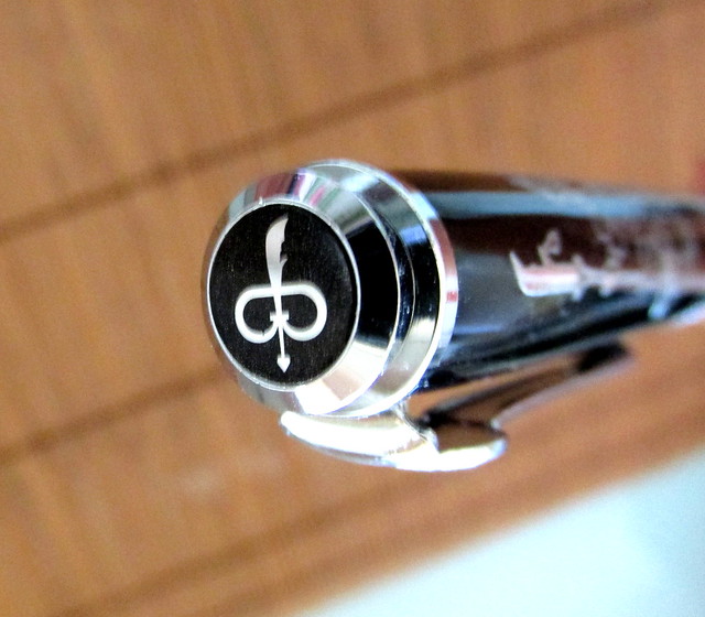
The logo used on the cap and clip is a crescent blade rather than the usual Duke crown. The whole design is thematic, consistent and very attractive.
The pen accepts International cartridges and comes with a screw type converter. Flow was inconsistent at first but settled nicely after a few practice marks. Writing was at its best following a fresh fill of the converter. At the very end of a fill, the pen skipped at times. Consider that an early warning that it’s time for more ink.
Nib
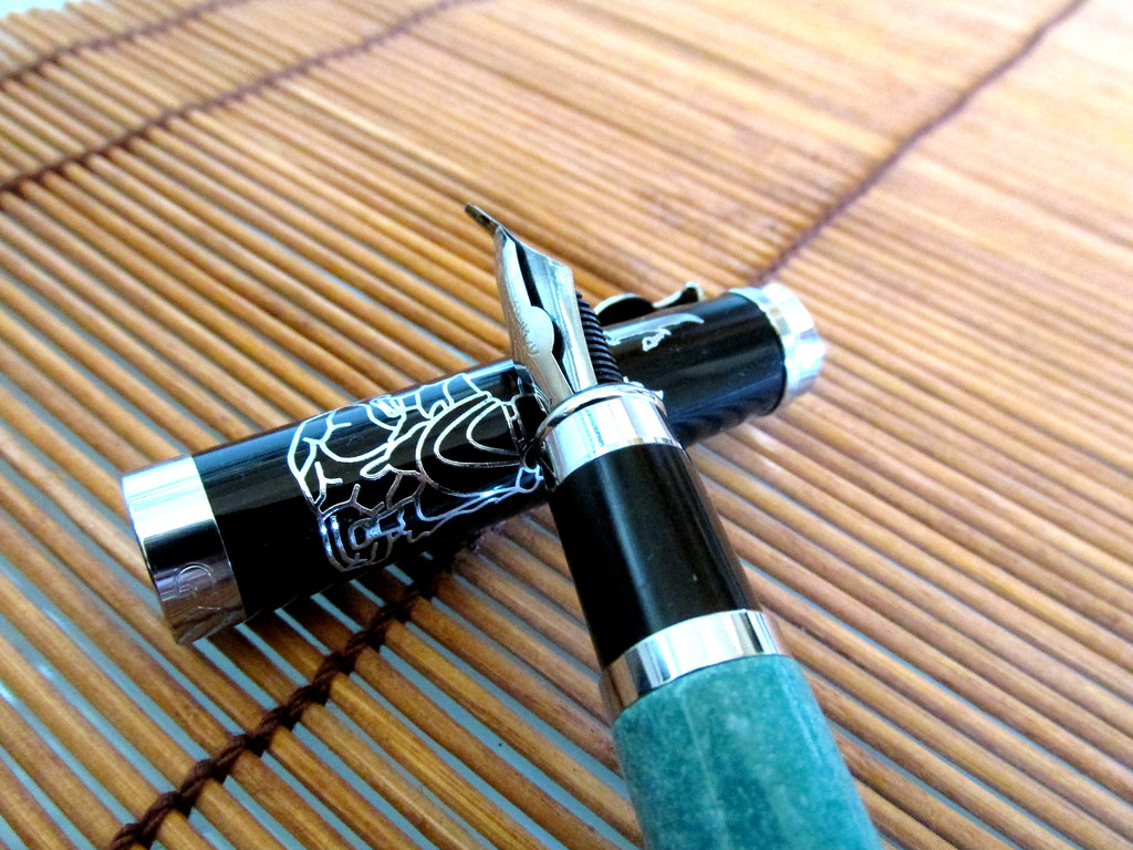
Sometimes this design is called bent nib or fude. Whatever you call it, the Guan Yu has a particularly long tip that makes my other Asian calligraphy nibs look puny in comparison. It is capable of producing a stunning 4 mm line while writing a 1 mm line or even thinner when held at a more upright angle. That makes it suitable for writing as well as sketching. Hold it too upright and it will skip so it does have its limits.
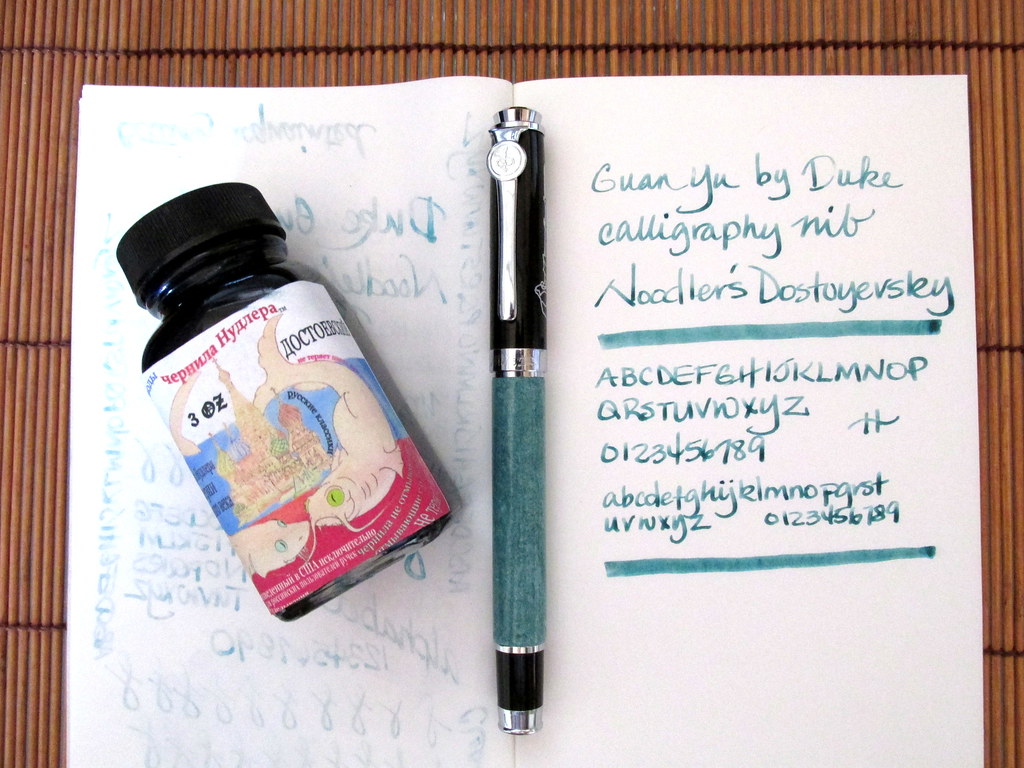
Noodler’s Lexington Grey is a good match since it is more subtle than black and shades nicely enhancing line depth and variation. Just the thing for a very wide nib.
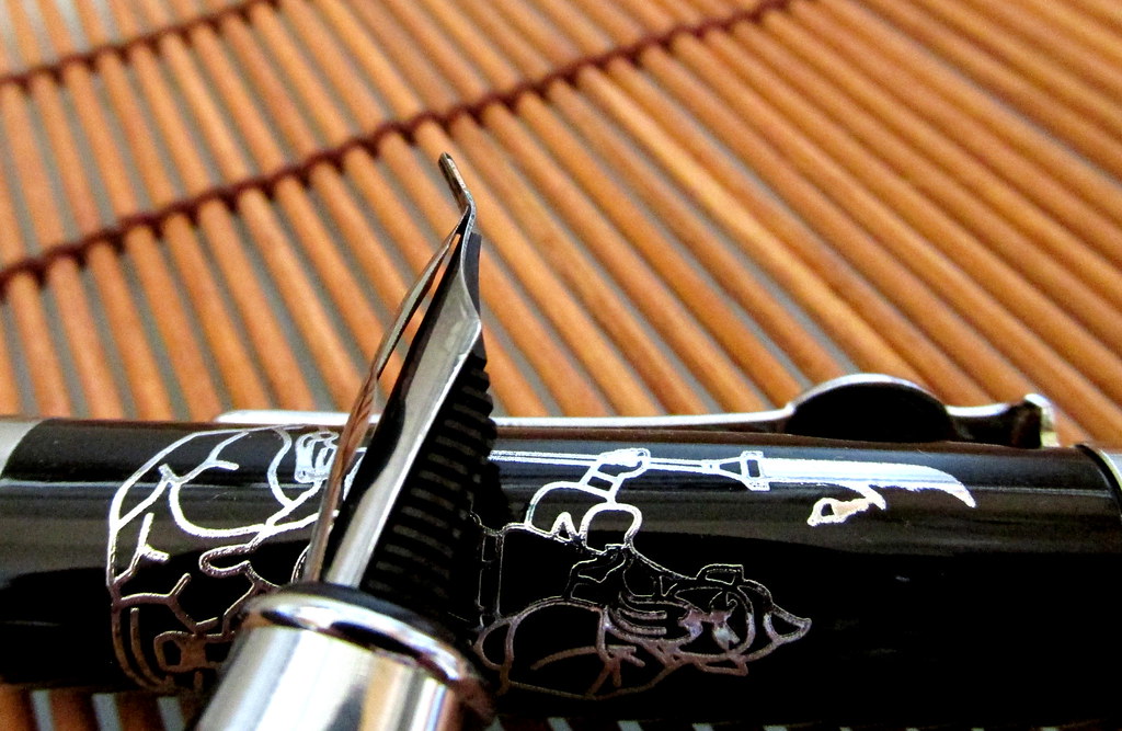
The pen has an overfeed, a strip of metal that goes over the front of the nib. It’s the first one I’ve used on a fountain pen though some dip nibs come with the enhancement. It’s designed to keep ink flowing to the nib and prevent skipping when a strong flow is needed. Given the amount of ink required for a 4 mm line, the overfeed is a a wise addition. It isn’t pretty, but it is useful.
The nib has a little flex to it probably from the length of the tip rather than by design. It takes a bit of effort to bring out the flex, but with a little practice, it is possible to mildly vary line width. I found that property more useful for drawing than writing.
Writing
The blue-green barrel closely matches Noodler’s Dostoyevsky so I used it for the first fill. A dark ink would make a very strong statement from such a wide line. Pale or pastel inks would show more substance. Dostoyevsky struck a nice balance between the pale and the dark.
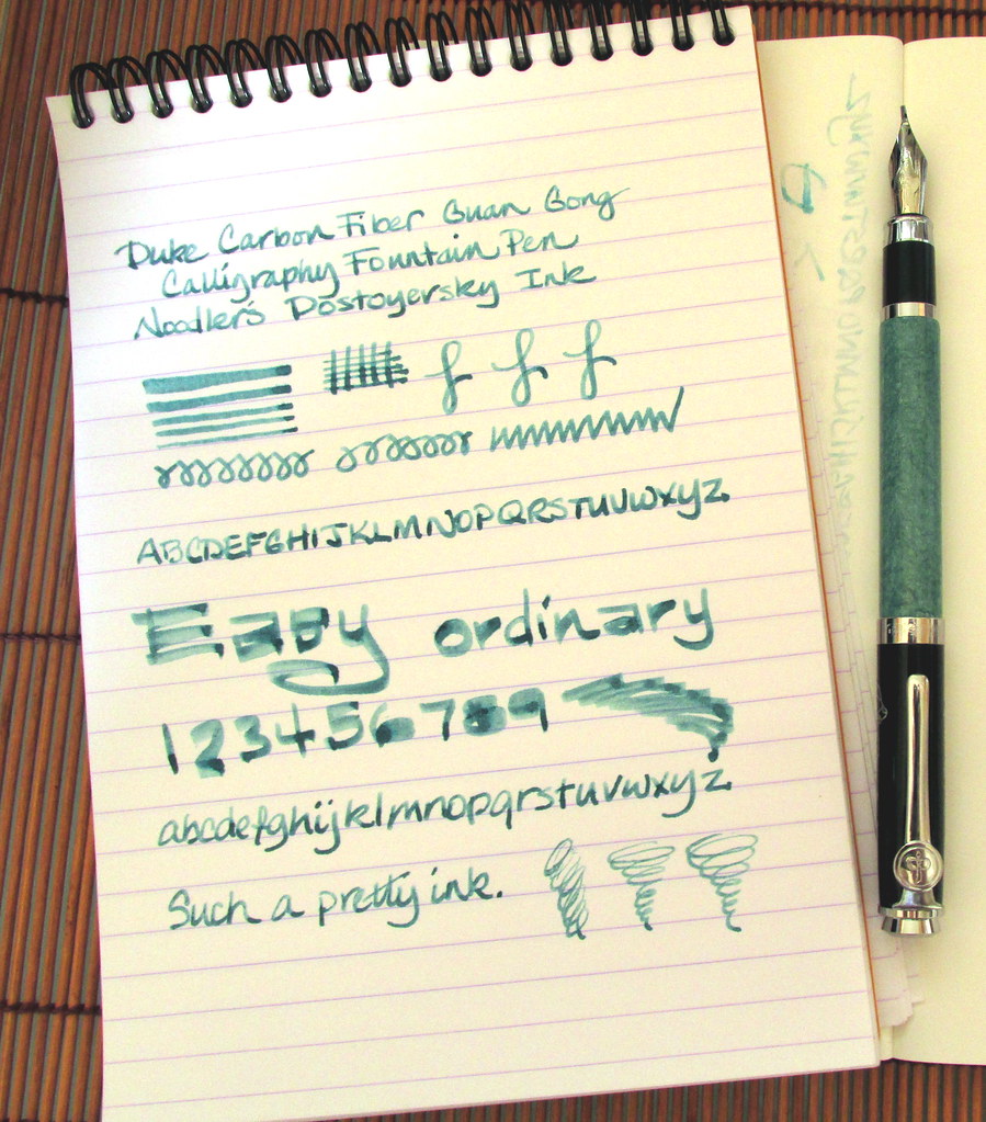
If used slowly for a thick line, the paper becomes critical. Drying time can be significant on a coated paper. Rhodia worked well despite the heavy flow though there was some ghosting and a few dots of mild bleed-through. Midori Traveler’s Notebook with Tomoe River paper showed heavy ghosting and significant bleed through. Experimentation will reveal good matches of ink and paper for this very wide nib.
One note about using this calligraphy nib. Mine does not lend itself well to writing in the Chinese style of holding the brush upright. The more contact the nib has with the paper, the better the flow and the wider the line. A western style hold will produce a very broad line. The lower the angle, the better.
The Duke Guan Yu is an eye-catching pen and might get some remarks from co-workers or fellow patrons at a coffee shop. However, this is a pen that makes writing more fun than serious. It would be perfect for a doodle journal or to decorate paper margins turning something ordinary into something elegant. Then write in the center with a standard pen.
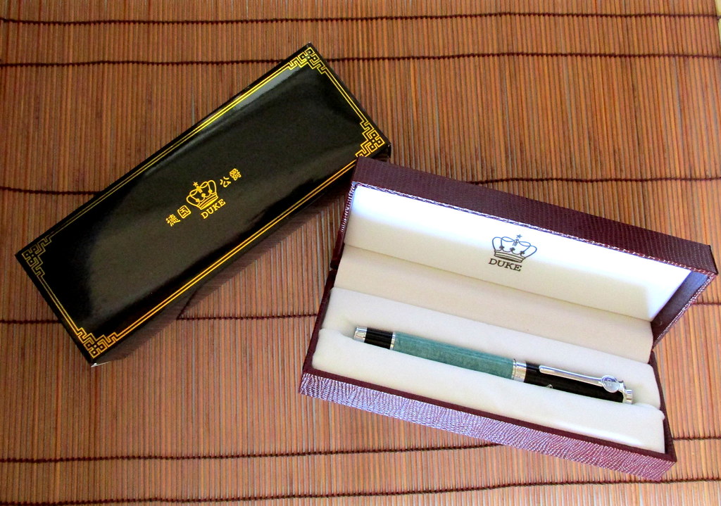
My Guan Yu came from an eBay seller in China. If you prefer Amazon, I found three offers: here, here and here. The Duke 209 Calligraphy Bent Nib has a smaller tip so look closely if you want the same nib I purchased. Leigh has the Confucius model with an extra long nib in a bamboo design. There is a black Confucius model as well.
This might not be a go-to pen, but it sure is a kick to use when you just want to play around with ink and pen in a bold and color filled way.


