Recently, Jet Pens sent Diamine Bilberry for review. It’s a very dark purple-blue ink that needs good lighting to show off its highly saturated color. In low light, it looks black. Does that make it a chameleon?
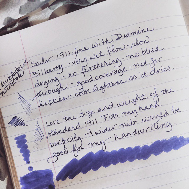

Recently, Jet Pens sent Diamine Bilberry for review. It’s a very dark purple-blue ink that needs good lighting to show off its highly saturated color. In low light, it looks black. Does that make it a chameleon?
“Flaneur” is easily my new favorite word…
When it comes to nib size, fountain pen users have a multitude of choices. Recently I was doodling with the inky beauties on my desk and was struck by the differences between them. Even two from the same maker and of the same width produced varied results. Getting the perfect line size to show your writing to its best may take a little trial and error, but the satisfaction in seeing your words look their best is worth it.
I have become an equal opportunity user though I was stuck on narrow nibs for a very long time. Most fountain pen nibs are either fine or medium with a smaller number available in broad and extra-fine widths. The tip of the nib is round in shape, a bit like a ball point pen when you put it to paper. That angle of contact suits general use very well.
Moving beyond the typical nib, the sweet spot where nib meets paper becomes less forgiving and requires more care in use. If it suits your writing style, even an exotic nib should work well once you get the hang of it. Less common categories include double broad (BB), stub, italic, cursive italic, music, and Arabic. There are other exotic nibs but they are too rare for a general discussion.
If a rigid nib doesn’t thrill you, there is a unique characteristic called flex which can be an attribute of any sized nib. It is measured in degrees from a soft give that produces just a slight squish with pressure to a wet noodle that puts down ink like a paint brush.
Another quirk is that Asian nibs for the most part are more narrow than Western nibs. Add to that the interplay between nib, ink and paper as well as the rate of flow from the ink supply to the nib tip and the range of line widths can get ridiculous.
Still there is a range and that is what the image demonstrates. Size is relative.

Fountain Pen Line Comparison
Note that the ink scan has not be color adjusted. Take that aspect of this post with a grain of salt.
What better way to start the year than with a thorough cleaning. Ten pens got the treatment and are drying, nibs down, in a wad of paper towel. That leaves a mere five for general use and two for testing. Does that sound like a lot? I assure you that is lean for me.
When a fountain pen won’t do, there are four more writing instruments at hand.
Elena sent a couple of Mitsu-Bishi 9800 2B pencils that will get some playtime soon. It’s likely the Levenger Kyoto True Writer Masuyama Stub will get a load of Iroshizuku syo-ro or possibly Private Reserve Ebony Blue in the near future. I love writing with this pen so it never stays clean for long.
That’s my winter rotation. What’s on your desk to start the new year?
With the end of the year approaching, it is time to consider new options for 2012. Have you heard of Daycraft? They make some of the best looking journals and diaries on the market. Whether edgy, fanciful, or twinged with humor, each design hits an aesthetic vibe. Something for everyone, no?

Daycraft Skinz Notebook
The company sent a few notebooks for review and I must say they are easily some of the most interesting looking journals I’ve seen anywhere. Unfortunately, they have yet to enter the U.S. market. Someone really ought to import this line even if only on a limited basis. The Cookie Bookie Notebooks are especially fun and received high marks for unique appeal and ingenuity from the group here. (See update below.)

Daycraft Cookie Bookie Notebook in the Cheese Cracker Version
The attention to detail in the presentation is amazing as you can see on the Daycraft website. But once you move past the packaging and the brilliantly designed covers, will the paper deliver an acceptable fountain pen experience?

Daycraft Illusions Notebook Written Sample
The good news is that fountain pen ink works very well in the Illusions Notebook I used for testing purposes. The paper has a smooth but not coated feel so ink dried quickly. There was a tiny bit of feathering and a few indistinct edges with the most free-flowing nibs and inks. For a private journal this level of performance would not concern me but it could bother a perfectionist.
")
Daycraft Illusions Written Sample (back)
The bad news is that the ink showed on the back of the paper. Writing instruments other than fountain pens worked much better. I used mostly pens of the felt tip variety since they tend to misbehave more than rollerballs and ballpoints. Even the Sharpie Permanent Marker Ultra Fine Point performed with only the faintest ghosting. However, count on one-sided use with most fountain pens sporting nibs graded larger than fine with a few possible exceptions.
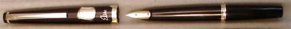
To my surprise Noodler’s Zhivago in a vintage Parker ’51’ Aero fine and Noodler’s Kiowa Pecan in a Levenger True Writer custom cursive italic did not even show on the reverse. Noodler’s Red-Black in a Sailor 1911 fine showed only very lightly. No other brand of ink fared so well. Individual colors may or may not bleed-through but success with three Noodler’s should mean others will provide a good experience, too. A wet writer or a wet ink will have problems but experimentation might reveal colors in other brands that can handle the paper.
Daycraft notebooks are so cool, I would use them regardless of any bleed-through. Yes, every once in a while, form takes precedence over function even for an inkophile.

Daycraft Slab Notebook in Gold
Update: MOMA carries the Cookie Bookie Notebook! I just learned there is a USA distributor for whom I can provide contact information if you are a retailer interested in stocking the Daycraft line.
Some new, some old, here are a few of my favorite things…

Inkophile's Favorite Products for 2010
So that’s my list of new or rediscovered items for 2010. Unlike in years past my regular rotation remained the same led by a Sailor Sapporo, a 1911 and a couple of Pilot Pocket Pens. The Pilot 742FA and Montblanc 220 OB are off for repair so we shall see how they work out on their return in January. There is one Lamy Safari with a custom cursive italic nib that is always inked with Montblanc Racing Green. It remains my #1 writer though I wish the nib had a snazzier body. Two Namiki Falcons with soft fine nibs are always close at hand and a Levenger True Writer is usually inked as well. That makes my core rotation total seven pens, give or take a True Writer or two.
Inks come and go but I am consistently pleased with Waterman Blue Black in my vintage pens especially those with flexible nibs. At the price point and with its easy availability, WBBk is an excellent match for pens that go through a volume of ink. It is also a good one to include with a gift pen. It won’t cause damage and it writes well from any nib. If the recipient loves it, a new bottle can readily be found.
Rhodia, Clairefontaine, Quo Vadis Habana, and Apica continue to be my favorite brands of paper. Triomphe and G. Lalo are excellent stationery though often I use a lined Rhodia pad for casual letters. For variety I have a few pads of Japanese paper that are lovely with even the roughest nibs. Lastly my stock of the long discontinued Exacompta Black Block is waning so I don’t use it as often as I would like though it has a softness that suits me perfectly. If you run across this one, do let me know. I would love to add a few tablets to my reserves.
So that’s my list of favorite things. Rumor has it that Santa just might have on his sleigh one of the new Noodler’s flex nib pens with a bottle of Noodler’s Black Swan in Australian Roses. Yeah, I know. That’s a mouthful but can you picture that pair? The demonstrator (clear) model with plum ink should be lovely. Hopefully, it gets delivered to the right home. I don’t think any of my neighbors would appreciate this dynamic duo but I could be mistaken…maybe…
Sometimes making a list helps me organize. This time my list revealed that I like a lot of brands but it also revealed a surprising color bias. Out of my eleven top choices, four are green while both blues have more than a hint of green in their formulas. Then there is Waterman BBk that can appear quite green depending on the pen and paper. Who knew I had such a bias in favor of green!
One favorite ink from a variety of major manufacturers…
Seldom used inks but still my first choice from these manufacturers…
When you look at your list of favorites, do you see a strong color influence or are you less slanted in your choices?


