Posts Tagged ‘favorite fountain pens’

h1

It’s Fountain Pen Day!

11/01/2019

Fountain Pen Day is a time for celebration, but also a time to appreciate my collection. Four years on, these pens remain favorites. Perhaps I am not as fickle as I thought. Do you have pens that remain in use despite acquiring new ones? Which are your favorites?


h1

The Best On My Desk Winners For 2017

01/12/2018

Whether penned on the back of an envelope, a scrap of napkin or in a classic journal, a list is my favorite organizational tool. The end of the year is the perfect time to make such a list, one that summarizes and compares my ever-changing pen, ink, and other tool preferences.

Rather than new faves, the focus for my 2017 list was which tools were used the most, those that rarely if ever left my desk. Products that arrived late in the year didn’t qualify even if they were noteworthy. The handsome journal from Central Crafts and two inks from Noodler’s will have to wait for the 2018 list.

(Links are to retailers and in some cases Amazon from which I receive a tiny commission should you make a purchase. Every little bit helps keep Inkophile alive!)

Tools for 2017

Pens

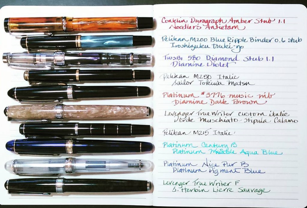
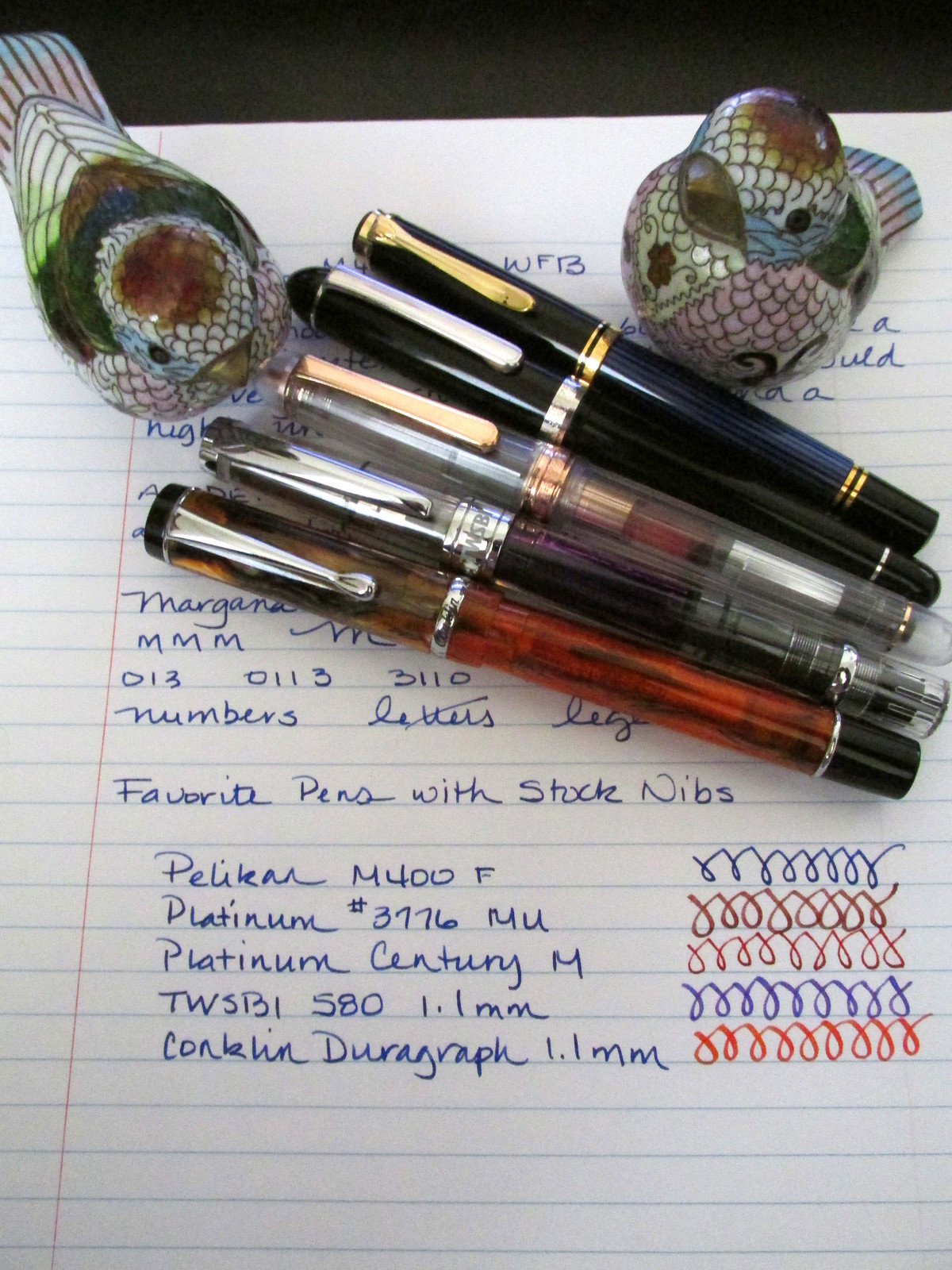
Pelikan M400 Fine – This pen has been in my collection for a number of years. The flow was increased by Chartpak to accommodate hand issues and proved to be a brilliant pen for my worst days.

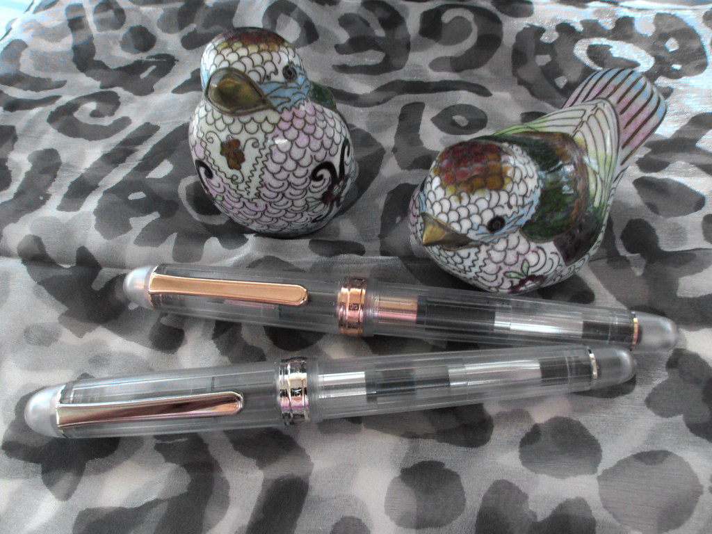
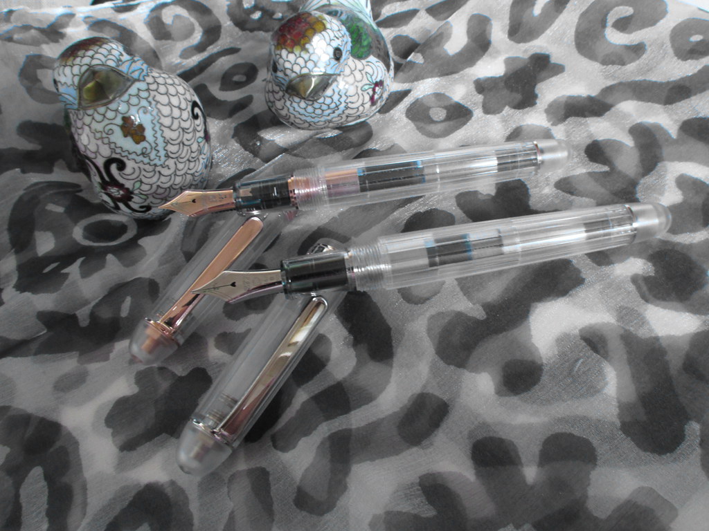
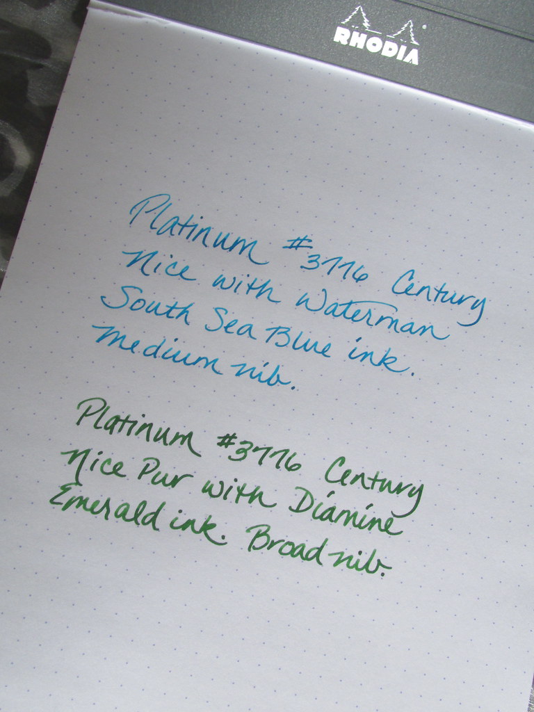
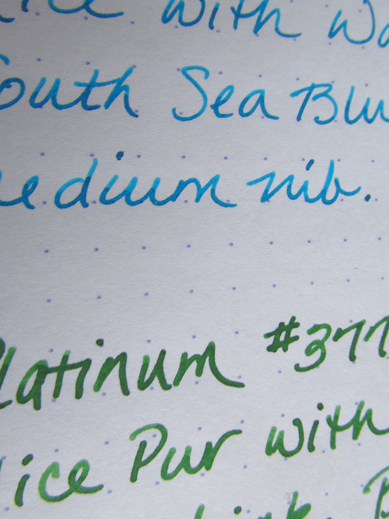
Platinum Century Nice Pur Medium – Using different grip widths relaxes my hand while a smooth nib makes short work of any written task. The Plat provided provided both and was a good alternative to the Pel. Besides, what’s not to like about a clear barrel that shows off colorful ink?

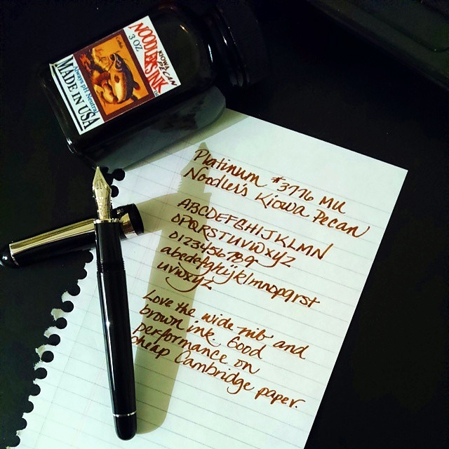
Platinum #3776 Music Nib – Sometimes a wide nib gives me a little extra support when my hand is tired and at those times a music nib fits my needs very well. It also adds a little flair to the written word without catching on paper as an italic might and that makes writing more enjoyable.

Pilot Metropolitan Medium – When out and about, I carry a pen that can easily be replaced, but still writes well and looks sharp. The turquoise Met meets all those requirements.

TWSBI Diamond 580 Stub – This pen won the slot for a nib with line variation. It also added a pen to my rotation with a slightly wider grip circumference than the other pens. You already know what I think of a clear barrel and this design makes colorful ink sparkle.

Lamy Studio Fine – It is on the list but last due to its unpleasantly sharp cap and barrel edge. However, the nib and flow make using it worth the risk so long as I remember to grasp it gently. Unfortunately, this one has disappeared and missed the photo shoot. Phooey.

Ink

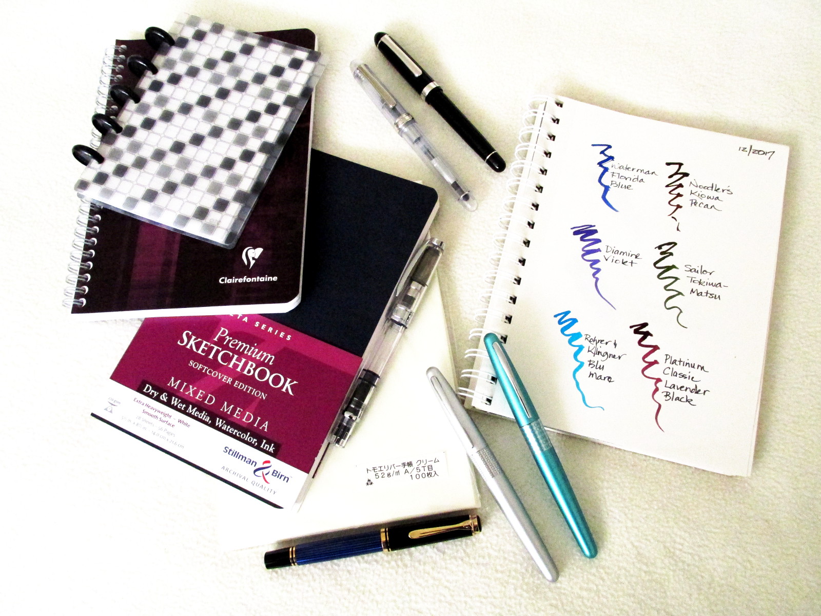
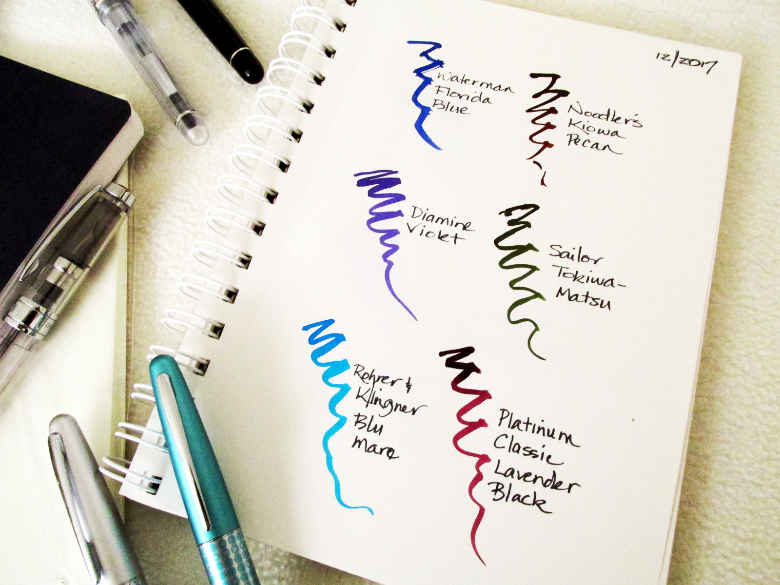
Waterman Florida Blue is mated to the Pel M400. The flow is perfect for the nib and though I may experiment with other inks, WFB always wins out.

Noodler’s Kiowa Pecan makes a luscious line with the #3776 and the shading can be quite dynamic.

Diamine Violet has been the choice of the TWSBI Diamond 580 stub and with good reason. Eye candy to be sure.

Platinum Mixable Aqua Blue suits the turquoise Met perfectly. My samples are now depleted, so it’s time for a full bottle. In the interim, Rohrer & Klingner Blu Mare will do.

Sailor Tokiwa-Matsu was my dark green ink which was well suited to a silver Met. It isn’t Montblanc Racing Green, but it does have excellent flow as well as other charming properties.

Platinum Classic Lavender Black is a newcomer that made a splash in the Platinum Century Nice Pur. Color and performance made this an excellent choice for my everyday ink.

Paper

Clairefontaine, Stillman & Birn, Staples Arc and anything made with Tomoe River paper. Enough said.
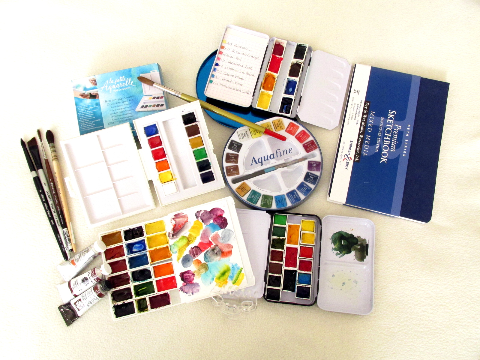
Watercolor Paint

Artist quality: Sennelier, Daniel Smith, American Journey, and Da Vinci are mainstays along with a couple of Winsor & Newton colors on occasion.

Student grade: Sennelier La Petit Aquarelle and Daler-Rowney Aquafine are about as good as student quality gets. They are not as saturated or lightfast as artist grade paints, but fine in a journal and are packaged conveniently for outdoor sketching. When I empty a palette of student paint, it gets refilled with artist quality paint.

Watercolor Paper

Arches 140# for paintings and Canson Watercolor 140# for color swatches. The best paper is 100% cotton. It will yield the truest colors and survive the longest. Arches is cotton and readily available. It is pricey but worth it.

Watercolor Brushes

SAA Gold Round #10 This was my favorite brush last year and easily got the most use.

Silver Brush Black Velvet Round #8

Escoda Versatil Rigger #2

Daniel Smith Platinum Angle 1/2″ (sable and taklon)

Isabey Petit Gris 6234 Quill Mop #0

Other writing and drawing tools

Pentel Pocket brush pen

Autopoint mechanical pencil

Pentel Sign Touch Pen

New Stuff

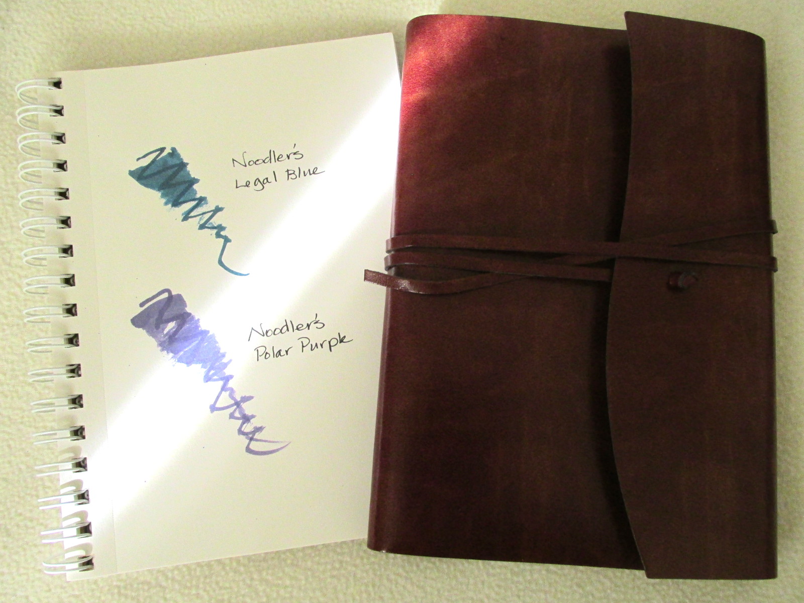
Noodler’s Legal Blue and Polar Purple

Romano Handmade Recycled Leather Wrap Large Journal (Paper is not friendly with all fountain pen inks. Handsome leather cover.)

What’s on your list? Use the comments to post your faves as well as most used tools for 2017. Or submit a link if you’ve already shared such a list elsewhere.

h1

That Platinum Music Nib Gets Noodled

10/27/2016

Sometimes I wonder why we use any pen and ink save the ones that make us the most happy. This duo is not only a joy to use, but the Platinum #3776 music nib has special memories as a gift from Dick Egolf of Luxury Brands. Noodler’s Kiowa Pecan was a lucky acquisition years earlier when I was looking for a saturated and shading brown ink. Kiowa Pecan ended my search. Years later, the duo remains a favorite at the Inkophile digs…

h1

Handwriting Day And Five Good Pens

01/23/2016

It’s National Handwriting Day! What better way to celebrate the occasion than by using a few very enjoyable pens. My short list turned out to be varied in nib size as well as price. The inks were randomly selected for paper tests except WFB in the Pelikan. Those two have been dating for years.

  • Pelikan M400 Fine with Waterman Florida Blue
  • Platinum #3776 Music Nib with J. Herbin Terre de Feu
  • Platinum Century Nice Medium with Diamine Wild Strawberry
  • TWSBI Diamond 580 1.1mm with Diamine Violet
  • Conklin Duragraph 1.1mm with Noodler’s Apache Sunset

Which duo did you choose today?

h1

Closing Out 2014

12/31/2014

Now that the year is over, a brief recap is in order. I had hoped to adopt a canine companion, but finding a rescue that wouldn’t trigger allergies proved illusive. However, my collection of tools expanded with some new favorites.

  • Platinum #3776 Century Nice and Nice Pur since they are clearly brilliant.
  • Conklin Duragraph Stub for a well-priced wide nib with character.
  • Noodler’s General of the Armies because I love blue-green ink.
  • Iroshizuku kon-peki for an all-purpose blue.
  • J. Herbin Orange Indien since I’m a sucker for orange.
  • Sailor Tokiwa-Matsu when only evergreen will do.
  • Tomoe River Paper for fountain pens and even a dab of watercolor.
  • Clairefontaine for it’s variety of formats and fountain pen friendly paper.
  • Stillman & Birn for watercolor and art journals.

A big thank you to Exaclair, Stillman & Birn, Luxury Brands USA, Jet Pens, and Paper for Fountain Pens for sending so many wonderful products to enjoy and review. Without your generosity, Inkophile couldn’t exist.

h1

Platinum #3776 Century Nice And Nice Pur Fountain Pens

11/23/2014

Platinum makes excellent pens that easily rank amongst my favorites. Thanks to the generosity of Carol at Luxury Brands LLC, I now have the #3776 Century Nice (rose gold) and Nice Pur (rhodium) to enjoy and review. Note that I placed “enjoy” before “review” which says a lot.

Century Nice pens have an unusual design that reminds me of cut crystal. The resin is not smooth like my Chartres Blue, but has diamond cut stripes along the transparent barrel and cap. The section is smooth and fits comfortably in my hand. The threads line up under my thumb which might be a problem for some users. However, with my light grip, this went unnoticed.

#3776 Century pens are medium sized and do not require posting to be well balanced. They have the “Slip and Seal” mechanism that keeps ink fluid despite long lapses in use. There is a brochure in six languages that explains how it works as well as how to maintain it. Just for the record, the five Century pens I’ve taken for a spin have all worked perfectly right out of the box. None have required special care and all have performed as well as any pen in my collection.

Here is where the two pens differ. The Nice has rose gold trim and a 14kt rose gold nib. The Nice Pur has a 14 kt gold rhodium plated nib with rhodium trim. If you are hooked on matchy-matchy, the converter has stainless bits that suit the Pur, but are slightly at odds with the rose gold Nice. The light reflective nature of the barrel reduces the contrast so that the color difference is minimized.

Note that there is no discoloration of the rose gold nib, but there is a significant reflection in the photo. It really is rose gold as you can see in the other photos. The diamond cut stripes are about the width of a finger nail and very smooth which makes them light-reflective. It’s an attractive effect.

The Nice came with a medium nib, my first on a Platinum pen. It is a bit wider than expected with very good flow and is a real treat on Clairefontaine and Rhodia paper. It offers good control over letter shapes and I found it a fine complement to my natural letter forms. The broad nib on the Nice Pur is quite substantial and very wet. Both nibs work best with a light touch. Digging in too deeply will cause the them to become chatty. With light pressure neither nib produces feedback though with a heavy hand, the medium will give a hint of it. They don’t skate over paper, but do provide orientation.

The Nice filled with the aqua colored Waterman South Sea Blue is a delightful addition to the various tools on my desk, but it is lovely with burgundy, blue and some greens as well. Catching a glimpse of colorful ink gives a lift to any writing task so the Nice adds a little inspiration to my day.

The clear resin body combined with rhodium furnishings makes the Nice Pur a neutral colored pen except for the ink visible in the converter. For those who match ink to pen, this model presents no restrictions. The writing sample is Diamine Emerald though any ink will suit and that’s the ultimate in versatility.

Want a little attention for your refined and discerning taste in pens? Just place a Platinum Century Nice on your desk and watch the reactions. Even in my fountain pen friendly family, these pens earned an unusual measure of comment and admiration. Pretty cool, eh?

(The Platinum #3776 Century Nice is PNB-20000R #5 ROSE and the Platinum #3776 Century Nice Pur is PNB-20000R #4 PUR just in case you want to order one from your favorite retailer.)


h1

Fountain Pen Experts And Their Favorite Pens

12/31/2013

Well, five experts and an inkophile of much more limited experience get quoted at Best Fountain Pen. It just so happens that my list of Really Good Fountain Pens will post on New Year’s Day. No vintage pens in the lot, but a number of models that are currently available.

Oh, and thank you Jennifer for including me in your post and Dick Egolf of Luxury Brands for the pen gift last year. My Platinum #3776 Music Nib is blushing at the notoriety.

Platinum #3776 Music Nib