
Want to keep things really simple? Fill only a few pens and use inks that make cleaning easy. Enjoyable pen use is sure to follow.
With hundreds of inks on the market, where should you start? Sheaffer, Waterman and Parker Quink inks are quite safe and easy to find. My favorites are Waterman’s Inspired Blue, Serenity Blue, and Mysterious Blue. They are comfortable colors that suit personal correspondence as well as business use, rinse easily from a nib, and work well in any pen. In addition, they are very reasonably priced so there is that to recommend them as well.
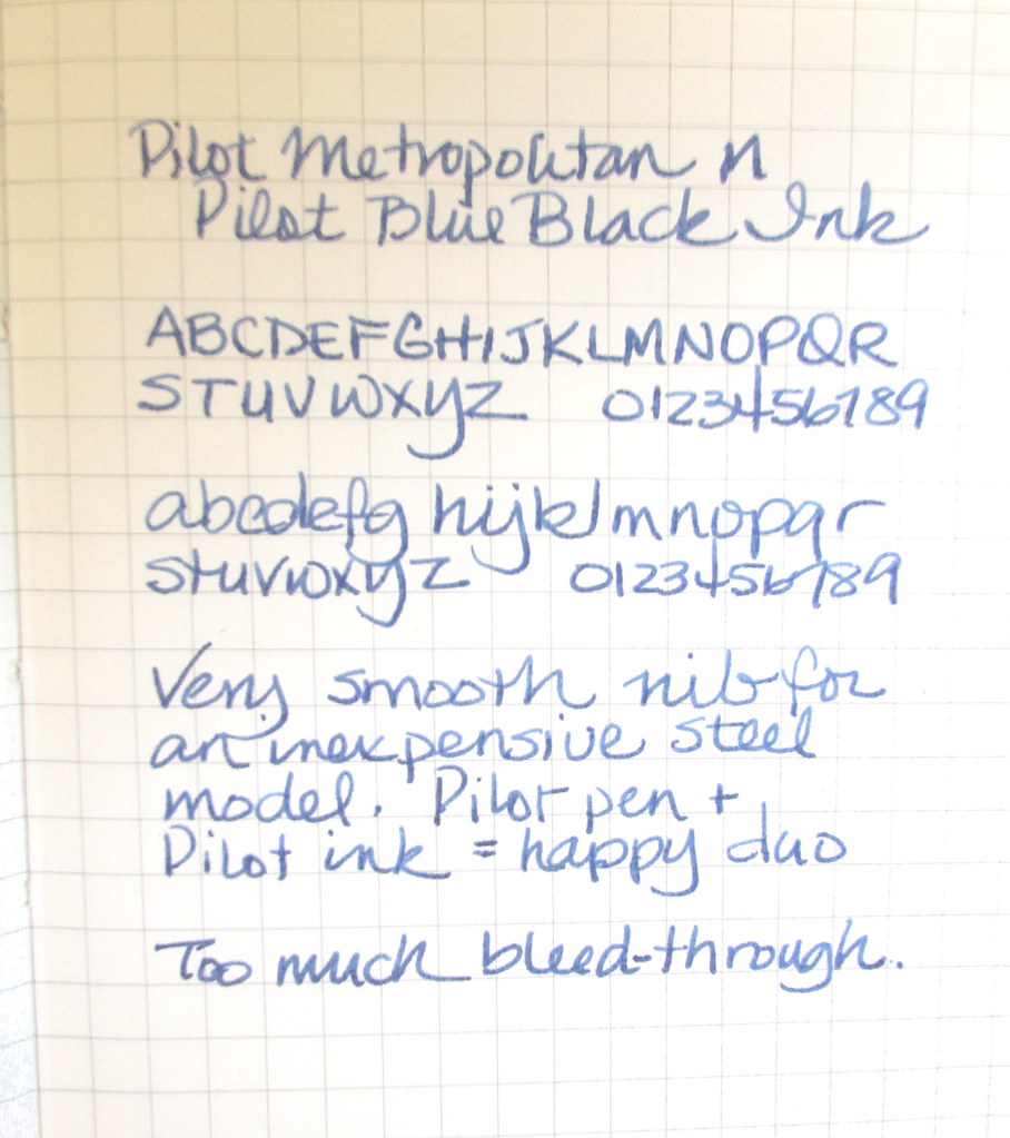
Another well-behaved ink is Pilot Blue-Black. The color is subdued but the other characteristics more than compensate for the understated color. Several years ago it became my alternate to Waterman Mysterious Blue for testing pens. That is high praise from an inkophile.
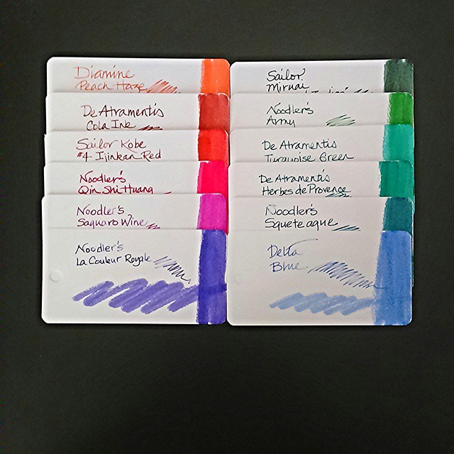
Initially, my ink purchases were from companies that also sold pens. This was based on the assumption that a pen manufacturer would be unlikely to offer ink that would cause damage. Eventually, Waterman and Quink colors seemed too limited so I sought advice from Sam and Frank at Pendemonium. It wasn’t long before well-behaved inks from Diamine and J. Herbin joined my collection including
- Diamine Emerald
- Diamine Sepia
- Diamine Violet
- Diamine Mediterranean Blue
- Diamine Dark Brown
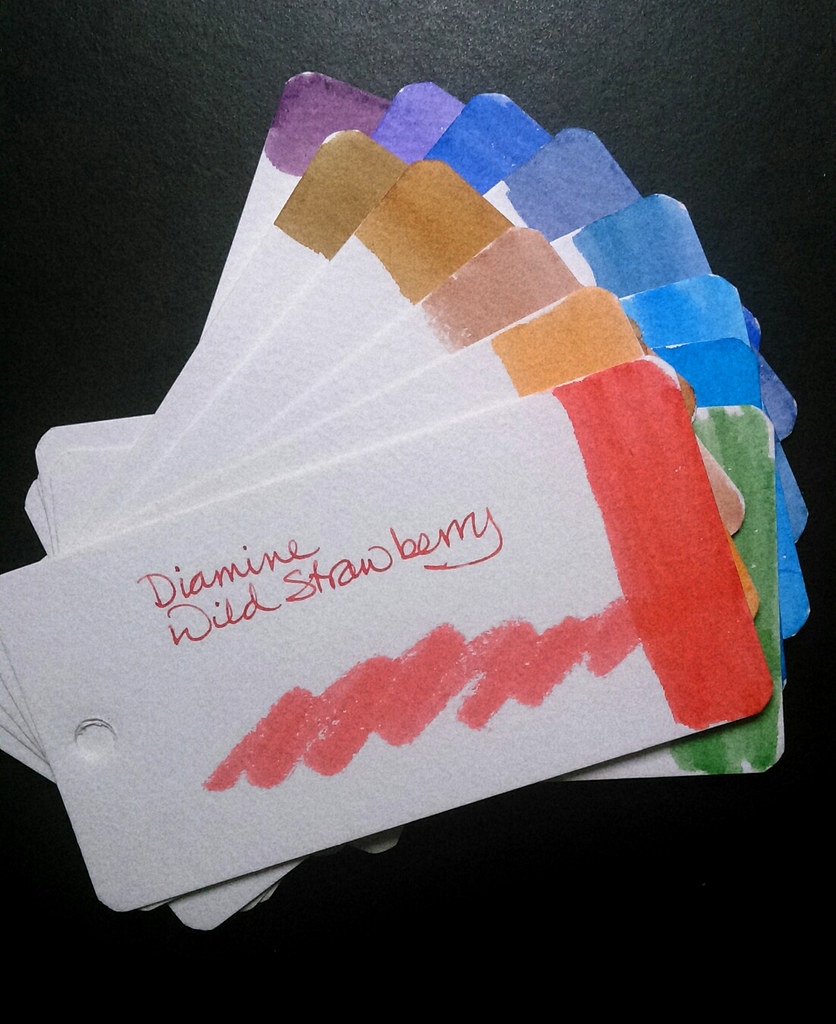
- Diamine Wild Strawberry
- Herbin Lie de The
- Herbin Orange Indien
- Herbin Poussiere de Lune
- Herbin Perle Noir
This group of colors cleaned easily and was perfect for a novice. For water-resistant ink, I turned to Noodler’s Black or Lexington Gray. They are slightly higher maintenance but only marginally so.
My list of inks is always changing since new brands and colors arrive every year. Among those new releases are certain to be at least a few that will be low maintenance. In my experience, blacks, blues and greens rinse out more easily than other colors. And if it’s easy to clean, you are more likely to do it frequently, right?
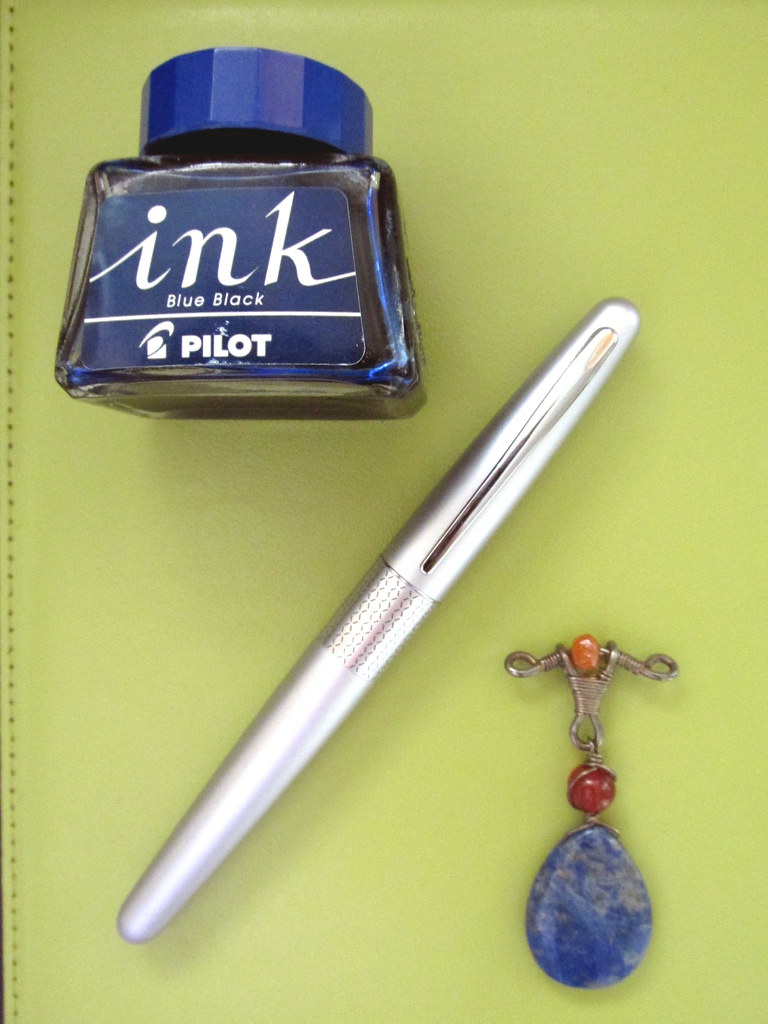
If you want to try Pilot Blue-Black but your preferred retailer doesn’t offer the brand, it can be found at Amazon in three sizes, 30ml, 70ml, and a humongous 350ml bottle for around $22. The latter comes in a tall, thin container that is unsuitable for pen filling. However, a thoroughly cleaned, empty ink bottle would make a nice home for a more practical amount of ink. A benefit to decanting is that the ink remaining in the larger bottle is less likely to become contaminated. Store the bottle in a dark place where moldy little beasties won’t thrive and color won’t degrade, and that Pilot BBk should last a very long time.
All of these inks continue to rotate through my pens and that is the best recommendation. However, my list is not definitive. Is there an ink you would add?


