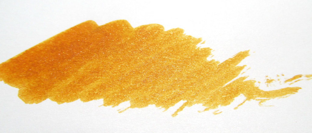
It flows very well in the Conklin Duragraph 1.1 stub that I have had since 2015. Not too wet as some inks can be from such a wide nib. This is definitely my kind of ink since it wrote without a skip after over a week of no use.
Swatches are good for relative comparisons. Here Frankly Walnut is shown next to three J. Herbin inks that many of you own. It is a neutral brown that leans slightly red, a fitting shade for an autumn palette. Easy on the eyes and a color that would be suitable for business as well as personal use. My Traveler’s Notebook is quite fond of it and Rhodia is also perfect as a companion. Perhaps based on how absorbent a paper is or how fast ink dries on it, the color can vary slightly. Not a deterrent but rather a charming characteristic.
There is always a slot for brown in my regular rotation and for that, Frankly Walnut will do nicely. Lucky me. I have a whole bottle to keep me happy for some time to come.
Ink samples from Federalist Pens saved me a bundle. Eight of them and not one suited my regular rotation so bottles of these inks would have gone to waste.
Edelstein Apatite and Laban Zeus are saturated colors that will please many people. Colorverse Butterfly and NGC 6302 along with Laban Hermes are pale and performed best on absorbent paper like the Strathmore Windpower Sketch used for the swatches. Laban Apollo, Aphrodite, and Poseidon are mid-range colors in terms of saturation. I might give Aphrodite a whirl someday, most likely in a pen with a narrow nib like the burgundy New Moon 2. That one just got a fill so Aphrodite will have to wait her turn.
A friend tested the Laban Hermes and found a normally smooth, fude nib to be scratchy. That was telling. However, The Well-Appointed Desk had a different experience with Colorverse Butterfly and NGC 6302. Unlike Jessica, I saw no sparkle or glisten from the Butterfly ink sample. It is possible the bottle from which the sample was taken could have benefitted from a good shake to distribute any reflective material. I am not a sparkle enthusiast so that is no loss for me.
Sometimes I just want to use familiar inks. This week it’s Diamine Eau de Nil, Raw Sienna and Merlot. But it’s good to try something new and samples are the best and most economical solution for me.
What works for you? Do you dip a toe in and buy samples or jump in with both feet and purchase bottles?
Swatches on Tomoe River paper made with a cotton swab and the name written with a dip style fountain pen reveal clear, bright colors and a well-rounded selection. I did not see any sheen though other reviewers have. The paper and pen combination can make such a difference.
All of the inks were well-behaved with average to slightly dry flow though I do not have a pen that would properly test their abilities to tame a truly excessive flow. In the past, some inks have been inclined to release a tad too much ink from the pen used for the writing samples. Not the case with any of the Anderillium inks. I could also write at least a half page with one dip making the inks especially useful.
For my own uses, Pompadour Cotinga Burgundy, Colossal Squid Dark and Cuttlefish Brown are likely prospects. The Cotinga and my burgundy Delike New Moon F ought to get along very well while the Colossal Squid should be right for the Lamy Studio F. Cuttlefish Brown could be destined for the Platinum #3776 Music Nib but the Platinum Century Nice M might also make a good mate. So many choices. So many pens clamoring for attention. What’s an inkophile to do?
Caveat: In all my years of writing reviews, I have never had so much trouble getting ink swatch photos to accurately reflect colors. We tried two cameras with a lightbox as well as sunlight in addition to scanning them, something I haven’t done in ages. I will post some of the results, but for the true colors check the manufacturer’s website. Or order ink samples from Federalist Pens. That’s the best way to know what you are getting before making an investment.
Out of rotation for a long time, the duo of Stipula Verde Muschiato in a Levenger True Writer CI caught my eye recently while browsing through my photo archives. In keeping with my 2022 plan to use what’s on hand, the two were reintroduced to each other a few days ago. No wedding bells but a long-standing friendship was renewed.
Verde Muschiato ranks as my favorite yellow-green ink for its color as well as its compatibility with any pen. It does lean towards brown so it can appear dark depending on nib size and flow. Though it has had assignations with a variety of pens, the 0.7mm custom cursive italic brings out its best qualities including mild shading. True for Stipula Sapphron as well which has long been my favorite for a yellow-orange ink.
Though the plastic caps have leaked on occasion, Stipula’s 70ml bottles are reasonably priced for the volume. Just keep the bottle upright and it should be fine.
Stipula Calamo inks lack sheen, shimmer and other flashy properties, but do offer pleasing colors and solid characteristics. It’s the kind of ink I would load in an eyedropper filler with its large capacity and just write and write and write. No glitzy distractions. Just easy-to-read lettering for pages of notes or long journal entries perfect for the writer in you.
Still looking without success for a printer/scanner (preferably Canon) under $200 for good quality photo printing. Inventory is stunningly low and prices are very high, the principle of supply and demand being fully in play. Regardless, a few articles turned up that are worth sharing with you.
Dip pens caught my fancy recently and J. Herbin’s 1798 inks have been just the thing to add some sparkle to my efforts. The current colors in the series are Cornaline, Amethyste, and Kyanite and they look beautiful alone as well as together. As a longtime fan of Herbin as well as anything silver, I was very happy to see this group of inks introduced.
My Fellowship dip nib has a fountain pen feed that holds a significant load of ink, enough to fill a page, and with a quick swish of water, it’s ready for another color of ink. The pen produced lively passages by switching between the turquoise, coral, and amethyst colors on a per word or line basis.
Next, I tried a small, synthetic watercolor brush to create softly edged doodles, swatches, and swirls without feathering or bleed-through. Not my usual approach, but it did provide a sufficient test of ink characteristics.
Swirling the bottles before each dip kept the shimmery bits in suspension. If they settle in your fountain pen, a gentle motion will redistribute them. Note that they appeared more well-distributed on the page than particles from some of the other sparkly inks I have tried.
The colors are among my favorites and I would be happy to see them in a non-shimmer version, suitable for mundane tasks and business use. These are not super-saturated but deeply colored and very easy to read. It isn’t even necessary to tilt the paper to see the silver glints.
Kyanite du Népal falls in the turquoise range and with its flecks of silver, brings to mind jewelry or a fountain pen with silver-colored trim.
Orange ink can be shy but not Cornaline d’Egypte.
Améthyste de l’Oural is a deep, mid-range purple. The silver flecks stand out well making it the most dramatic ink of the three.
All three inks performed admirably on Clairefontaine paper demonstrating good flow and lubrication. If you like fat pens, the bottles have wide openings to accommodate the larger ones in your collection.
Herbin 1798 Ink would make a lovely holiday gift for the inkophile on your list.
There are lots of reviews and dozens of images at other sites in case you are not yet convinced to add a bottle to your collection. However, be forewarned. Resistance is futile.
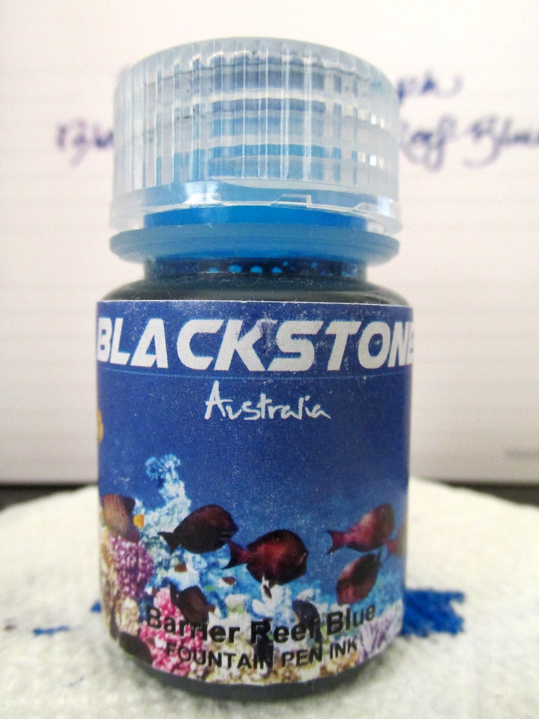
Blackstone delivers beautiful, saturated color with its Barrier Reef Blue ink. My 30 ml bottle came from Anderson Pens and at $8.50 it was a steal.
Blackstone ink hails from Australia and is available in nalgene bottles that are incredibly sturdy. I’ve the same bottles to decant vintage inks preserving them for years. I’m interested in ink, not the packaging, so this is just right for me.
Don’t expect any water resistance. Do expect rich blue that swings from a near purple to a deep, medium blue depending on the paper. The red component can fade as the ink dries which makes it a chameleon of sorts. No feathering on good paper. There were some rough outlines on cheap copy paper, but that was only noticeable under magnification.
The Conklin Duragraph 1.1 mm nib has a juicy flow, but Barrier Reef handled it well. Lubrication is average and should suit most pens. The wide swath of ink took a few seconds to dry, but not unreasonably long. This ink might be a good match for a dry writer, but none of my pens qualify for that test.
After a month of use, I am happy with the results especially in my Quo Vadis Plan & Note. The color even received some nice compliments from family members, something rare for a blue ink and high praise indeed. That glint of red makes Blackstone Barrier Reef Blue intriguing and at the price point, a decidedly cheap thrill.


