Posts Tagged ‘herbin fountain pen ink’

h1

Too Many Inks

09/17/2021

Anyone else challenged by the number of inks on the market? So many brands. So many colors. A few have piqued my interest including several offered by Colorverse and Robert Oster, but I cannot begin to follow all of the Sailor inks and so many others now available. A few days ago, I was looking for an ink for a 1970’s Pilot pen and found myself wishing there was another color in the spectrum. Absent that, I decided to revisit inks that have been around for decades.

Reliable inks from Herbin, Iroshizuku, Diamine, a few Noodler’s and older Sailor colors beckoned. There isn’t an ink in the bunch that I haven’t known for at least ten years, and some are on their second or third bottles, a testament to their properties and characteristics. One of those old inks might be just the right mate for a newer pen.

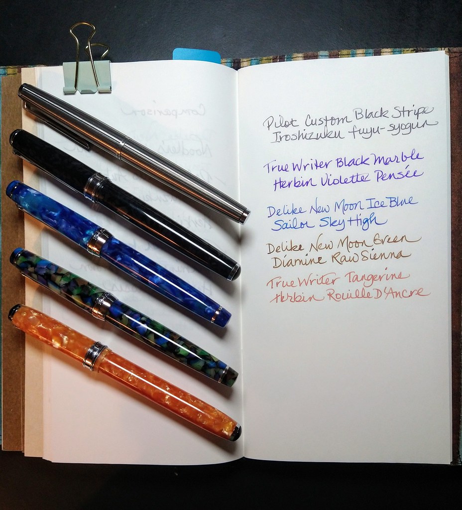
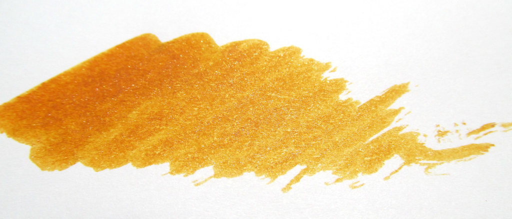
Iroshizuku syo-ro has been a constant on my shelf since it was introduced. Despite having a number of partners over the years, no pen had proven to be its ideal mate. A few months ago, a Delike fude joined the crew and despite dancing with a variety of partners, the pen with syo-ro has proven to be a terrific match that invites writing in a daily journal, an activity that had fallen out of my routine quite some time ago. Now I look forward to it and the fude is on its fourth fill of syo-ro. Isn’t that the best evidence of a perfect pairing?

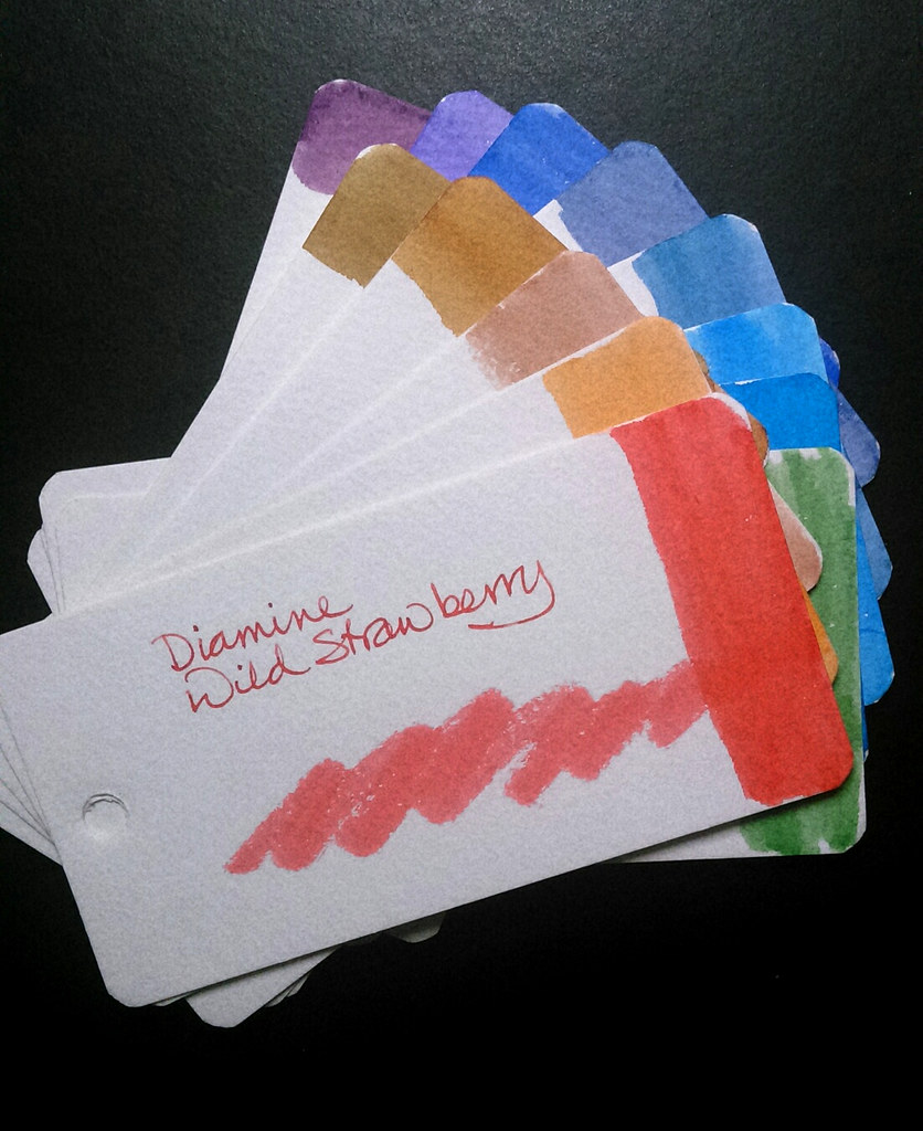
Other inks that have new pen mates are J Herbin Larmes des Cassis, Violette Pensee and Rouille D’Ancre. Diamine Raw Sienna continues to look for a companion. Perhaps a mink (brown) True Writer will take to it or a Japanese fine nib or even a Platinum Century. More experimentation is in order along with a bit of restraint or the number of pens on my desk will get crazy.

Are you willing to give some of your earliest inks a chance to play again? I bet none of them will turn you down.

h1

Fountain Pens For The Weekend

08/14/2021

It’s going to be a hot weekend which makes it a good time to take it easy and update the fountain pens on my desk. In the past few months, a Traveler’s Notebook has become my journal for a major project as well as some personal notes. The paper is Tomoe River 52 gsm in a #013 blank refill with 128 pages. A lined template with 5mm spacing keeps my writing on the straight and narrow. The more I can fit on a page the better. Wide nibs are not suited to the task, so I have put some narrow ones to use along with inks that aren’t dark but allow the lines of the template to show through.

  • Pilot Custom 1970’s Black Stripe F with Iroshizuku fuyu-syogun
  • Levenger True Writer Black Marble F with Herbin Violette Pensee
  • Delike New Moon Ice Blue Fude with Sailor Sky High
  • Delike New Moon Green Fude with Diamine Raw Sienna
  • Levenger True Writer Tangerine F with Herbin Rouille D’Ancre

The green Delike had Iroshizuku syo-ro in it for months and that was a very good combination which I expect to return to soon. Or perhaps I will purchase another New Moon but an extra-fine this time for the syo-ro. A review of this model is in the works. Suffice to say the two that I currently own are getting consistent use and that does speak well of them.

Which pens and inks are in your current rotation? Do they make you want to write or do they fight your best efforts?

h1

Herbin 1798 Shimmery Inks Meet A Dip Pen

11/27/2019

Dip pens caught my fancy recently and J. Herbin’s 1798 inks have been just the thing to add some sparkle to my efforts. The current colors in the series are Cornaline, Amethyste, and Kyanite and they look beautiful alone as well as together. As a longtime fan of Herbin as well as anything silver, I was very happy to see this group of inks introduced.

My Fellowship dip nib has a fountain pen feed that holds a significant load of ink, enough to fill a page, and with a quick swish of water, it’s ready for another color of ink. The pen produced lively passages by switching between the turquoise, coral, and amethyst colors on a per word or line basis.

Next, I tried a small, synthetic watercolor brush to create softly edged doodles, swatches, and swirls without feathering or bleed-through. Not my usual approach, but it did provide a sufficient test of ink characteristics.

Swirling the bottles before each dip kept the shimmery bits in suspension. If they settle in your fountain pen, a gentle motion will redistribute them. Note that they appeared more well-distributed on the page than particles from some of the other sparkly inks I have tried.

The colors are among my favorites and I would be happy to see them in a non-shimmer version, suitable for mundane tasks and business use. These are not super-saturated but deeply colored and very easy to read. It isn’t even necessary to tilt the paper to see the silver glints.

Kyanite du Népal falls in the turquoise range and with its flecks of silver, brings to mind jewelry or a fountain pen with silver-colored trim.

Orange ink can be shy but not Cornaline d’Egypte.

Améthyste de l’Oural is a deep, mid-range purple. The silver flecks stand out well making it the most dramatic ink of the three.

All three inks performed admirably on Clairefontaine paper demonstrating good flow and lubrication. If you like fat pens, the bottles have wide openings to accommodate the larger ones in your collection.

Herbin 1798 Ink would make a lovely holiday gift for the inkophile on your list.

There are lots of reviews and dozens of images at other sites in case you are not yet convinced to add a bottle to your collection. However, be forewarned. Resistance is futile.

Ed Jelley: J Herbin 1798 Kyanite du Népal Ink Review

Pen Chalet: J Herbin 1798 Kyanite du Népal Ink Review

The Gentleman Stationer: Ink Review: J Herbin 1798 Kyanite du Népal

Doodlewash: REVIEW: Jacques Herbin Kyanite du Népal Ink by Life Imitates Doodles

The Well-Appointed Desk: Eye Candy: Herbin 1798 Kyanite du Nepal by Ana

Chris Saenz: Herbin Kyanite du Nepal – Ink Profile – Viewer’s Choice

Pen Boutique: J Herbin 1798 Kyanite du Népal Ink

Goldspot Pens: Herbin 1798 Kyanite du Népal Fountain Pen Ink Unboxing and Review

Ink courtesy of Exaclair USA.

h1

Herbin Vert de Gris Ink

09/03/2019

Exaclair, Inc. sent a bottle of Herbin Vert de Gris ink to review and it did not disappoint.

Caveat: I am a longtime fan of Herbin inks but I set aside my bias when putting ink to the test. Mostly.

Herbin Vert de Gris bottle and writing sample.

According to the website, the color is “based on the lovely gray/green patina that appears on aging copper”. It is a deep, dark teal. A free-flowing nib will bring out its dark side while a dry nib will make it a little less saturated and encourage a more subtle look. I shook the bottle before testing both the Herbin glass pen and the Namiki Falcon SF just in case there should be any settling. Oddly, results were slightly more green than online examples or the color swatch on the top of the box.

It is not an extremely lubricating ink, but rather a moderate one that will be more than satisfactory in most pens. I think my Parker ’51’ in Navy Gray is going to love it, especially the color. No bleed-through, show-through or feathering on Clairefontaine. A doodle on the back of a cheap envelope showed mildly uneven outlines, but that isn’t the surface on which my fountain pens get the most use.

No fancy-schmancy, two-toned, glittery look to Herbin’s Vert de Gris. Rather it is a well-behaved ink dressed in teal that could easily augment an everyday-carry (EDC) selection of blue and black. At least that’s what my pens recommend and I would not disagree.

For a second opinion, Paper Girl has a good review of Vert de Gris.

From the ExaClairUSA YouTube channel: