
The Leuchtturm1917 Finds A Few Mates
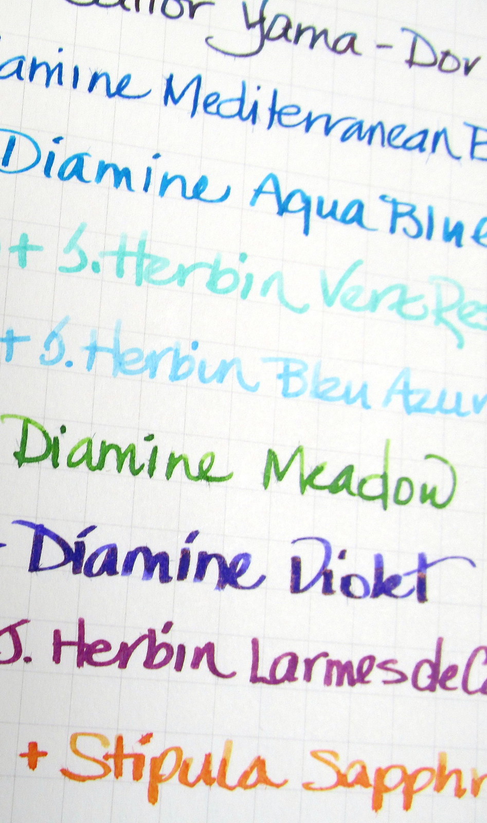
06/15/2016The Leuchtturm1917 paper is so nice to write on that finding compatible inks and pens has become a quest. Every duo on hand whether for personal use or testing purposes gets a page to itself in the search for suitable matches. With a few exceptions, wide and flex nibs have caused dots of bleed through. There is some show through, but it isn’t a deterrent for me. At least in my journal, neither is the tiny degree of Moleskine-like feathering. How the pen moves across the paper is more important for private musings and the sheer joy of writing.
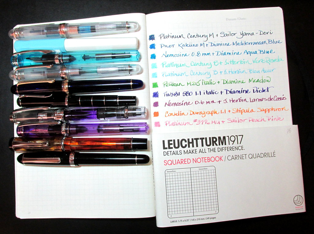
Best duos
- Lamy AL-Star EF with Noodler’s Black
- Conklin Duragraph Stub with Sailor Tokiwa-Matsu
- Levenger True Write F with Pelikan Violet
- Noodler’s Naponset with Iroshizuku yu-yake
- TWSBI 580 1.1 with Diamine Violet
- Platinum #3776 music nib with J. Herbin Terre de Feu or Cafe des Iles
- Vintage Platinum Karakusa 18k EF with Noodler’s El Lawrence
- Pilot Kakuno M with Diamine Mediterranean Blue
Most disappointing duos
- Platinum Nice M with Diamine Wild Strawberry
- Platinum Yamanaka SM with Diamine Merlot
- Pelikan M200 italic with Iroshizuku tsuki-yo
- Noodler’s 1820 Essex Konrad Flex with Noodler’s Dostoyevsky
The paper is absorbent so free-flowing inks produced the most bleed through. After testing more than twenty, this is now a predictable characteristic eliminating some inks from use in the Leuchtturm. No hardship since other inks work just fine.
However, the tendency to feather along a few of the fibers will be off-putting to some users.
A Pentel Pocket Brush Pen with J. Herbin Lie de The or Noodler’s Kiowa Pecan showed no feathering or bleed through. Good mates for this journal are to be found.
What continues to surprise is the way in which the paper handles light watercolor washes. There is very little buckling though with some colors I had to work at getting enough paint down. The paper held up well considering the abuse. No bleed through, but watercolor is more dense than ink. With more coarsely grained pigment particles and less water than ink, paint dries on the surface. It isn’t as translucent as ink, but for a hit of color or some doodles in margins, watercolor will do the trick.
This might seem like heresy, but the Leuchtturm1917 journal provides a wonderfully soft surface for my Autopoint mechanical pencil with HB lead. Should the need arise, a FACTIS extra soft eraser will leave the paper’s surface intact. It can even be used gently on art paper.
The deal here is that I love the paper and needed to persist to find good mates for it. Hey, persistence is a positive trait, isn’t it?


I’ve found Pelikan violet in a fairly damp Parker Frontier has have a few bleedthrough dots, too, but only at the wettest of shading points. I haven’t been as diligent as you in noting what doesn’t work, although I’ve only had a Leuchtterm for a couple of months and of the pen/ink pairings I’ve used so far, that’s the only one that has given any pause.
LikeLike
Wait… “has have”? Must be too early in the morning for my fingers to run properly.
LikeLike
Pelikan Violet is a pleasing color though I don’t currently have it in a pen. Maybe later in the summer, I’ll give it a go just to see if it bleeds in my Leuchtturm. What size nib does your Frontier have?
LikeLike
It’s a medium– nothing special.
LikeLike
Just wondered about the width of the line relative to the flow. My italics have issues with many papers that mediums do not.
LikeLike
[…] The Leuchtturm1917 Finds A Few Mates The Leuchtturm1917 paper is so nice to write on that finding compatible inks and pens has become a quest. Every duo on hand whether for personal use or testing… […]
LikeLike
[…] The Leuchtturm1917 Finds A Few Mates by inkophile […]
LikeLike
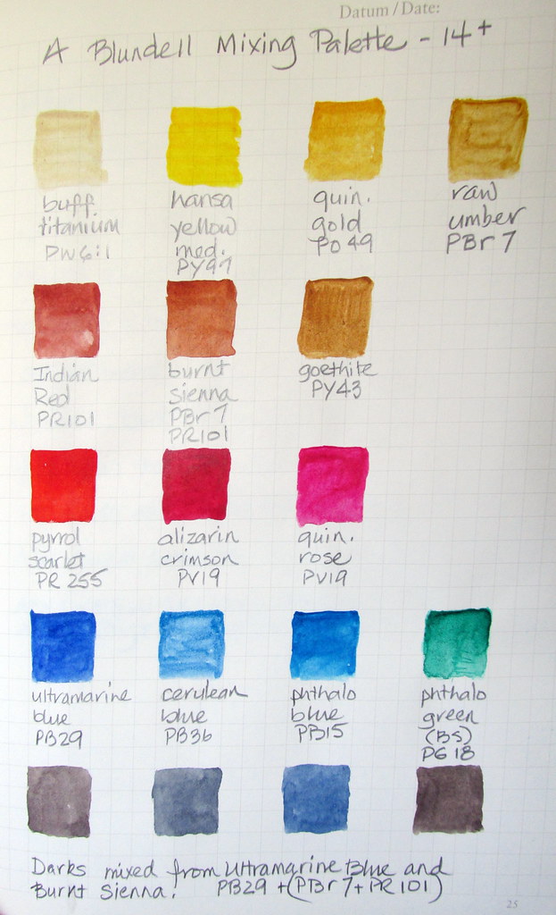
OH SQUEEEE! You included the color index names for the paint swatches! I admit, it’s one of the points upon which my nerd flag flies. Thank you so much for this. ^_^
What brand of paint did you use, if I may ask? My go-to brand is no longer available and I am now looking into other brands. Thank you again. ^_^
LikeLiked by 1 person
I get the “nerd” thing totally. 😀
The brands of watercolor I currently use are Daniel Smith, Sennelier, and Cheap Joe’s American Journey, with a few Winsor & Newton and DaVinci thrown in. The palette in the photo is comprised of DS and AJ paints.
Daniel Smith: Buff Titanium, Hansa Yellow Medium, Quinacridone Gold (discontinued formula), Goethite, Pyrrol Scarlet, Quin Rose, Phthalo Green
American Journey: Raw Umber, Indian Red, Burnt Sienna, Alizarin Crimson, Ultramarine Blue, Cerulean Blue, Phthalo Blue
LikeLike
Thank you for replying back. ^_^ I’ll have to check out these brands. They sound really good!
LikeLiked by 1 person
The paints listed are artist quality so it’s hard to go wrong with any of them. Sennelier is honey-based and wets easily though it can be a bit tacky. Daniel Smith, American Journey and DaVinci work very well together. There are a few paints in every brand that don’t perform as well as others, DS Viridian is very hard and disinclined to soften properly so I wouldn’t recommend that one. Cobalt Violet can be weak from any brand. A few paints are under-saturated but you can find varying opinions with a little research. In the main, I have rarely been disappointed. Hopefully, your experience will be as good as mine.
LikeLike
I hope so too! Thank you for your advice. It’s so kind of you to share it. ^_^
LikeLike