
Easy-Peasy Way To Add Color To A Journal
04/28/2016Adding a little color to a journal is easy with watercolor dots, a brush and some water. Contrast or complement with fountain pen ink for a unique twist to doodling in a journal.
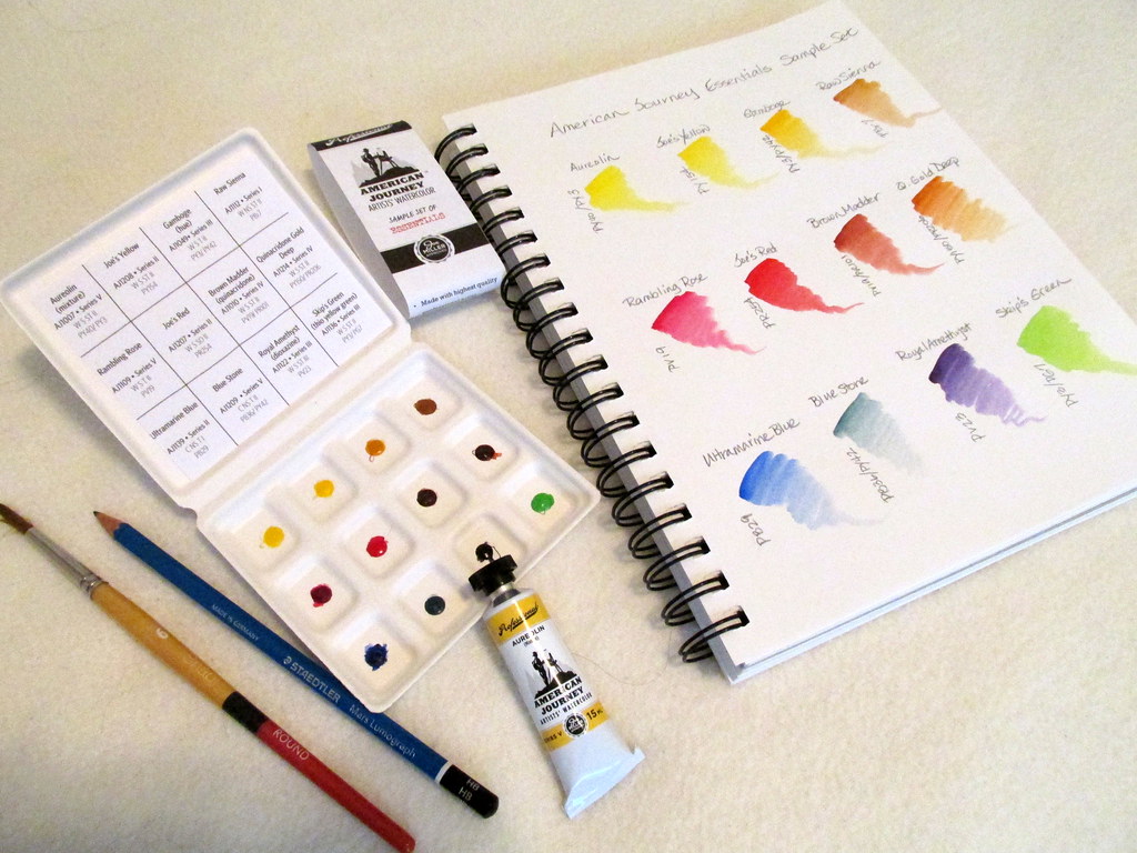
American Journey is a line of watercolors from Cheap Joe’s and rumored to be produced by DaVinci. Whatever the source, it is artist quality and reasonably priced. Not long ago Joe began offering small dots of paint to get acquainted with the colors. Then last week one of the Essentials Sample Color Sets jumped into my shopping cart just to show me what I had been missing. At less than $6, it was an offer too good to refuse.
The packaging is simple but functional with a box that feels like a cardboard egg carton and a paper label that slides on easily to keep it closed. It is very portable though it lacks a mixing area. That can be overcome with a piece of Yupo trimmed to fit inside the lid. Or just allow the colors to mix together on a journal page by placing them next to each other for a variegated effect.
There is a sheet of paper inside the box with the names of the paints, characteristics, and pigment codes with enough room to paint a small sample of the color. It is printer paper so use a minimal amount of water, but it is a handy way to know which color you are grabbing.
The paint dots are small so a round brush is best for lifting color. The website claims it’s enough to make a painting. Heh, maybe a small one. However, it is enough to see the color though limited for making mixes when you consider how many you can create with a dozen colors.
Single pigment colors are preferred by most watercolorists and there are six in this set. The six multiple pigment paints are fine, but can make color mixing more complicated.
- Aureolin lacks the brown/gray aspect of other brands of Aureolin and for me that is a plus. It’s more true yellow which is better for mixing purposes, the primary use for yellow. It is a multiple pigment paint, but the two pigments are both in the yellow family. So Aureolin behaves more like a single pigment paint.
- Joe’s Yellow is benzimidazolone, a watercolor sold by Winsor & Newton as Winsor Yellow. It’s a good mixing color and useful as is for florals.
- Gamboge (hue) is a double pigment color that is achieved with a single pigment in the Daniel Smith and Winsor & Newton lines. At least both pigments are yellow and the combination does produce a more even color transition from orange to pale yellow than what some companies produce. I could get used to the AJ version.
- Raw Sienna is slightly less red than many brands, but it is single pigment and makes very smooth dark to light gradients. When diluted to its palest form, it can be used for skin tones in landscapes where features are not defined.
- Rambling Rose is made from the same pigment as Daniel Smith Quinacridone Rose and Winsor & Newton Permanent Rose. It is a versatile color that can be used in place of red and mixes well with a wide range of colors.
- Joe’s Red is pyrrol red like Winsor Red and is closer to a true red than Rambling Rose.
- Brown Madder (quinacridone) is similar to Transparent Red Oxide though a touch more orange.
- Quinacridone Gold Deep is more golden than some similarly named paints. Like Raw Sienna is can be diluted to make a flesh tone for landscapes. This version is made from a yellow and a red pigment so if you add blue, it will produce gray.
- Ultramarine Blue is exactly what it should be. It mixes well with the yellows in the set to create lovely greens or with Raw Sienna to produce gray. Try it with the reds for some lovely purples.
- Blue Stone was reluctant to release color and never became as saturated as the other paints. It resembles Daniel Smith Lunar Blue though more green. It is not an essential color. Joe’s Blue (phthalo) or Cobalt Blue would have been better choices.
- Royal Amethyst is a beautiful dioxazine purple and rightly called amethyst. Add yellow to make neutral and warm browns.
- Skip’s Green is a yellow biased spring green and is a novelty color rather than an essential. I think the set would have been better served with a more useful green.
Add a #4 or #6 travel brush or a waterbrush to the Essentials Sample Set for a simple kit of basic tools to decorate your journal. Dots, dashes and doodles are all it takes.
Note: Daniel Smith offers watercolor dots on 8.5″ x 11″ sheets that aren’t nearly so portable. However, if you really want to fool around with a lot of different colors, it’s another way to go. There are three other American Journey sets, if the Essentials selection isn’t right for you.


[…] Easy-Peasy Way To Add Color To A Journal – Inkophile’s Blog […]
LikeLike