
A Trio Of Chinese Fountain Pens
07/29/2013It’s easy to find a great pen if you have a big budget but finding a good pen under $35 is a lot more challenging. There are a number of choices but quality varies as does buyer satisfaction. Recent positive comments about Chinese pens, piqued my interest so I finally took the plunge.
The most discussed names were Jinhao and its sister brand Baoer. They offer pens at the right price point to satisfy the most frugal buyer and a number of users were quite happy with them. So I chose two models to test build quality as well as their stock medium and broad nibs. The pens were inexpensive from an eBay seller but the seller posted inaccurate photos. Caveat emptor. To test consistency between pens, I purchased the same model but from a different seller. That third pen came with a custom grind allowing me to test a new source for italic nibs.
These are the pens tested:
- Jinhao X750 Shimmering Sands with a stock broad nib
- Baoer 507 Eight Horses in bronze with a stock medium nib
- Baoer 507 Eight Horses in copper with a custom cursive italic nib
Both models accept converters and International cartridges which is convenient. The snap-on caps click confidently so there is no doubt when they are secure.
My initial impressions are included in the pen photos but my opinion has changed over time as reflected in this review.
Jinhao X750 Shimmering Sands Broad Nib
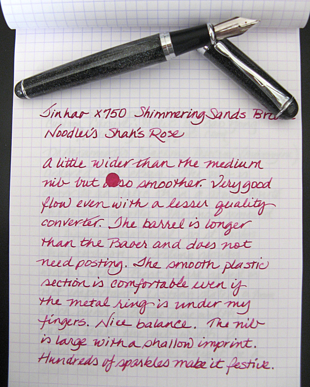
The Jinhao X750 Shimmering Sands is an attractive chameleon going from near black to rainbow sparkly depending on lighting conditions. It measures 5-1/2″ capped, 6-1/4″ posted, 5″ unposted, and weighs 37g. The chrome appointments suit it and highlight the clear colors of the barrel.
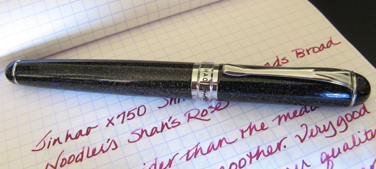

It has a very solid feel and a hard plastic non-slip grip. The length and balance are sufficient to use the pen comfortably without posting.
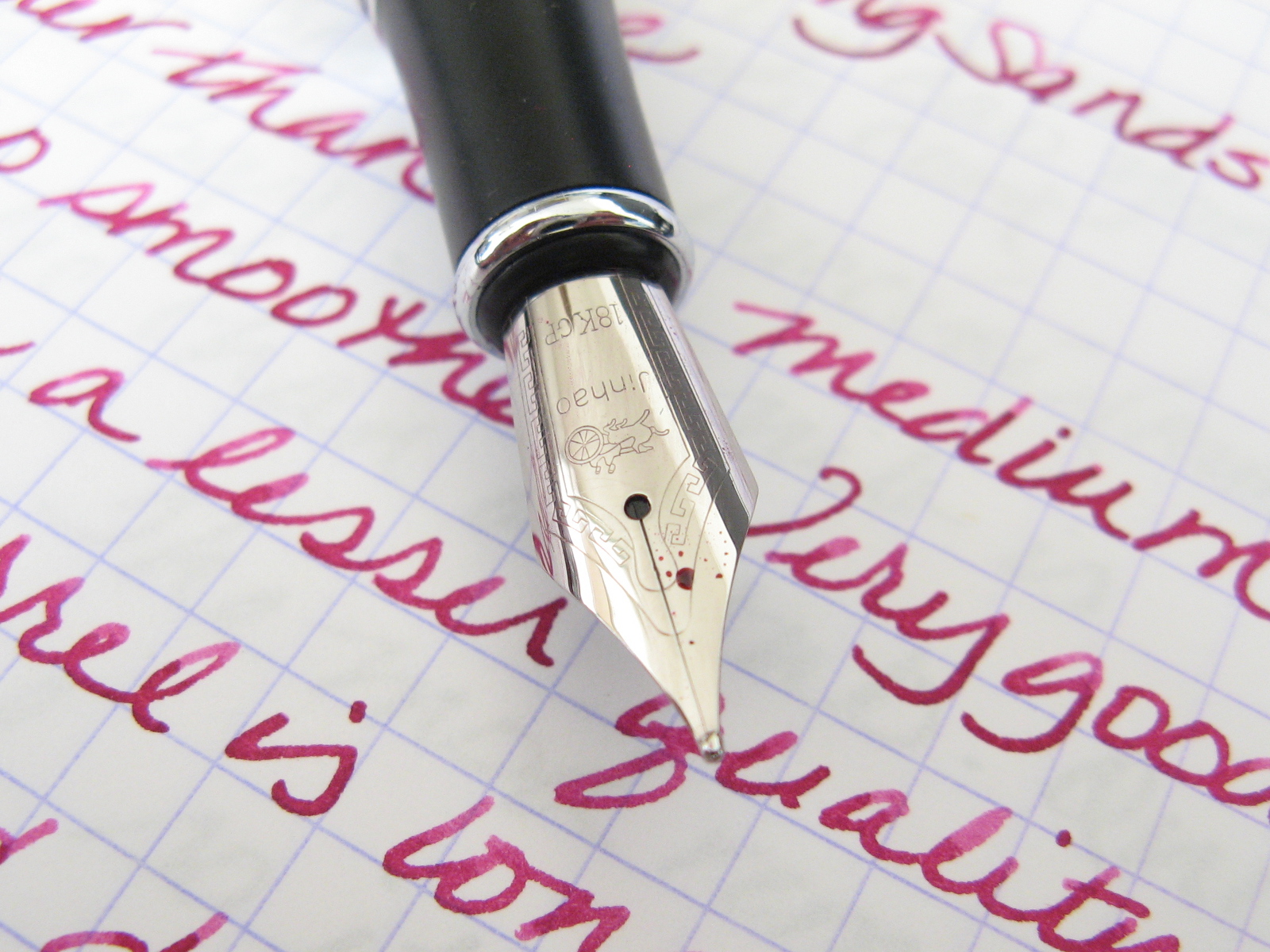
The large nib has a decorative but shallow imprint. That size at a low angle reduces contact with paper and can interfere with ink flow. The more upright you hold the pen, the better. Even at the perfect angle, some skipping occurred. The slit gets awfully narrow as it approaches the tip which could restrict the flow and the pen skates at times which could be another factor. Gently opening that slit might improve the flow but it is easily overdone. The pen still writes so it isn’t horrible, but as an out-of-box test, it was a disappointment. Given the much better performance from the medium nib, Jinhao does know how to make decent ones. This broad just isn’t up to my standards though an ink with a wet flow does improve performance. Noodler’s Turquoise has been the best to date.
Baoer 507 Eight Horses Medium Nib
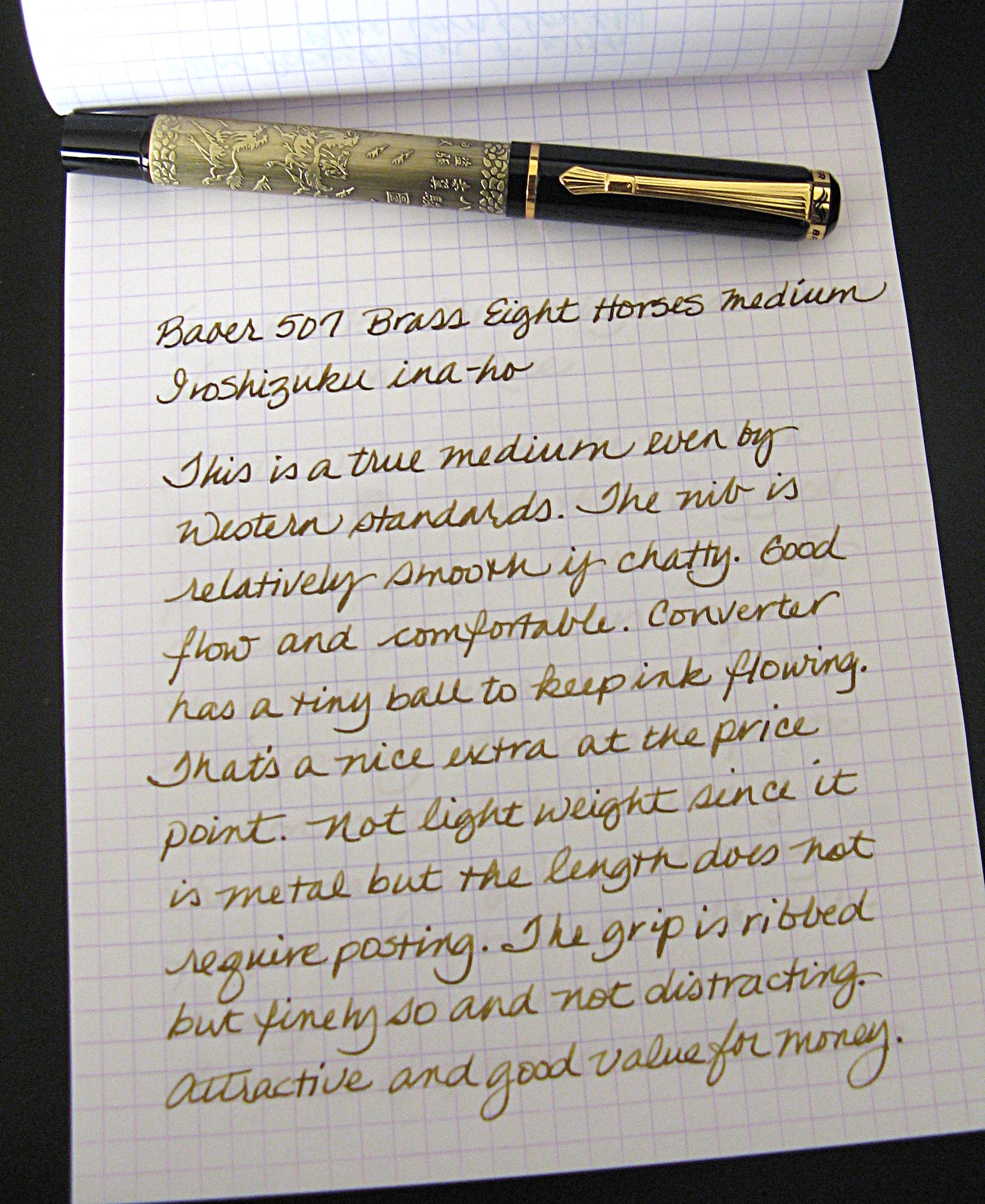
The Baoer 507 Eight Horses model comes in three colors, bronze, copper, and silver. It is 5-3/8″ capped, 6-1/2″ posted, 4-7/8″ unposted, and weighs about 32g. The nib is smaller than the Jinhao but two-toned and more deeply etched. The converter is better constructed than the Jinhao and contains a silicone ball to keep ink flowing. This is a handsome if slightly heavy pen. Fit and finish are as good if not better than any pen I’ve used in the price range.
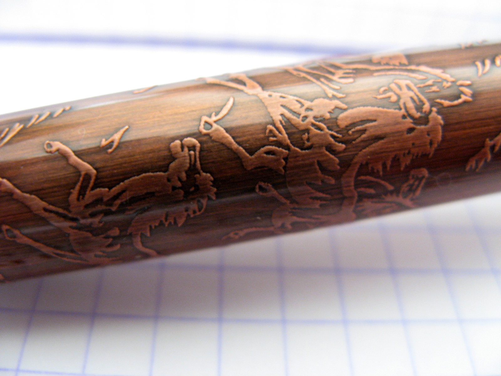
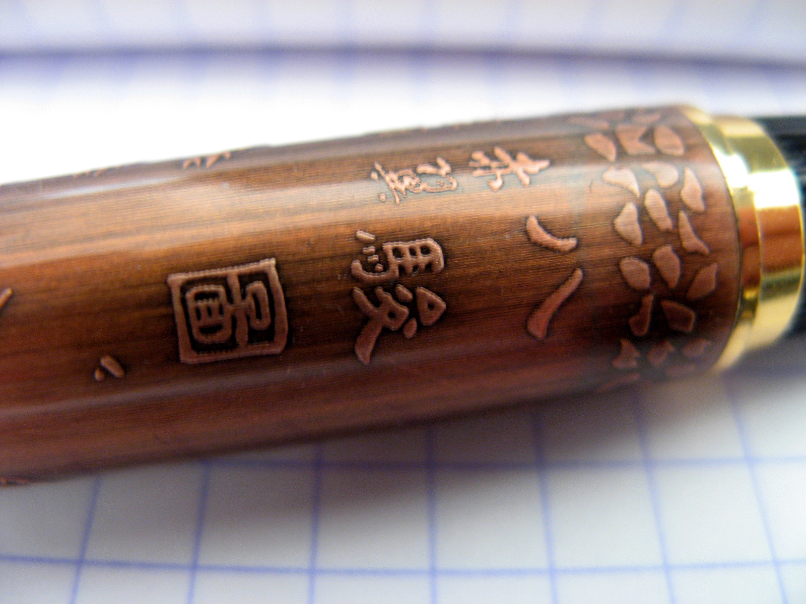
There really are eight horses cavorting over a field and a poem in Chinese characters across the top. It even has an artist’s seal just as you would find on a Chinese painting. The design could have been garish but it isn’t. For an inexpensive pen, it is remarkably attractive.
Both the Jinaho and the Baoer are more visually appealing than many low priced fountain pens but they need to write well, too. The best indicator that the Eight Horses medium nib qualifies for a recommendation is that it has seen regular use in my journal. It’s a bit chatty but not squeaky and has a tiny bit of feedback though not enough to be distracting. Line width is closer to Western standards than Japanese. The flow has been good with both Iroshizuku and Diamine inks though on occasion it will start a bit hard. Warm, dry weather might be a contributing factor so it shouldn’t be marked down for that.
Stock Nibs
The two stock nibs I tested worked well at a 45 degree angle but also did well with a more upright hold suited to writing Asian characters. The broad nib won’t tolerate much rotation but the medium has no such limitations. For most writers that won’t matter. The medium has a more consistent flow than the broad but it also has the converter with the ball which might account for some of the difference. Any shortcomings like inconsistent flow would have benefited from adjustments but could improve with continued use. If you are good at tinkering with nibs, those skills should come in handy.
If you want your pen to work well from the start, buy from HisNibs.com. The site states that “Every nib that ships from His Nibs is closely examined under high magnification and tuned or adjusted if needed.” The site offers both the X750 Shimmering Sands, aptly renamed Starry Nights, and the Baoer Eight Horses along with a good selection of other models from Jinhao. Buying from Norman is more cost effective than buying an inexpensive pen through eBay that either needs a professional adjustment or is a disappointment that never gets used. You might get a great pen that works perfectly from an eBay seller, so if you are a gambler, go for it. Otherwise, invest in the sure thing.
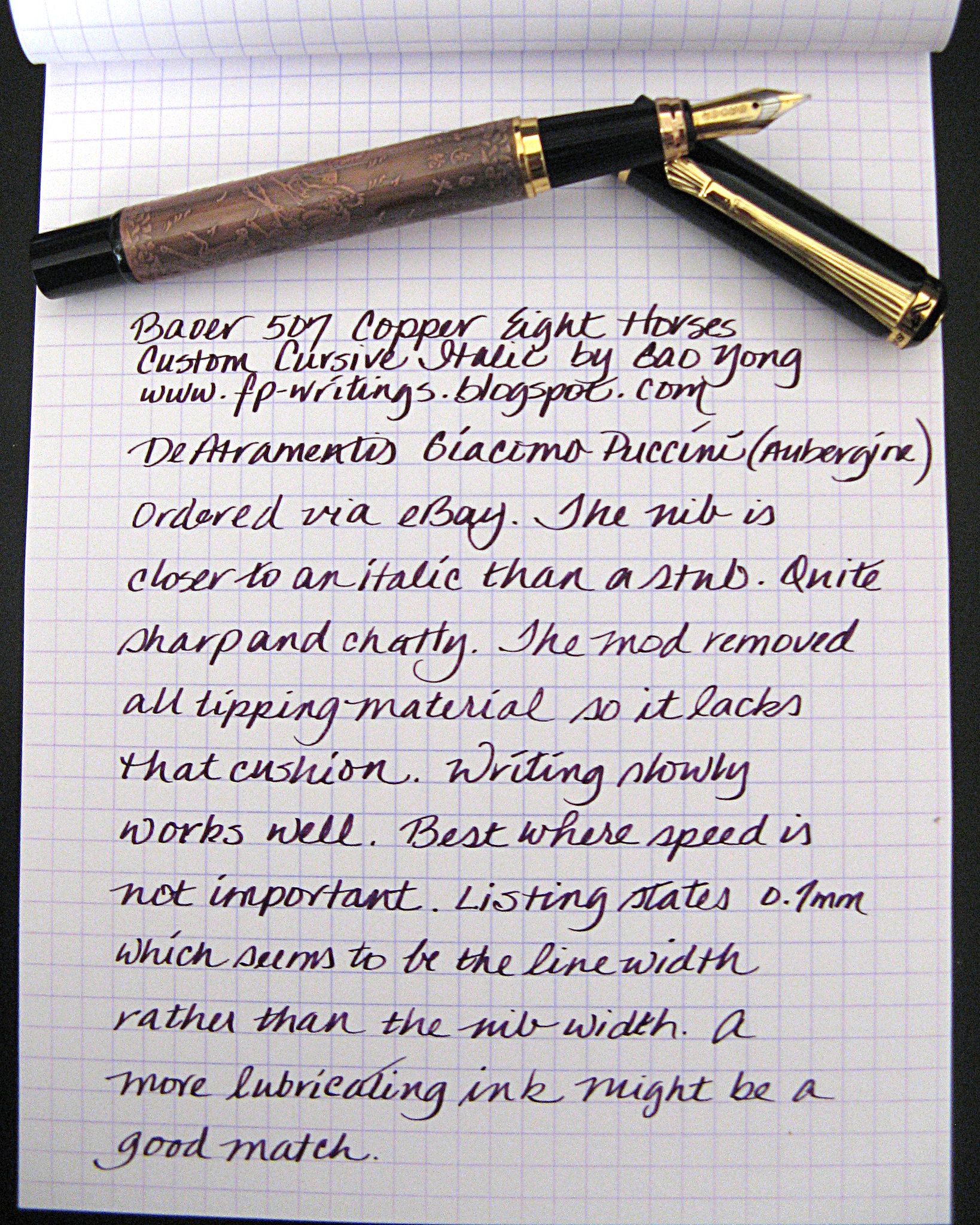
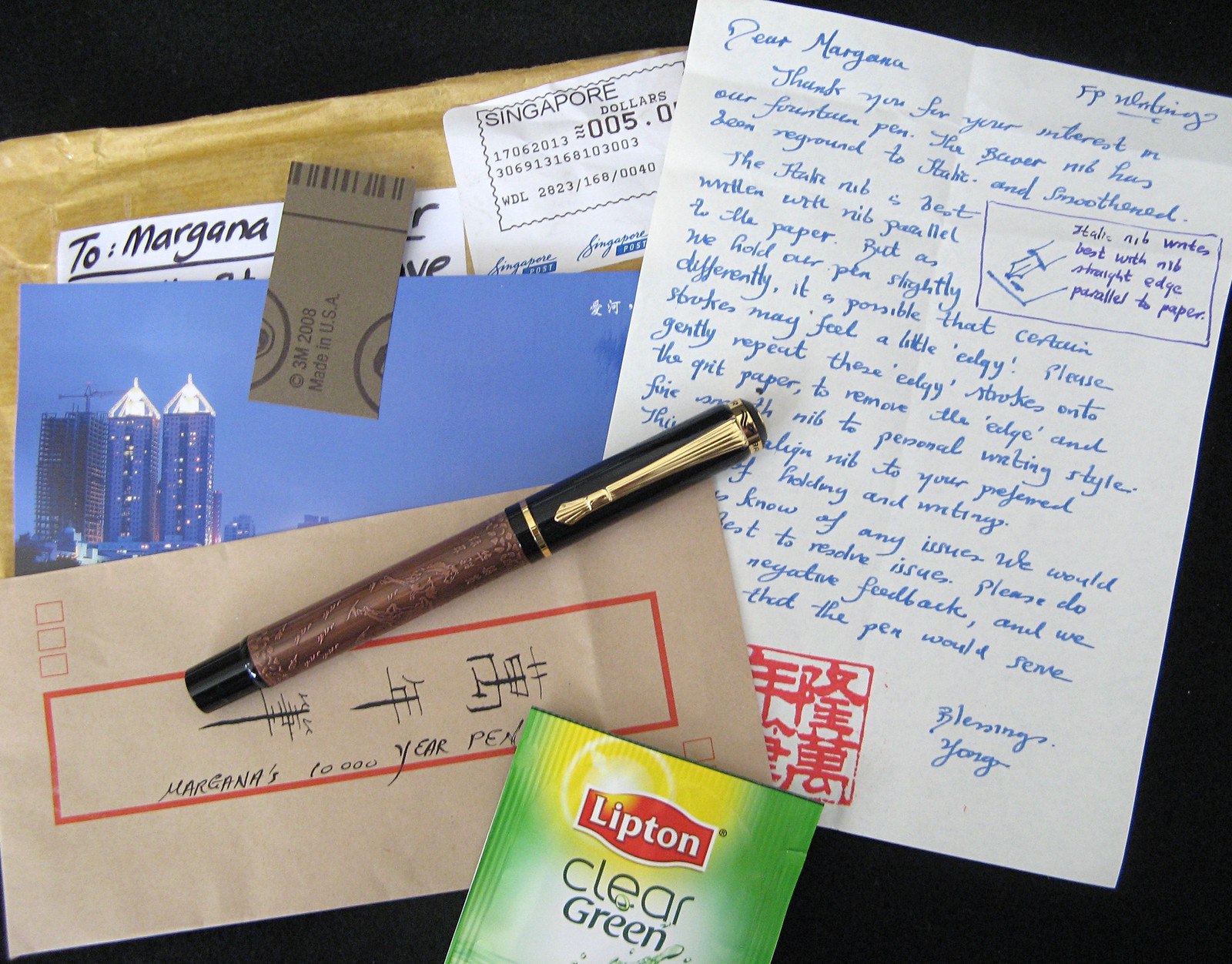
Baoer 507 Eight Horses Cursive Italic
The custom cursive italic from Goa Yong is a whole different matter. His package was a treat to open with its personal letter, and goodies including a postcard and green tea bag to enjoy with my “10000 Year Pen”.
The modified Eight Horses has an average ink flow and is closer to a straight italic than a stub. The lack of tipping material keeps it from being a cushioned, any-angle-writer, but a lubricating ink makes that less apparent.
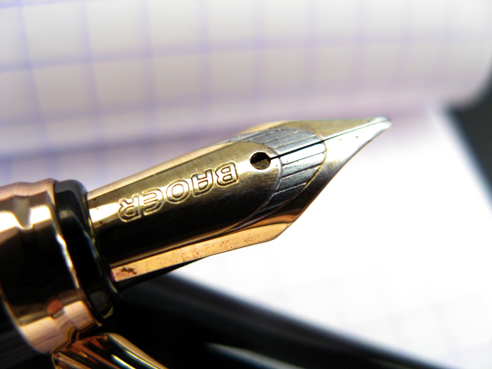
For someone new to italic nibs, the moderate flow will make writing more controlled so that’s a plus. It also makes small lettering possible which is another advantage. The degree of line variation will give any handwriting an appealing look and can improve legibility. The sharp corners work best on smooth paper so Clairefontaine and Rhodia are ideal. As with many italic nibs, writing more slowly solves most problems. With the right ink, it might even perform well on Moleskine paper. A light hand is best, otherwise it will dig in too much, but that is true for a lot of italic pens. Yong included a bit of special paper with which to smooth the nib. However, it would be all too easy to ruin it, so I have set that aside for now.
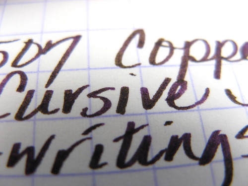
De Atramentis Aubergine is pictured on Rhodia, but Stipula Sepia is in the copper Eight Horses today. Neither has produced feathering even on cheap copy paper. Maybe it’s something about the sharp corners that limits the flow and maybe the paper isn’t as awful as it seems. Regardless, it’s a benefit worthy of note.
This pen has wheedled its way into my summer rotation which around here is a form of praise. It’s a pen worth considering if calligraphy nibs are of interest. Yong modifies a number of Chinese pen models so if an Eight Horses doesn’t appeal to you, perhaps another style will.
Matching Inks to Pens
If you like matching inks to pens, the pale bronze Eight Horses is lovely with Iroshizuku ina-ho. Purchasing a bottle is a must for me now. It is also pretty with purple ink as its current mate, Diamine Violet, proves. The copper model looks good with Diamine Golden Brown, Noodler’s Golden Brown, Private Reserve Copper Burst, J. Herbin Cafe des Iles, J. Herbin Terre de Feu, Stipula Sepia, De Atramentis Sepiabraun, and Diamine Dark Brown. Some deep purple inks suit it as do a few reds including Noodler’s Red-Black, Diamine Monaco Red, Sailor Red-Brown, and Parker Penman Ruby. The X750 Shimmering Sands works with most colors though brown might be less than exciting.
Too much information?
Well, this is a three pen review. Besides, each pen was different and just in case I didn’t make it clear, I like all of them. The Eight Horses with its smaller nib and lighter weight edged out the X750 but my fondness for Chinese Brush Painting might have been an influence. Then, again, it might be my frugal nature and delight with a pen that well exceeded my expectations. How often do you get to say that in a review!
Links
Baoer at His Nibs
Jinhao at His Nibs
X750 Shimmering Sands/Starry Night
Italic nibs on eBay and Fountain Pen Singapore (fp-writing)


I’ve collected fountain pens for many years but up until a couple months ago never tried a Chinese pen. I was browsing online and found some pens on ebay and decided to give the a try. I must say I’m pleasantly surprised with Chinese fountain pens. So far seem to favor Jinhao pens and am amazed at the prices and the smoothness of the nibs.
LikeLike
Hi David,
It’s good to know that Jinhao pens have consistency. That’s part of what I wanted to discover with my three pen purchase. Have you tried a fine nib? If so, what did you think of it?
LikeLike
Oh! I have that shimmering sands Jinhao! Fantastic pen – did not require any tweaking at all!!
LikeLike
Thanks for the kind words!
LikeLike
Welcome. Hey, I really did count eight horses though it took a magnifying glass to be certain. 🙂
LikeLike
Yes, when I sell one to a customer, I always mention in the enclosed note that it’s a challenge to find them…but they’re all there! 🙂
LikeLike
It would be an irresistible challenge not to count and reassure oneself they are all there. I was delighted to find I had not been cheated. 😀
Are there any other Jinhao/Baoer models you would recommend or models from other Chinese companies?
LikeLike
That’s a tough one Margana! There are so many, and so much depends upon personal choice (appearance, size, weight, etc.). A few to look at, from different companies:
Duke: http://www.hisnibs.com/duke_116.htm;
Bookworm: http://www.hisnibs.com/yellow_filigree.htm;
Crocodile: http://www.hisnibs.com/outre.htm;
Picasso: http://www.hisnibs.com/candle_flame.htm;
Jinhao: http://www.hisnibs.com/wooden_chariot.htm;
Uranus: http://www.hisnibs.com/uranus_621.htm;
Baoer: http://www.hisnibs.com/sonata1.htm;
Hero: http://www.hisnibs.com/victorian.htm…and a hundred more! 🙂
LikeLike
That’s quite a group to consider. Thanks for the suggestions, Norman. 🙂
LikeLike
[…] over the weekend, one of the Baoer Eight Horses will get a fill. Stipula Sepia was such a good match for the custom italic that it might be worth […]
LikeLike
[…] “A Trio of Chinese Fountain Pens,” […]
LikeLike