
Sheaffer Taranis Fountain Pen Gets A Test Run
12/14/2013Recently, Sheaffer offered the Taranis fountain pen to review. Saying “no” was not an option. Sheaffer has a good reputation for making fountain pens, but my experience is with vintage models including a 1950’s Sheaffer Sentinel. What would I think of a modern pen?
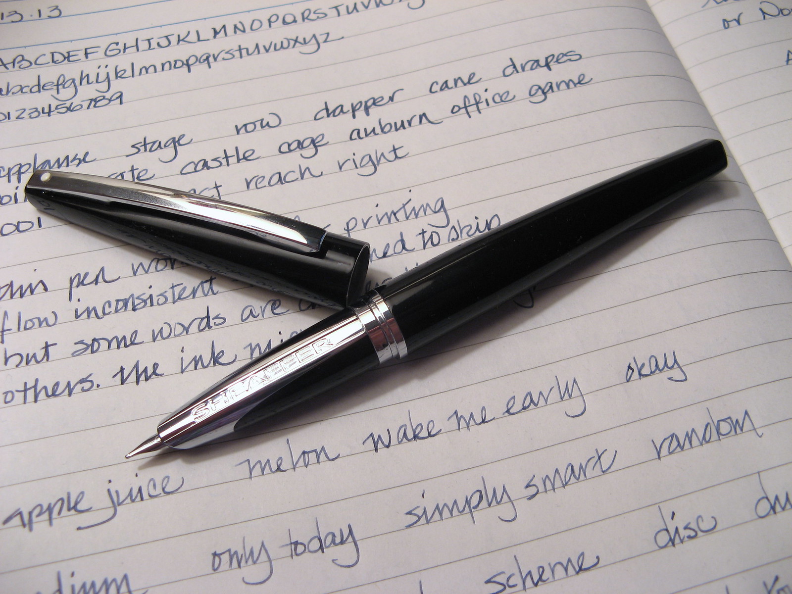
The Taranis is named after the Celtic God of Thunder. Grab the details from Sheaffer, but the main points are that it’s a metal pen with excellent balance and it sports a semi-hooded nib that resembles a Pilot Vanishing Point. The pen comes with a converter plus two cartridges and is solidly packaged for safe shipping.
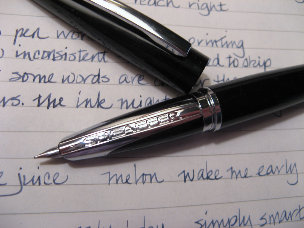
The logo runs the length of the section so it will be under your finger though I did not find it to be uncomfortable. Stepped sections or sharp threads are far worse and this model has neither of those annoying issues. The section is otherwise smooth with the threads placed very high and not in range of my grip. Balance is good whether posted or not. Build quality is very solid, tank-like, and should make it last forever. The snap cap seats solidly with a minimum of effort and I was able to pop off the cap one-handed which I find very convenient. The Taranis is a good candidate for a carry pen since it will survive better than most pens those knocks and blows that come from excursions into the wild.
The Taranis Sheaffer sent needed cleaning with soapy water to get the flow right. Whether from minute bits of debris or oils from manufacturing, an overnight soak improved performance. This can be true of any new pen so it should not be off-putting, but rather a reminder to clean new pens before filling. My usual light rinse with cool water did not cleanse the feed sufficiently and my enthusiasm at acquiring a new pen got the better of me.
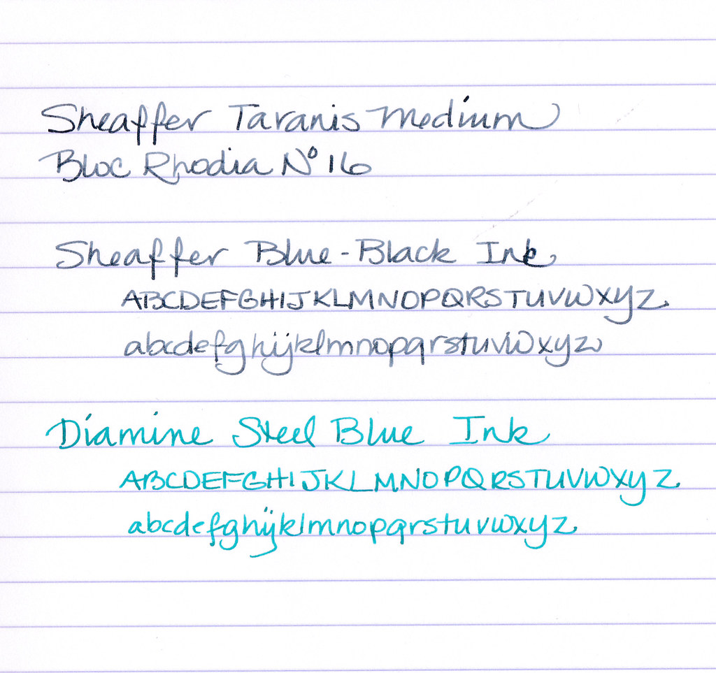
The stainless steel nib is a smooth nail that doesn’t have that tendency to skate that some pens possess. The medium wrote a bit dry with Sheaffer Blue-Black, but less so with Diamine Steel Blue. It may turn into a good match for free-flowing inks, of which I have more than a few. The nib width is on the narrow side of medium and I was able to write quite small with it. It tolerates a variety of writing angles, even upside down for a finer line which makes it an all-purpose nib.
And the clincher?
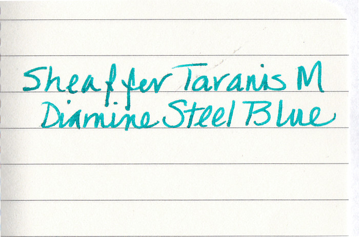
That is Moleskine paper! Have you recovered from the shock? Minimal show-through and only a few tiny dots of bleed-through. Impressive!
There is quite a price range amongst retailers so shop around for a good deal. Given the build quality and the sturdy nib, the Sheaffer Taranis could make an attractive way to turn a non-user into a fountain pen enthusiast. After all, Christmas is just around the corner…
More reviews at FP Geeks and Best Fountain Pen. Jim Mamoulides covered the vintage Sheaffer Snorkel at Pen Hero.


Nice review! I have been eager to hear more about this pen. Thank you. =)
LikeLike
I have mixed thoughts on this pen. I REALLY like the look. Very interesting. That big, capital SHEAFFER lettering on the grip area is really befuddling though. So ugly.
LikeLike
It is a big hunk of metal in an unusual location, but it does distinguish the pen design from other models on offer. I would recommend giving it a test before purchase. The logo did not bother my grip and is only visible when the pen is uncapped. The squared ends are a nice touch and give the Taranis a bit of character when closed. The build is very solid making it a good possibility for a carry pen. There are a lot of pluses to sway many, but that logo will be a deterrent for others. Is it a deal-breaker for you?
LikeLike