
A Palette Of Inks
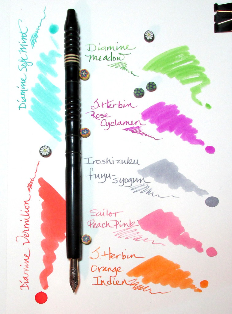
06/04/2019Three years ago I put together a spring palette of understated inks. No dual-toned, sparkly colors in this lot. Just gentle, soothing shades.
As this year’s flowers fade and the pastel petals float away, this palette is the final link to spring. I want to hold on to that as the summer swelter looms. I loathe the heat and appreciate the cooling, soft colors and minimal maintenance these inks require.


Lovely spring shades! I am really drawn to the corally lusciousness of that Diamine Vermilion. And I’m a sucker for a good gray ink, like that Iro fuyu-syogun.
LikeLiked by 1 person
I was lucky enough to be given a small bottle of Vermilion years ago and it has remained a favorite despite all of the reds and oranges I’ve tried since. It is especially lovely with a wide nib. Fuyu-syogun makes the gray look intentional rather than a watered down black. How did I do at enabling?
LikeLiked by 2 people
You are alarmingly effective at enabling, and my wallet does not thank you even if my eyes do!
LikeLiked by 2 people
Oopsie? Or maybe not. 😀
LikeLiked by 1 person
I have J. Herbin’s “Orange Indien” and find that I like it much better than the highly touted Noodler’s “Apache Sunset”. It flows well in all my nibs, from Fine to the Pilot CM.
LikeLiked by 2 people
Apache Sunset has good shading for those we enjoy that characteristic. But it would be hard to beat Orange Indien for an all-purpose orange ink. Like you, I’ve never had a problem with it in any pen or with any nib and it is striking in a clear demo. What’s not to love about that!
LikeLiked by 1 person
Lovely shades! I need to get more of the regular (non-sparkly) J. Herbin inks. They’re all so pretty.
LikeLiked by 1 person
The current trend towards sparkly, dynamic colors is very appealing. But ink that is beautiful for color alone still has a place in inkdom and Herbin is one of the best producers in that category. No enabling whatsoever, eh?
LikeLiked by 1 person
Um. Well. I had wanted to pick up something else as well (a planner with Clairefontaine paper, oooh) so some rose cyclamen ink may have also fallen into my basket…
LikeLiked by 1 person
What a cheeky bottle of ink!
LikeLike
Right? At least the ink color is also a bit cheeky. 🙂
LikeLiked by 1 person
Every time you feature Diamine Vermillion I get a bad case of FOMO. =)
LikeLiked by 1 person
😀 To be sure I suffer from a weakness for the color. There is always a version of it in my watercolor kit even when I have no need for it. Dang. I am even good at enabling myself!
LikeLike
There’s nothing wrong with having good taste. With that aside, Diamine Meadow remains one of my favorites. It’s such a perfect shade of green.
LikeLiked by 1 person
With so many inks on the market, finding a perfect color is like winning the lottery. Lucky you!
LikeLiked by 1 person
So true!
LikeLiked by 1 person
Could you please explain what you use all the different inked up pens for in one season. I DO love the idea of having different palettes, but I don’t know how I would use them! I want one of everything available all the time!
Thanks for enlightening me.
LikeLike
Good question but the answer is simple. I am fickle though I do aim for a variety of colors and manufacturers. Inks get matched to nibs and pens based on characteristics. Then when writing notes to myself, a bit of color-coding goes into it with bright colors indicating urgency. Correspondence to pen friends will get at least a paragraph or two with each color in my rotation. Putting together a seasonal palette, as I did last night, is often an exercise in color gluttony. Plus it’s fun!
LikeLike
Thank you! Rainbow letters – what a fabulous idea. There cannot be too much beauty in the world.
LikeLiked by 1 person
Agree with you all about J.Herbin’s “Orange Indien”…much easier to use in my pens!
LikeLike