
Turquoise Ink Suggestions
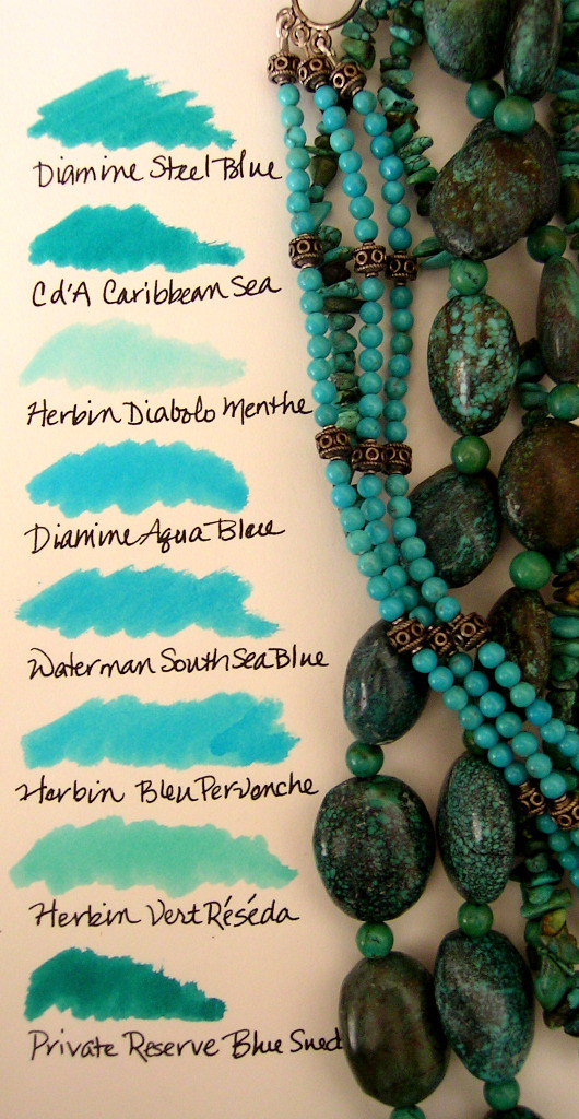
05/18/2014Not that there aren’t a number of turquoise fountain pen inks in my collection, but they just don’t have that hint of green that resembles verdigris. Do you know of an ink that looks like the larger beads in this image?


Look at R& K’s Verdigris.
LikeLike
For the darker turquoise did you try Roher & Klingner Verdigris? Iroshiquku Ku-jaku is also nice.
LikeLike
Diamine Marine is one of my favorite turquoise inks. It might be close to what you’re looking for…
LikeLike
Looks a bit like Diamine Teal or R&K Verdigris? I also know if you mix a little Iroshizuku Tsuki-yo with something greener like Shin-ryoku, it takes on a convincing blue-green hue.
LikeLike
Verdigris, Teal, and Ku-Jaku match some of the colors in the beads. I don’t have Marine for a comparison. That might be the one to acquire next.
LikeLike
I was also going to suggest Diamine Marine or Iroshizuku Ku-Jaku.
LikeLike
I don’t have Marine for comparison, but I held swatches of Diamine Teal and Steel Blue next to the beads a few minutes ago. Teal is close to the darker color while Steel Blue is brighter but similar to the smaller beads. R&K Verdigris matches the darkest veins. Choices, choices. 🙂
LikeLike
Wish I were able to send a sample of Marine off to you. I just sampled it, myself. =)
LikeLike
So many inks to try. It’s a never-ending saga here, but I enjoy matching inks to images like this one or to items around my house. Mixing watercolor paint is a similar adventure. Am I alone at this?
LikeLike
Me, too. One time an Expo ‘bold color’ blue dry-erase marker showed up in a meeting room at work. It was a stunning blue that I just had to have loaded in a pen. I ended up scribbling with the marker on a sheet of paper and sending it to Brian Goulet for advice. Iroshizuku tsuki-yo was about as close a match as we could find.
And in just a few months I’ll be beginning my annual fruitless search for ink in the deep purplish red that we see here in New England during foliage season…
LikeLike
Margana, you are not alone. I do this all the time, and like another poster, this coming fall, I, too, will be looking for an ink that resembles the lovely foliage we experience here in New England. Most recently, for the change of season from winter to spring, I was inspired by the brown, and young yellow/green hues reflected in the outdoors. Luckily, I already have that color on standby: Stipula Verde Musciato. What’s interesting is that this phenomenon can also happen in the reverse. Using Sailor Tokiwa-Matsu made me take an extra look at the pine trees here, only to notice that they truly are green with a touch of red. kinda cool. =)
LikeLike
Don’t get my wrong. I do love color, but then go through times when black just does it for me. Within easy reach, there are always other pens inked with a variety of colors so I’m not swearing off color addiction and a change of season is as likely a trigger as any.
Tokiwa-Matsu sounds like a good match for autumn. Thanks for the tip.
LikeLike
[…] Turquoise Ink Suggestions (via Inkophile) […]
LikeLike