
Paperblanks Journals Are Gorgeous
01/13/2014Until a few weeks ago, I would have needed a “way back machine” to recall my last Paperblanks journal. So when the company offered products to review, I was happy to oblige. Imagine my delight when not one but three of the beauties arrived!
These journals are solidly constructed and friendly with enough inks to earn a place in my paper wardrobe. They come in lined and blank formats and offer standard Smythe sewn binding, acid free archival paper, ribbon bookmarks and Memento Pouches in the back of each journal. The closures vary by model from clasps to flaps to traditional book style.
The journals sent for review include the Parisian Mosaique Safran Midi, the Gandhi Embellished Manuscript Mini, and the Silver Filigree Maya Blue Ultra.
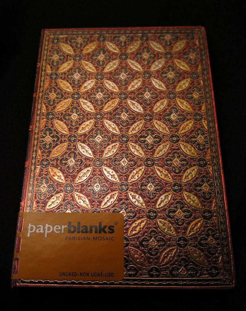
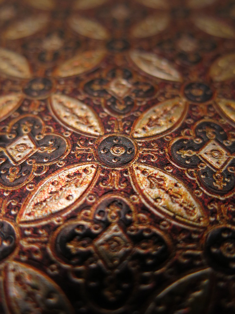
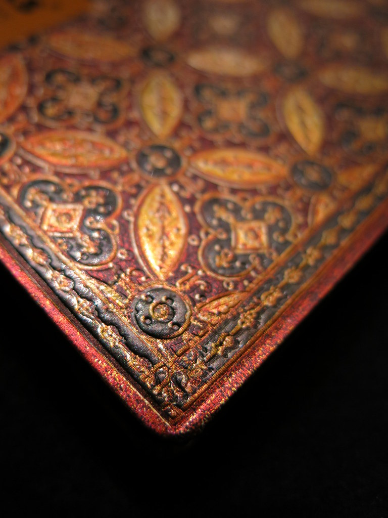
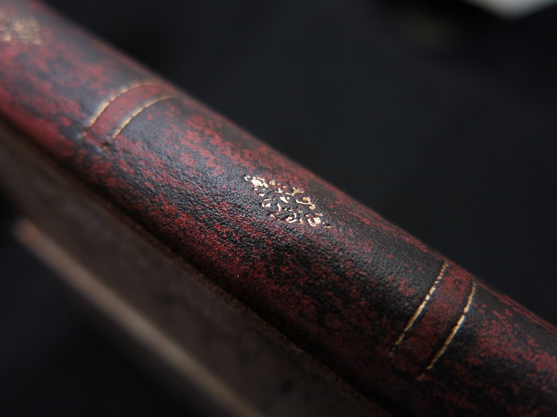
At 5″ x 7″ the Safran Midi is just the right size for my desk. The cover is gorgeous, rich in color and texture. Like the other two Paperblanks, the spine carries the same detail as the cover and looks sumptuous and vintage on my bookshelf. My Safran will get pressed into service as a repository for famous, and maybe not so famous, quotes along with a few doodles and flourishes in the margins. How would you use such an elegant journal?
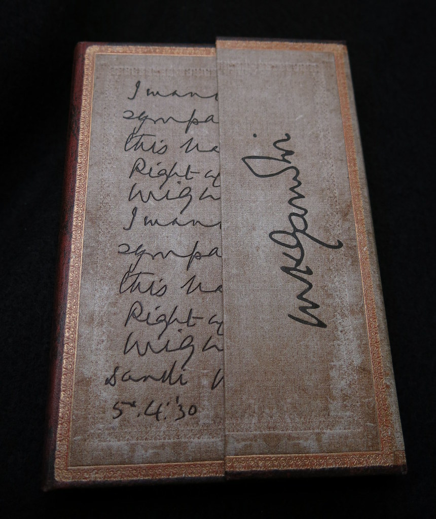


The Gandhi has an aged look with an embossed quote decorating the front. It’s a mini at 3 3/4″ x 5 1/2″ and a very comfortable size in the hand. Pages are lined on both sides so there is ample room for writing. The cover of the Gandhi snaps closed with concealed magnets. The flap protects the pages so it could easily serve as a travel journal and it is sure to be a head-turner at the local coffee shop.
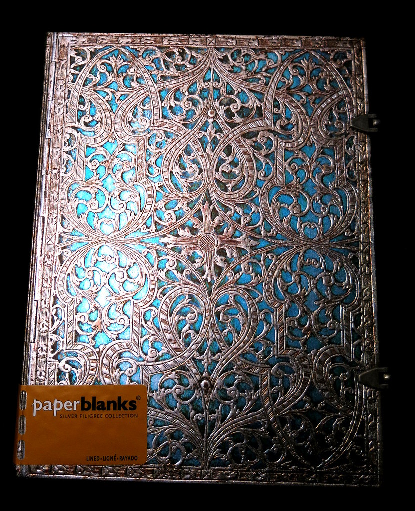
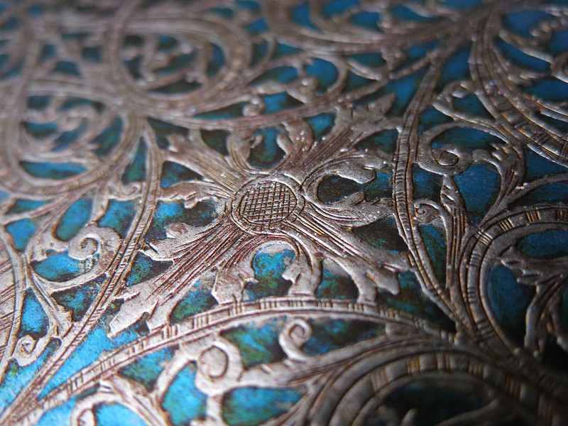
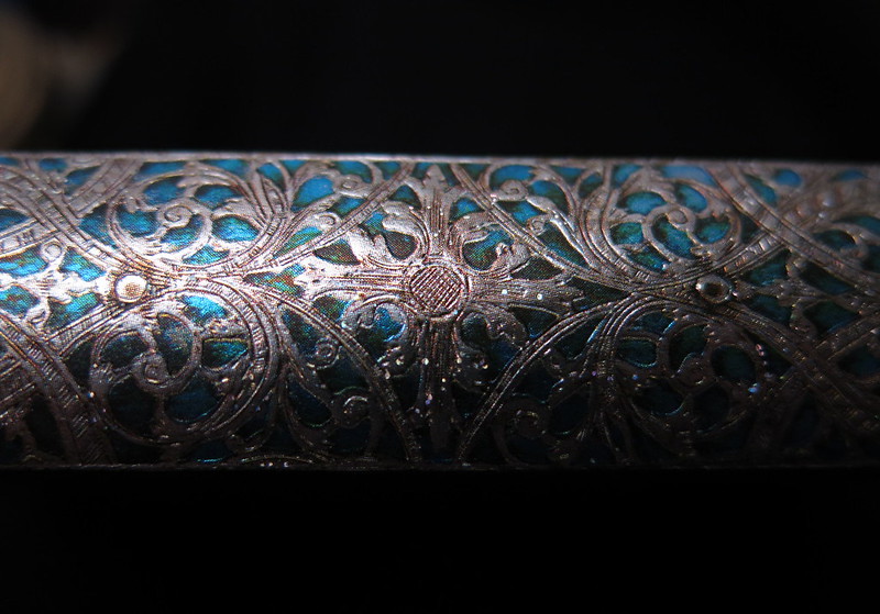


The 7″ x 9″ Silver Filigree is just beautiful with its blue and silver cover and antique-looking clasps, but then I do have a soft spot for those colors especially when turquoise ink flows from a white gold nib. However, black ink might be better suited to this journal allowing the cover to be the prominent feature. The Silver Filigree is so elegant it begs to be treated like royalty.

Then there is the paper. Although there is a faint impression on the back of a sheet, it isn’t enough to be considered show-through or ghosting and there is absolutely no bleed-through. This makes the paper suitable for writing on both sides and is how all journals should perform. It’s like getting double the writing surface compared to Moleskine and the like.
Black ink is the perfect neutral for the beautifully detailed covers and it has convinced me to keep a pen so loaded at all times. Noodler’s Black performed very well and, as a good all-purpose ink, is a fine choice for Paperblanks. For now NB is loaded in the ivory Pilot Prera Italic for an elegant duo that will suit any of the journals.
Additional inks that tested well include Noodler’s Air Corp, Diamine Sepia, Diamine Steel Blue, Sailor Sky High and Waterman Florida Blue. The remaining inks tested showed the tiniest amount of feathering, but no show-through or bleed-through. Rohrer & Klingner was the exception and produced too much feathering to get a pass, but I’ve been disappointed with it on other brands of paper as well. I will continue to test inks as pens get refilled and post an update should any ink prove to be as trouble-free as Noodler’s Black.
So here’s the deal. Paperblanks journals are gorgeous, but you already knew that. If you use anything but fountain pens, the paper will be fine. For fountain pen users for whom paper is the deal breaker, my findings are mixed. Some pens and inks are good to excellent. Others are not up to my standards.
Because the covers are so attractive, I won’t use my full ink inventory but restrain myself to neutral colors like black, gray and brown. With Noodler’s Black handy, ink performance will not be an issue. Eventually, the best gray and brown inks will emerge and my ink selection for the Paperblanks journals will be settled.
Since all inks tested performed better or comparable to Moleskine without any show-through or bleed-through, and Paperblanks easily beats Moleskine in the looks department, I know which one I would choose. Well, at least I know which brand. Selecting a style from the Paperblanks offering is a whole ‘nother matter.
With the lone exception of the writing sample, all photos were taken by Tessa Maurer.
Here is a first for An Inkophile’s Blog:


I fell for the silver filigree as well several famous authors from Poe to Twain. BUT the paper is so uneven in performance, even within a journal, that I’ve regretfully decided no more with fountain pens. These will be my last.
Most had 2011 dates on the back page, so long after 2008 when PB claims to have upgraded their paper. OBB nibs that NEVER misbehave were awful, not just with R&K, but Diamine & even the ever-dependable Iroshizuku.
Such beautiful covers deserved far better paper. I am desolated.
LikeLike
You’ve had a lot more experience with them than I have. The Silver Filigree does have the 2011 date, but I would have to fill the book to know the performance of every page. Given my rate of speed, that could take a very long time. The Parisian Mosaic is dated 2013 and is the paper used for the ink test. The Gandhi is also dated 2013. Perhaps paper performance has improved though wide nibs lay down so much ink that they challenge lots of brands of paper. I don’t disagree that the paper should be up to the standards set by fountain pen ink for if it is good for that, it’s good for anything!
LikeLike
Too many paper companies seem to mix grades of paper so that poor quality is buried inside their journals, apparently under the impression most people won’t actually fill them or will use cheap ballpoints if they do.
It seems the focus is all on quality outer covers & less so on what they contain. I hope the paper is improving, but how can we tell?
I notice the last few writers versions (I can get through one of these in a month or two) the pages had a sort of crosshatch texture on one side of the page. Not as noticeable as the rough Lalo paper, but definite enough to reflect in ink absorption.
LikeLike
The paper in the journals I have are not textured so I can’t make that comparison. Hopefully, someone at Paperblanks will see the comments and take seriously the paper problems you and Papish have experienced. The only thing I can do is send my ink test pages to them – the good, the bad and the ugly. With certainty the paper is not in the category of “works well with all inks.” So far Diamine and Noodler’s are working the best in the Parisian Mosaic though not all of their colors work well. However, that can be said of any brand of ink on most any paper with the exception of Tomoe River paper. It seems to be good with all sorts of inks, but I’m still in the testing stage on that one.
LikeLike
Hi Beth,
Thanks for the feedback! Any new insights are valued.
I can, however, confirm that, in regards to your comment about paper companies’ tendencies to mix grades of paper, this is definitely not the case with our books. We have different paper suppliers, yes, but they are all subject to the same strict high quality standards. We test every batch of paper that is ordered. Different books use different papers, but we do not ever mix paper from different suppliers in the same journal. We have a very detailed and closely controlled material handling process so that we know exactly what paper is used in each book. 🙂
– Paperblanks
LikeLike
Thank you for your answer. Have you changed anything since 2011? The 3 authors journals I used, a Fitzgerald, Twain & Austin in the larger size were all problematic for me. I’d send pages, but I’m clearing house & packing for a move so they’re definitely NOT accessible.
I can tell you the inks included Iroshizuku, Noodler’s, Diamine, Roher & Klinger, Herbin, & Watermans. Can’t remember if I had the Montblanc Violet in rotation then, but think not. Nibs ranged from Krone M up to and including a Montblanc 149 OBB.
LikeLike
I agree with Beth… I have one gorgeous Paperblanks notebook and I’m not able to use any of my fountain pens on it… Maybe a Sheaffer Imperial 440 EF with Inoxcrom Black ink should pass the test, but any other pens or inks I tried performed so bad on its paper 😦
If they made better quality paper I’m SURE many people will start buying them. It’s sad having these amazing covers we have to choose Quo Vadis Habana, Leuchturm or Fabriano Ecoqua to be sure we don’t spend our money to have a white-paged-book on the shelf 😦
By the way, I will try mine again with a Prera and Noodler’s Bulletproof Black (the only Noodler’s I have) and will be so happy to know which grey and brown ink performs well when you test. I love grey, sepia and brown inks!!
Thank you.
LikeLike
Papish, I just tested Diamine Raw Sienna with a dry-writing Prera on the Parisian Mosaic paper with good results. Will post a review in the next couple of weeks. I also tried brush pens loaded with Noodler’s Lexington Gray and Kiowa Pecan without signs of feathering. I’ll post more inks tests when I have enough new colors to warrant it. Suffice to say it’s a matter of matching ink, paper and pen for best results. Also, the journal is a 2013 edition. Older models may have different paper so there is that to consider as well.
LikeLike
Thank you very much. I will wait for your results. Beautiful colours you chose!
I had a look at mine and it is a 2011 edition. Maybe that is the reason why paper is different in performance…
LikeLike
Papish, you may well be correct. Paper stock in any run or year could vary considerably. That’s as likely an explanation as any.
LikeLike
I love Paperblanks but also have experienced the mixed results with fountain pens, even fine nibs and low-feather inks. So I look forward to seeing your further tests and reviews. (I’d be happy to share photos of my results, just to back up my feathering statement.)
I agree it would be good if they upgraded the paper, but then maybe they don’t feel like they need to do that, considering the niche market that is the FP- using consumer. I say that, but my heart isn’t in it. 😉
Thanks for the review!
LikeLike
I believe you, Carol. Most certainly there is feathering with some inks. Off hand do you recall any of the inks that feathered? No need to delve into your archives, but I could put a few more to the test.
LikeLike
Oh, I forgot to mention I used the Gold Foiled and Grolier notebooks. Some of our feathering friends included Diamine Ancient Copper, Sapphire Blue, and Rustic Brown. But vintage gold nibs were a big part of the problem, I’m pretty sure.
Noodlers’ North African Violets did well in an EF steel nib. But it kills me to use that gorgeous ink in a teeny tiny nib! I always had to weigh feathering vs. legibility. Stressful. The dodgy paper quality was turning every journal entry into ‘Sophie’s Choice!’ I couldn’t handle it. 😉
LikeLike
You have made a good point for using an easy to replace ink like my choice of Noodler’s Black. It isn’t exciting but it is so reliable.
LikeLike
I had a Gold Foiled daily planner from their range last year – there were a couple of inks it didn’t get on with, but overall, it was pretty good. (Especially the slightly over A5 “Maxi” size, which I really liked.
I’d have bought one this year, if they were still in the range – as they aren’t, I’ve chosen Leuchtturm, (A5 Daily Planner) which is a revelation – I’ve yet to use an ink that the paper doesn’t handle with ease.
LikeLike
Leuchtturm has a good reputation, but I have no experience with their products. Paperblanks are so readily available and so attractive that it is hard to imagine looking for something else. Still there is a lot to be said for paper that works with any ink. That’s a huge plus for a fountain pen user.
LikeLike
Leuch quality is variable. Some are awesome & some bleed like sponges. Better than the Moles & better than the 2011 Paperblanks so do try them.
LikeLike
Hmmm. I’m not likely to invest in a product that is inconsistent or unpredictable. At the very least the paper needs to be good with my mainstays like Noodler’s Black, Noodler’s Kiowa Pecan, and Diamine Mediterranean Blue. I mean a girl has to have some standards, you know.
LikeLike
Tomoe is still my gold standard, followed by Clairefontaine, then Rhodia. After that Leuch, then Paperblank with Piccadilly and Moleskine last.
LikeLike
I’m still getting acquainted with Tomoe and have a review in the works. Your list makes sense for those wide nibs you favor. Piccadilly is another inconsistent performer that works well with some inks but not others. Heh. There are days when I just want to use an instrument like a mechanical pencil that writes well on every paper.
LikeLike
[…] Paperblanks Journals (via Inkophile) […]
LikeLike
I discovered Paperblanks in 2013. They are the best that I’ve ever used. I use Noodlers black ink and Watermans black….and Higgins for my dip pen. No bleed through. I’m in my late 60’s and I plan to journal as long As I can …. So my children and grandchildren can have them. I draw and write in them. I mostly use my dip now it is the slowest method but I really enjoy it. When I got my first one and saw how good they were …. I went on Amazon and bought 3 more.
I’m not at home now and don’t remember what size they are…but I would say 7×9 at least.
LikeLike
Thank you for the feedback. Your journal sounds like the large size and could be any one of several models. Noodler’s Black is so good on Paperblanks, that I’m not sure it is a fair test. 😉 My next black refill will be Waterman so we shall see how well I do with that ink.
LikeLike
Nice review. Like you, I haven’t seen these in a while but I am impressed by the cover designs. The textures are lovely.
LikeLike
They do make beautiful journals. The paper is inconsistent for fountain pen use, but fine with anything else. My fiber tips are great for Paperblanks and so is Noodler’s Black. It’s a compromise to use only one or two inks, but worth it to enjoy the aesthetics of the books.
LikeLike
I’m surprised to see the comments about feathering etc with the Paperblanks Journal. I now have been using them for over a year now…I think. I use fountain pens with Watermans Ink…I now mostly use dip pens with Higgins ink. Great results. I just bought 2 more on EBay. I use 7×9 lined pages, acid free. They seem perfect to me. I sketch and write in them. Artlike
LikeLike
Thanks for sharing your success. Performance seems to depend on the paper batch and the year of manufacture. It may well be that the newest editions are better with fountain pen ink. Perhaps that is what you have.
LikeLike
I have made a discovery…
The shit cheap, bottom dollar, school exercise books, well that paper is designed to be the lowest cost possible, AND it’s made for ball point pens and pencils.
It’s a very thin paper in the first place, and it FREQUENTLY has thinner spots and soft spots, which results in the nibs slicing the paper, and the digging in of the tines..
Sort of like mud holes in the back yard…..
I must start purchasing a more suitable paper – just mainly for scribbling and note taking…
The A3 cartridge paper is for artistic uses only..
LikeLike