
Which Trio of Inks Do You Like Best?
03/28/2013A Levenger Notabilia binder with an Apica 6A10 journal and a three-pen case can take me anywhere. The pens should have a variety of nibs and the trio of inks should be colorful and suit text, margin notes, and edits. Finding three that work well together is a fun part of the hobby and worth cataloging the results for future reference.
Sometimes the trio is obvious. Other times it takes some trial and error with lots of swatches to see which inks make a pleasing palette. This week two emerged quickly but the third slot could have been filled by several inks already in pens. Time for a swatch test on the gray Apica paper. It has a subtle influence on the colors, so it helps to see the test patches side by side.
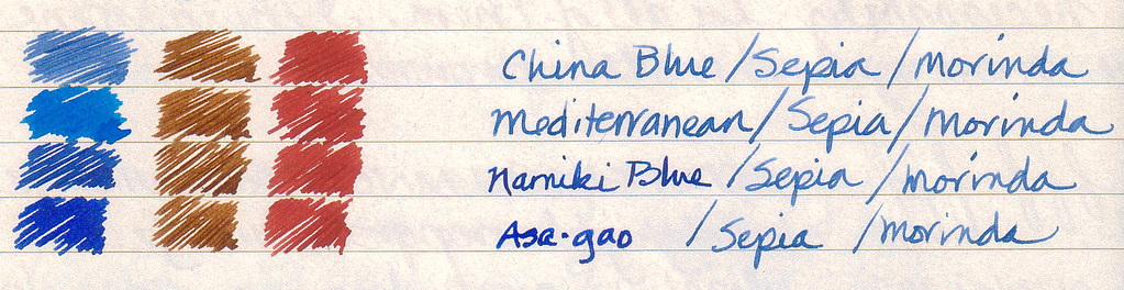
The inks are Diamine China Blue, Diamine Mediterranean Blue, Namiki Blue, Iroshizuku asa-gao, Diamine Sepia, and Rohrer & Klingner Morinda. The names were written with China blue except Namiki Blue and asa-gao which were written with those inks.
Which trio do you like best?


I find Mediterranean Blue combination more for spring, it adds a little sun to the trio 🙂
I also like Namiki interesting, more for long writing.
Asa-Gao seems to me to be a little deep to combine with the other two colours.
China Blue is not my personal taste, I feel it’s like a “school” blue ink…
LikeLike
I love diamine indigo, an old-fashioned looking blue black, Diamine grey is another favourite and looks especially good on todays stark, bright-white papers and it also as a low key protest against the officialdom that insists that black is the only colour to use on any sort of form to be filled in. I have just swapped Diamine sepia for saddle brown, as it is appears less shaded and looks really good on cream or ivory papers
LikeLike
Indigo might have been my first Diamine ink. Might have to revisit it soon.
LikeLike
How well does your leather cover work with regular composition notebooks? I always thought that the Apica was an odd size.
LikeLike
Wendy, it works fine with comp books. In inches, the Apica is 10 x 7 while the Notabilia comp book is 10 x 7.875, slightly larger than my Mead comp book at 9.6 x 7.5. All three will fit inside the Notabilia cover.
LikeLike
Interesting. I will keep this journal cover on my wishlist then. It seems quite versatile. Thank you for the recommendation.
LikeLike
The China Blue one for me.
LikeLike
I like the Namiki best with the Sepia and the Morinda — it seems to make all three brighter and not as muted.
LikeLike
for me, it’s a toss-up between mediterranean and asa-gao. =)
LikeLike
Can’t choose? Me either. Mediterranean Blue is in a Platinum #3776 music nib and is a show stopper. The asa-gao is in the Platinum Century Chartres Blue broad nib that is such a good writer. I have been spoiled by both and could spend all day writing with either one. Am I a sucker for a good pen and colorful ink or what!
LikeLike
I like the mediterranean Blue in this combination most.
(Please let Feedreader show full articles – it’s a bit annoying if readers have to open Safari each time we’d like to read the whole article)
LikeLike
Mediterranean Blue is certainly the most brilliant of the lot. It really pops off the page.
When people view Inkophile posts on my blog directly, there are statistics I track to better serve their interests. If they only view through a reader, those stats are not tracked as far as I know. Consequently, that information is lost. Also, there is no option with WordPress to allow full articles for only one reader like Feedreader. It’s a setting that would change it for everyone which I am disinclined to do.
I hope that won’t deter you from following Inkophile in the future. I value your loyalty and willingness to open your browser to see a full post. Hopefully, it is worth it, at least most of the time.
LikeLike
I’d love for Inkophile to play well in my various feed readers too, but I’d view your website while standing on my head if that is what you required for me to admire your handwriting! It isn’t overly ornate, but it is soo pretty! When new posts arrive in my feedreader from Inkophile, I don’t open them right away because I don’t want it to be over so soon!
Sometimes the busyness of life pulls me away from the hobby of fountain pens and ink – not that I stop using my pens and ink, but there are seasons when it’s just “fill and go”. If I can squeeze in a few minutes to read your blog, it instantly sucks me back in!
Thanks for your blog. I enjoy it immensely!
LikeLike
Thank you so much for the kind words. I plan to enable you many more times in the future.
LikeLike
Namiki Blue — easiest on the eye, especially in combination with it’s companion inks.
LikeLike