
Kindred Pink Fountain Pen Inks
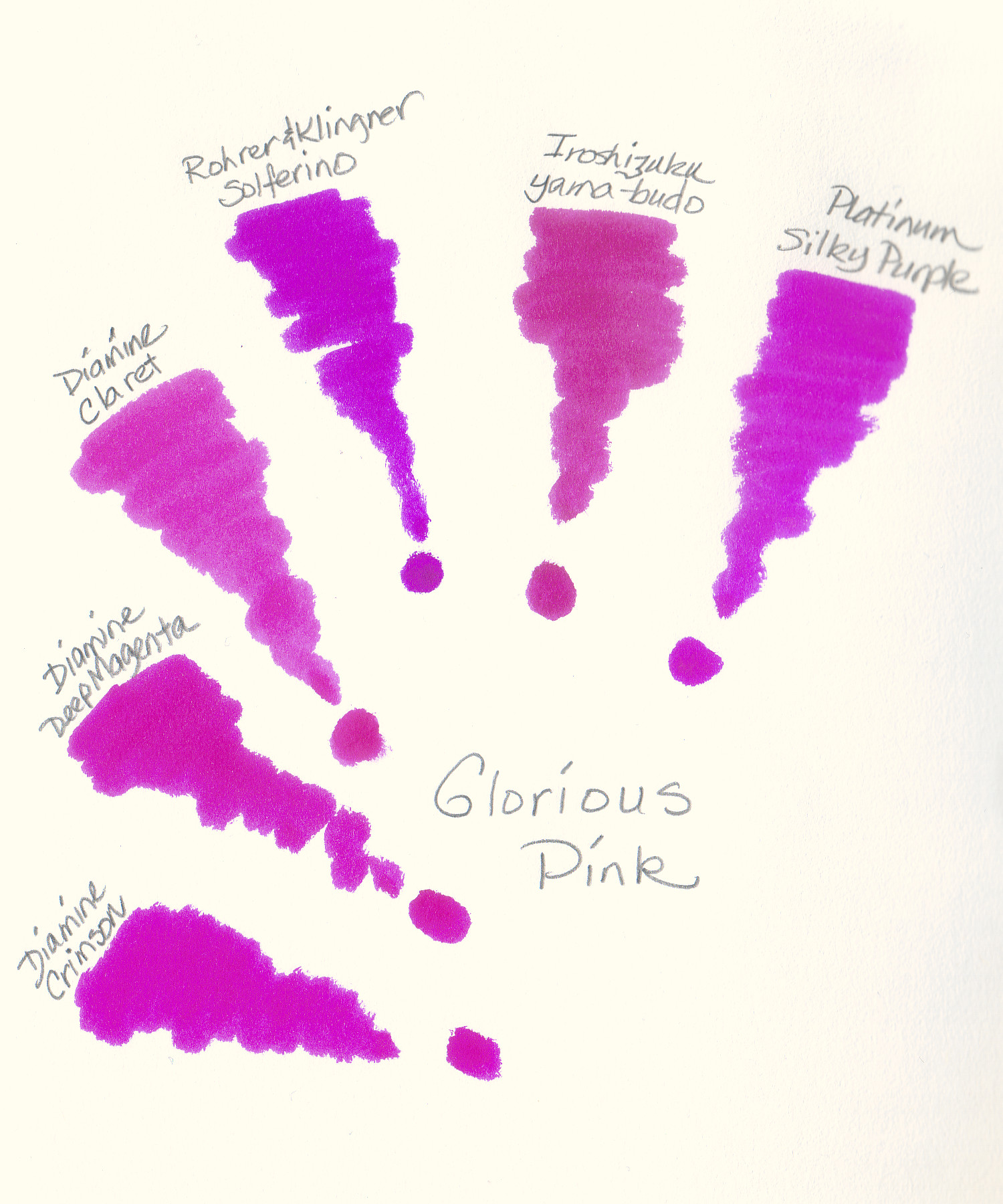
03/03/2013Frankly, I was surprised to see how similar these pink swatches turned out. Claret, Solferino, and yama-budo are full-sized bottles while the others are samples. Good thing since all six would be redundant indeed.


I actually bought Claret as a backup in case I ever ran out of Yama-budo!
LikeLike
I went the reverse and bought Claret long before yama-budo. They are different enough to enjoy both. I think Claret dries faster so it is better in wider nibs. Yama-budo is so colorful that it looks gorgeous even from a very fine nib. Which pens do you favor for them?
LikeLike
Yama Budo does look the most different of all the samples.
LikeLike
You are right about the color, Deborah. It’s a bit more subdued than the others though it takes seeing them adjacent to each other to discern the difference. I have it in a Pilot Elite pocket pen from which it flows very well but, my oh my, is it ever pink!
LikeLike
I´m surprised the Yama Budo looks so “pink” here… mine seem to be a great deal darker. I love using it in a XF nibbed MB No 22. Lovely, lovely colour. Thank you for sharing! What did you use to write the names of these inks?
LikeLike
The names were written with my trusty Autopoint mechanical pencil.
LikeLike
Ah, yes I thought it might be pencil, but I thought I’d just check as the coloured looked pretty along with the pink:)
LikeLike