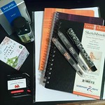
J. Herbin Café Des Îles
04/14/2009It would be very hard to use J. Herbin Café Des Îles without thinking of coffee. On Rhodia it dried with just enough shading to make the tops of the letters look the color of foam on the surface of a mug of coffee with the richer coffee color settling towards the bottom. While I was testing Café Des Îles today, I drank two cups of the brew in rapid succession and then forgetfully grabbed the empty mug looking for more…twice. Good thing this ink isn’t coffee scented or it would be irresistible.
Smooth flow, though not lubricating, and good coverage make this lovely brown useful for any application. However, the drying time with an Esterbrook SJ and a 9314-M nib (1.0mm) might be frustrating for a lefty at least wherever the ink pools. Time for those densely saturated blobs to dry exceeded ten seconds. However, with a very fine or dry nib, the issue should be less troublesome since the upper half of a 1.0mm line dried quickly on Rhodia.
Some folks think brown ink is generally slow to dry and this may well be the case. Café Des Îles is far from the worst offender in this category but it might take a little patience or a blotting sheet to prevent mishaps. J. Herbin happens to make an elegantly decorated one (3 ¼ x 1 7/8”) that would be a good investment to tuck in your journal regardless of the pen and ink you favor.
Part of the fun of using this ink is that it changes color as it dries. Initially it looks red-brown and deepens to a coffee brown in a couple of minutes. While Café Des Îles has lots of color, it is neither heavily saturated nor thick. The color of the paper has a decided effect on the final shade for an overall harmonious look. It might look interesting on aqua or pink paper and goes beautifully with any yellow-based white. It could also be good for expressive drawing. The slow drying time for the end of a line where the ink pools could be used to smear it creating shadows and other interesting effects.
The color of Café Des Îles and the beautiful shading make it charming for wide nibs. For extra fine nibs it could become a staple. For coffee lovers, it could be the perfect touch to writing at your local cafe while enjoying your favorite cuppa. Yum on all counts.
Note: The color represented on the top of the J. Herbin Café Des Îles box has a good deal more red than the ink in the bottle. The coffee bean on the front panel is a closer match though slightly darker than the true color.


Being the coffee addict and pen aficionado I am, I am now compelled to purchase this ink. I really like that color!
Now if Lamy would just make a coffee-colored Safari . . .
LikeLike
Wouldn’t a coffee-colored Safari be gorgeous! Sam at Pendemonium thinks Cacao du Brésil is a closer match to her “morning java” and that Café Des Îles looks like a café au lait. Either way it looks like coffee of one type or another. Speaking of which…
LikeLike
My cute little jar of this ink came yesterday. Bought it specifically to write the new book. Wish, I had seen your review first as I’m a lefty.
I’m using it in a pilot petit (brown). So far it’s drying well. No smudging yet.
LikeLike
That’s really encouraging. As a right handed writer, I am not a good judge of what works for a lefty. I would be happy to update my FPN review if you continue to have such good success with Café Des Îles. Please let me know how it goes. Of course, you could comment at FPN yourself. Thanks.
LikeLike
My Café Des Îles ink arrived (along with a new Lamy Safari Vista!) and I must say, I really like this ink color! It works surprisingly well in a Moleskine, perhaps due to the extra-fine nib of the Safari.
Thanks again for your excellent review!
LikeLike
I’m so glad you like it. My daughter started using Café Des Îles in a Pilot 78G medium last night and that looks like a winner for her, too. A Vista EF would have been even better. 🙂
LikeLike
[…] J. Herbin Café Des Îles […]
LikeLike
[…] Review on the Inkophile blog […]
LikeLike